


Use AI to summarize this article


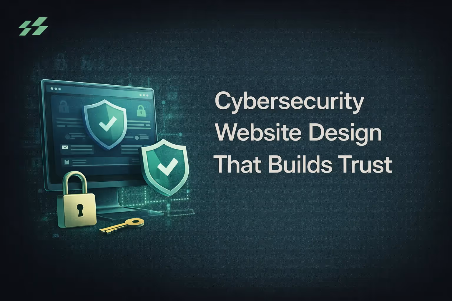
Your cybersecurity product might be the best in its category.
But if your website looks like it was built in 2019, loaded with padlock icons and dark stock photos of hoodies, your buyers are already gone.
Here is the truth that most cybersecurity companies miss: 75% of users judge a company's credibility based on its website design. And in cybersecurity, where trust is literally your product, that judgment takes about five seconds.
Your buyers, CISOs, CTOs, CFOs, and compliance officers, are doing this evaluation before they ever talk to your sales team. They are scanning your site the same way they scan a vendor's security posture. Every inconsistency, every slow load, every confusing navigation path signals risk.
This guide covers what actually works in cybersecurity website design. Not trends. Not aesthetics. What drives qualified demos and pipeline.
Why Cybersecurity Website Design Is a Different Problem
Most B2B websites need to look credible. Cybersecurity websites need to feel airtight.
The difference matters because of who you are selling to.
Your buyer is not one person. A typical cybersecurity purchase involves a CISO evaluating technical capability, a CFO assessing ROI, a compliance team checking certifications, and an IT lead validating integrations. Gartner research shows that B2B buying groups now average 6 to 10 stakeholders. Each of them lands on your website with different questions. Each of them needs a different reason to stay.
This creates a design problem that most agencies get wrong. They build a single homepage that tries to speak to everyone and ends up resonating with no one.
There is also a trust dimension unique to this space. In cybersecurity, your buyers are professionals trained to identify gaps and inconsistencies. A slow site, an outdated case study, a certificate that expired, these are not just bad UX. They are credibility killers. A one-second delay in page load time can reduce conversions by 7%. For a cybersecurity site, that number is likely higher because slow performance actively contradicts your brand promise.
What the Best Cybersecurity Websites Have in Common
Before building, it helps to study what is already working. Here is what separates the sites that convert from the ones that just look impressive.
Clarity Before Complexity:
Companies like Vanta and Drata do not open with feature carousels or animated threat maps.
They open with one clear statement. What they do, who it is for, and why it matters. Their buyers are stressed. They come to a site after a board meeting, a compliance audit, or a vendor evaluation. They do not have time to decode your messaging.
Clarity builds trust faster than aesthetics ever will.
CrowdStrike takes a different approach but achieves the same result. Their mega menus are divided by use case, not product name. A security buyer who does not know the difference between EDR and XDR can still find what they need without feeling lost.
Zscaler is the best example of visual consistency done right. Their typography is disciplined. The layout repeats predictably. The color palette does not shift every scroll. That consistency communicates exactly what a security buyer needs to feel: reliable, stable, and detail-oriented.
Light or Dark Themes: Let Positioning Decide:
The old assumption was that every cybersecurity site should be dark, technical, and dramatic. That is changing fast.
Light-themed cybersecurity sites are becoming the standard for compliance, audit, and risk management products. Light backgrounds feel transparent. They read faster. They feel more like enterprise software, which is exactly what CFOs and compliance officers want to see.
Dark themes still work for specific positioning. If your product is a technical, AI-driven threat detection platform with data-heavy visuals like attack graphs and behavioral timelines, dark works well. High contrast makes those visuals pop.
The Design Principles That Actually Drive Conversions
Put Trust Signals Where Decisions Get Made:
SSL certificates and padlock icons are expected. Every site has them. What actually moves conversion rates is where you place your stronger trust signals.
Compliance certifications like SOC 2, ISO 27001, and HIPAA logos should appear near contact forms and pricing pages. Not in the footer. Not on your About page. Right next to the moment when your buyer is about to share their email or request a demo.
Displaying security badges near forms can increase conversion rates by up to 30%. That is not a small number for a B2B sales cycle.
Client logos work the same way. A horizontal logo strip is fine. But adding three words of context, what industry, what use case, what outcome, makes it significantly more persuasive.
Short Forms Convert More:
Your buyers are skeptical of unnecessary data collection. This is almost ironic. The company selling data protection is asking for six fields before someone can request a demo.
Reducing a form from four fields to three can increase completion rates by up to 50%. If the information is not essential for the first conversation, do not ask for it upfront.
Multi-step forms also outperform single-page forms by 86% in conversion rate. Breaking the ask into steps reduces perceived effort at each stage.
And for any form on a cybersecurity site: use encrypted submissions, visible reCAPTCHA, and a "secured form" badge nearby. Show people their data is safe before they hand it over.
Performance Is Part of Your Brand:
A slow site is a trust problem, not just a UX problem.
Your security buyers are trained to spot performance gaps the same way they spot security gaps. Over half of visitors abandon a site after a 3-second delay. For a cybersecurity company, the damage runs deeper. Slow performance directly contradicts the message that you run a tight, high-performance operation.
Keep landing pages under 2MB. Use a CDN. Optimize every image. Strong Core Web Vitals do not just improve SEO rankings. They are proof that you take technical quality seriously.
More than 60% of B2B traffic comes from mobile. Executives read, forward, and share content on their phones after hours. A site that breaks on a 375px screen loses deals it never even knew were in play.
Navigation Built for Multiple Buyers:
One navigation has to serve a CISO, a CFO, and a compliance lead at the same time.
Mega menus work well here if done right. Cap top-level navigation at five to seven items. Use descriptive labels. "Solutions by Role" tells a visitor more than "Products." "By Compliance Framework" is more useful than "Features."
If your buyers have different entry points, consider building dedicated landing pages for each persona. A CISO-focused page leads with technical depth and certifications. A CFO-focused page leads with ROI data and risk reduction metrics. Same product. Different doors.
Content That Proves You Know Your Space
Case Studies Are Your Strongest Conversion Tool:
79% of B2B buyers read case studies before engaging sales. For cybersecurity buyers making high-stakes decisions, this number is almost certainly higher.
A weak case study describes what you did. A strong one quantifies the outcome.
"Improved security posture" is not a result. "Reduced breach response time by 47%" is. "Helped achieve compliance" is not a result. "Achieved SOC 2 Type II certification in 90 days" is.
Make your case studies filterable by industry, company size, and challenge type. A healthcare CISO should find healthcare examples immediately. A Series B startup should find examples from companies at their stage. Relevance closes deals faster than a perfect layout.
Video Converts What Text Cannot:
Including video on a landing page can boost conversions by 80% or more.
Product demos and customer interviews that show how your product actually works in a real environment outperform any static feature page. Show the product in action. Do not describe it.
For distribution, prioritize LinkedIn. 43% of B2B buyers engage with industry video content on LinkedIn, making it the most effective channel for reaching CISOs, IT leaders, and security decision-makers.
Thought Leadership That Earns Trust:
Your buyers want to work with people who are ahead of the threat landscape.
A blog section with threat intelligence updates, compliance guides, and technical breakdowns positions your team as experts with a point of view, not just vendors with a product.
Consistency matters more than volume. One well-researched post per month builds more authority than four generic posts per week.
The Mistakes That Are Quietly Killing Your Conversions
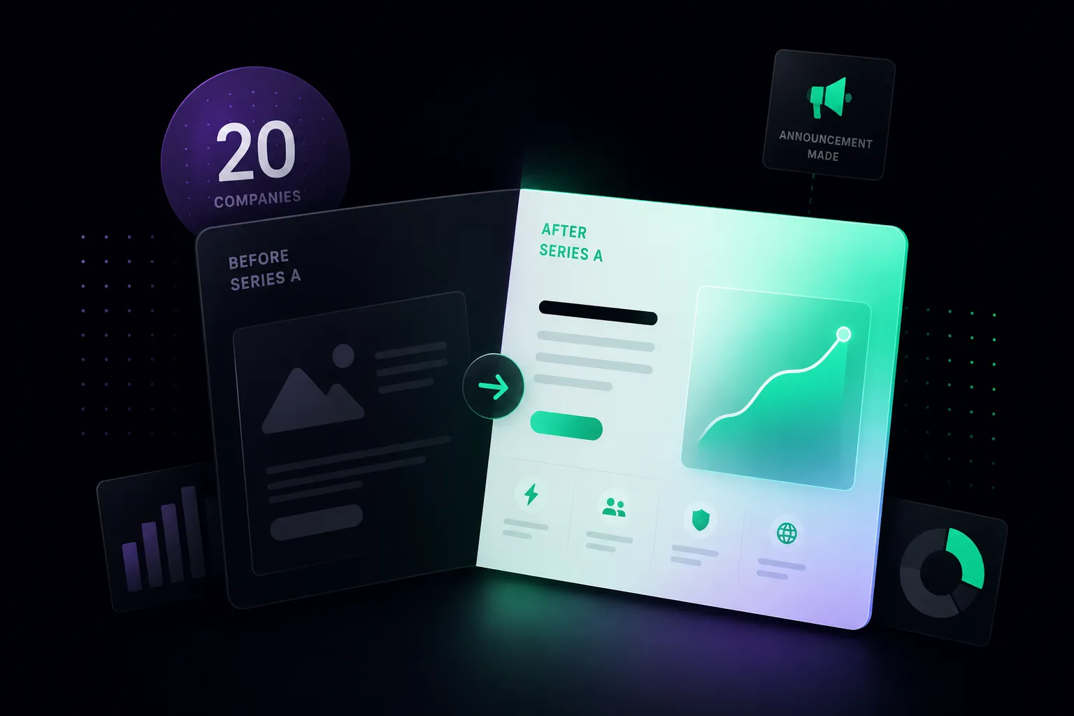
How Flowtrix Approaches Cybersecurity Website Design
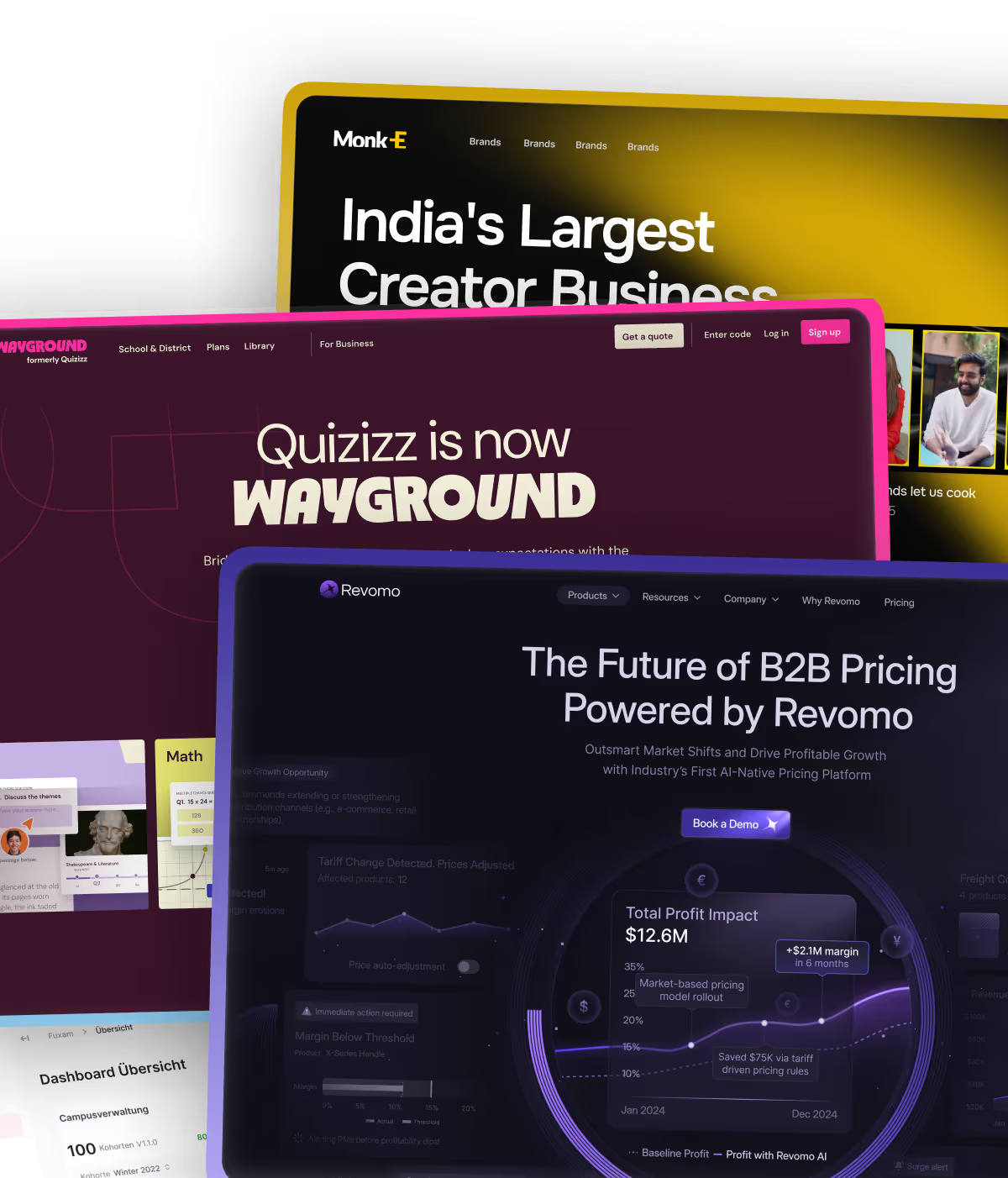
Flowtrix is a Webflow Enterprise Partner. We have worked with 120+ B2B companies across the US, UK, Europe, and the Middle East, including cybersecurity and AI companies from Series A through Series C.
The pattern we see most often is this: cybersecurity companies build their website for their internal team. It communicates fluently with engineers. It fails to convert the buyers who sign contracts.
Our process starts with the buying committee. We map who evaluates the site, what they need to see at each stage, and what trust signals carry the most weight for each persona. Then we build a site that guides each buyer type toward a demo or conversation.
We work on Webflow because it gives marketing teams the speed to iterate without developer dependency. That matters especially for cybersecurity companies, where compliance requirements, product positioning, and market messaging shift constantly.
Our clients include companies like Databahn, Akirolabs, Fuxam, and Wayground. The consistent outcome across these projects: shorter sales cycles and more qualified inbound. You can see the full picture in our case studies.
Quick Audit: Is Your Cybersecurity Website Ready to Convert?
The Bottom Line
The cybersecurity companies winning on website design are not the ones with the biggest budgets. They are the ones who understand their buyers well enough to make a complex product feel safe, clear, and worth a conversation.
Your website is not your product brochure. It is the first evaluation your buyers run on you. It needs to pass.
If you are planning a redesign or need to identify what is holding your current site back, start with our 2026 Web Design Trends Guide for a broader view on where B2B website design is heading.
And if you want a second set of eyes on your cybersecurity site, book a call with Flowtrix. We will walk you through what is working, what is not, and what to fix first.


.avif)


.svg)
.svg)

