


Use AI to summarize this article


If you're running a B2B SaaS or AI company, you've probably noticed how many modern websites now offer dark mode. It's not just a visual trend anymore. Dark mode has become a fundamental expectation for users who spend hours evaluating software platforms, reading documentation, and navigating complex product interfaces.
But here's the thing: implementing dark mode isn't as simple as inverting your color palette and calling it done. Get it wrong, and you'll create accessibility nightmares, readability issues, and conversion problems. Get it right, and you'll reduce eye strain, improve the overall user experience, and potentially boost engagement metrics.
As any experienced UX designer will tell you, dark mode requires thoughtful consideration of visual elements, user personas, and the broader design process. Since Don Norman coined the term user experience in the 1990s, we've understood that every design choice affects how a person experiences a digital product. Dark mode is no exception.
This guide breaks down everything you need to know about dark mode in UX design for 2026, including when to use it, how to implement it properly in Webflow, and the specific considerations for B2B SaaS websites.
Why Dark Mode Matters for B2B SaaS Websites
Dark mode has evolved from a nice-to-have feature to a competitive necessity. With 82.7% of users now preferring dark interfaces on their devices, ignoring this design option means you're potentially frustrating the majority of your visitors.
For B2B SaaS companies, the case for dark mode gets even stronger. Your users are typically product managers, developers, and technical buyers who spend 6+ hours daily staring at screens. These aren't casual browsers. They're evaluating your platform against competitors, reading through feature documentation, and making decisions that affect their entire organization.
Any UX designer working in B2B software understands that these extended evaluation sessions create specific design challenges. Users aren't just glancing at your homepage - they're diving deep into pricing comparisons, technical specifications, and integration documentation. This extended engagement makes comfort a critical factor in user experience design.
Dark mode directly addresses their comfort and usability needs. When implemented properly, it reduces glare in low-light environments, minimizes blue light exposure that disrupts sleep cycles, and creates a more professional, focused browsing experience. For the designer working late hours, dark interfaces feel natural and reduce eye fatigue.
The Conversion Impact of Dark Mode
Recent A/B testing data shows that dark mode's impact on conversions varies significantly by industry and audience. For B2B SaaS targeting technical buyers, the psychology shifts dramatically. A 2025 study of industrial software found that dark-themed landing pages converted 42% better than light versions for technical audiences.
The reason? Dark backgrounds communicate substance and seriousness. For expensive B2B software purchases involving multiple stakeholders, that visual gravity reinforces the perception that your platform can handle complex operational requirements. But this doesn't mean every B2B site should go dark - context matters more than trends.
The Real Benefits of Dark Mode in Webflow Design
Let's get specific about what dark mode actually delivers. Any product designer or interaction designer will tell you that successful user experience design goes beyond aesthetics - it's about understanding how visual design choices affect actual user behavior.
1. Reduced Eye Strain in Extended Sessions
Users evaluating B2B SaaS platforms spend 20-30 minutes navigating pricing pages, feature comparisons, and documentation. Dark mode reduces harsh contrast between screens and their environment, particularly during evening sessions.
When you conduct user research with technical buyers, many work late hours evaluating platforms. Blue light reduction helps maintain natural circadian rhythm. Usability testing consistently shows users report less fatigue with properly implemented dark interfaces during extended sessions.
2. Better Battery Performance on OLED Devices
For mobile users on OLED or AMOLED displays, dark mode delivers measurable battery savings since OLED pixels don't require energy to display black. For users attending conferences or working remotely, battery life affects how long they can engage with your documentation or videos. A designer working on mobile-first experiences needs to consider these practical constraints.
3. Enhanced Visual Hierarchy
Dark backgrounds make bright elements pop, creating natural focus on CTAs and key messaging. For B2B SaaS websites with complex information architecture, dark mode guides attention more effectively.
Good graphic design principles apply: contrast drives attention. In dark mode, you achieve higher contrast with less visual noise. Key conversion elements stand out naturally. The user interface UI designer can create clear visual pathways through complex product information without overwhelming visitors.
4. Professional Perception and Brand Authority
Dark interfaces signal sophistication and technical credibility - critical for AI platforms, cybersecurity companies, and data infrastructure tools. When your digital product targets technical user personas, dark mode aligns with their existing mental models. These users spend days in code editors and terminal windows (nearly all dark-themed), so your marketing site adopting dark mode creates visual continuity with tools they already trust.
When Dark Mode Works (and When It Doesn't)
Not every website needs dark mode. Here's when it makes sense for B2B SaaS platforms:
Dark Mode UX Design Best Practices for 2026
Implementing dark mode requires more than flipping a switch. The design process needs to account for how every visual element behaves in a darker environment.
1. Use Dark Gray, Not Pure Black
The biggest mistake teams make is using pure black (#000000) backgrounds, which creates harsh contrast that increases eye strain. Material Design recommends #121212 for dark surfaces.
Any UX designer who has worked on dark interfaces knows pure black creates problems. Dark gray tones provide depth through subtle elevation changes. Layer different shades (#1A1A1A, #242424, #2E2E2E) to create visual hierarchy without relying solely on color. During usability testing, users consistently report dark gray backgrounds feel more comfortable than pure black for extended sessions.
The same applies to text. Instead of pure white (#FFFFFF), use slightly desaturated versions around #E0E0E0 or 87% opacity. This reduces visual vibration when text sits on dark backgrounds.
2. Maintain Proper Contrast Ratios
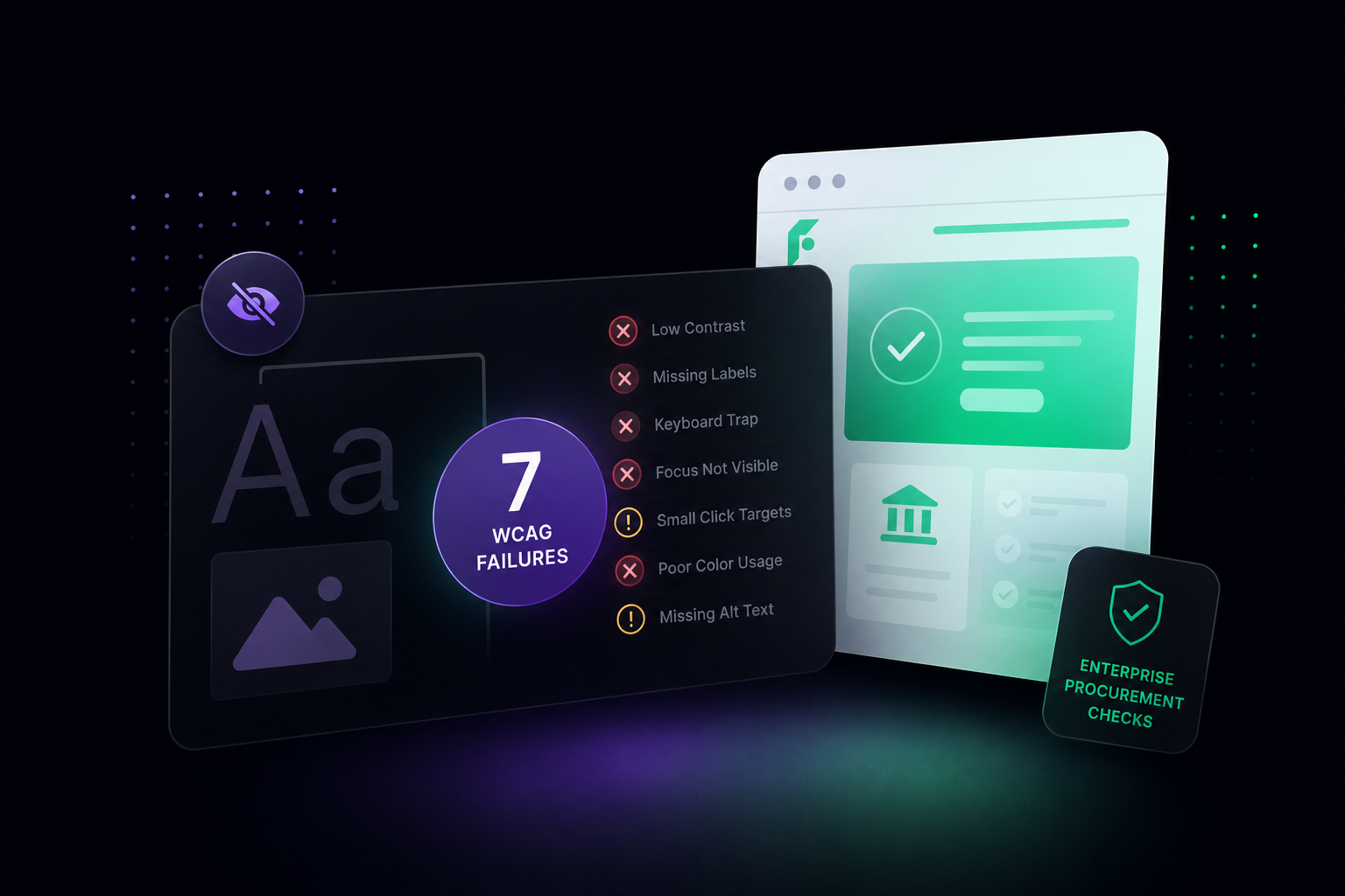
WCAG guidelines require minimum 4.5:1 contrast ratio for normal text and 3:1 for large text - accessibility requirements affecting usability for millions of users. In dark mode, achieving proper contrast becomes trickier because saturated colors appear more intense.
Test every element with contrast checking tools like WebAIM Contrast Checker. Focus on body text at 4.5:1 minimum, interactive elements at 3:1 minimum, and error messages at even higher contrast.
3. Design Specific Color Schemes
Don't invert your light mode colors. Saturated colors that work on light backgrounds can appear harsh on dark surfaces. Desaturate accent colors by 10-20% for dark mode. Keep most interface in dark neutral tones and reserve saturated colors for critical actions.
4. Handle Images and Media Thoughtfully
Images designed for light backgrounds often lose impact on dark interfaces. Don't just place existing imagery on dark backgrounds and hope it works.
For photographs and complex graphics, consider creating dark mode-specific versions with increased contrast and adjusted color temperature. For logos and icons, create light versions specifically for dark mode - a dark logo on dark gray becomes invisible.
SVG graphics and icon fonts offer the most flexibility because you can adjust their colors dynamically through CSS, maintaining consistent styling across both modes without managing separate image files.
5. Provide Easy Mode Switching
Users want control over their viewing experience. Provide a clear, accessible toggle that lets them switch between light and dark modes instantly.
The toggle should be visible but not obtrusive. Common placements include the top navigation bar, footer, or a floating button in the corner. Make sure the toggle's icon clearly indicates which mode is currently active.
Respect system preferences by detecting the user's OS-level dark mode setting using the prefers-color-scheme media query. But always allow manual override. Some users prefer dark mode on their devices but light mode for reading web content, or vice versa.
Most importantly, remember the user's choice. Store their preference in localStorage so they don't need to re-select their mode on every visit.
The User Experience Design Process for Dark Mode
Before building dark mode in Webflow, approach it like any major design decision. User experience design isn't about implementing trendy features - it's about understanding actual user needs.
1. Start With User Research and User Personas
Understand whether your users actually want dark mode. If targeting technical user personas like developers or data scientists, dark mode is likely a strong expectation. But if your primary users are marketing executives or sales leaders, preferences might differ.
Conduct user research through surveys or analytics: Do you use dark mode on other websites? What time do you research software platforms? Do you experience eye strain browsing B2B websites?
2. Create a Component Library
Inventory every visual element: navigation, buttons, forms, cards, modals, and charts. A product designer will create a component library defining how each element behaves in both modes, preventing situations where dark mode works on your homepage but breaks on case study pages.
3. Test Through Usability Testing
What looks good in design tools might create readability issues for users with visual impairments or on different devices. Test with users representing your actual user personas completing key tasks: finding pricing, navigating features, filling forms, and reading case studies.
Don Norman, who coined the term user experience while working at Apple, emphasized that good design considers the entire context where people use products. Users might view your site on bright office monitors, laptops in dimly lit coffee shops, or phone screens in bed - each context creates different needs.
Implementing Dark Mode in Webflow: Technical Approach
Webflow has made dark mode implementation easier with variables and improved interactions. Here's the systematic approach:
1. Define Color Variables and Build Toggle
Create comprehensive color variables for both themes in Webflow's Style panel: primary backgrounds (3-4 shades), text colors, borders, accent colors, and status colors. Create separate variable sets for each mode (like bg-primary-light and bg-primary-dark).
Build a toggle button element - styled checkbox, button with icons, or custom switch. Give it a unique class name like theme-toggle for targeting with interactions.
2. Set Up Interactions and Persistence
Use Webflow's native interactions to create toggle functionality. Create a click interaction that adds or removes a dark-mode class to your page wrapper. Set up two interaction states - one for dark mode, another for light mode. Use combo classes to define element appearance in each mode.
To remember user preferences across sessions, store the theme choice in browser local storage. Check for saved preferences on page load and update when users toggle modes, creating consistent experience without re-selection.
3. Optimize and Test
For images needing dark mode versions, use CSS custom properties to swap sources. For logos and icons, use CSS filters rather than loading separate files.
Test thoroughly on desktop browsers, mobile devices, and different screen types. Check every interactive element and verify contrast ratios meet accessibility standards in both modes.
Dark Mode Considerations for B2B SaaS Sites
For B2B SaaS companies specifically, dark mode implementation has unique requirements. The overall user experience for enterprise software buyers differs significantly from consumer web design.
1. Product Screenshots and Interface Previews
Your product screenshots are conversion-critical - they provide social proof and help users visualize your solution. If screenshots become hard to see in dark mode, you've defeated the purpose.
Add subtle shadows or borders around screenshots in dark mode. Use slightly lighter background cards to create separation from the page background. This maintains image clarity without requiring separate versions.
2. Pricing and Comparison Tables
Dark mode can improve pricing table readability by creating clearer separation between tiers. Use subtle elevation changes (lighter dark grays) for each pricing card rather than borders.
From an interaction designer's perspective: how do users compare options? In dark mode, higher contrast between selected and unselected states helps users track which features they're evaluating. Make sure hover states and CTAs maintain strong contrast.
3. Documentation and Technical Content
If you provide extensive documentation, consider keeping it light mode regardless of your main site's theme. Long-form reading performs better on light backgrounds. Implement dark mode for navigation while keeping content readable on light backgrounds.
Your user personas inform this decision. If documentation primarily serves developers copying code, dark mode throughout makes sense. If it serves less technical users reading conceptual guides, a hybrid approach works better.
4. Form Fields and Input Elements
Form completion is where dark mode often fails. Keep form inputs light with dark text, even in dark mode. This maintains familiarity and reduces errors.
From a visual design perspective, light form fields on dark backgrounds actually create better focus. The eye naturally moves to bright elements, improving form completion rates by making the conversion path more obvious.
Common Dark Mode Mistakes to Avoid
These mistakes appear consistently in B2B SaaS dark mode implementations:
1. Inverting Colors Automatically: This breaks visual hierarchy and feels off-balance. Design dark mode intentionally from scratch.
2. Too Many Saturated Accent Colors: Limit bright colors to 2-3 accent tones. More creates visual chaos on dark backgrounds.
3. Forgetting Focus States: Keyboard navigation indicators that worked on light backgrounds often disappear on dark ones. Test tab navigation thoroughly.
4. Ignoring Load Performance: Loading both themes' assets adds page weight. Optimize by using CSS custom properties rather than duplicate stylesheets.
5. Not Testing on Real Devices: Dark mode appears differently on OLED versus LCD displays. What looks great on one device might have contrast issues on others.
Measuring Dark Mode's Impact
Track how dark mode affects your key metrics:
Engagement: Monitor time on site, pages per session, and bounce rates segmented by theme choice.
Conversions: Track demo requests, trial signups, and other conversion goals separately for each theme. You might find one performs better for specific user segments.
User Feedback: Add a simple feedback mechanism near your theme toggle to surface issues you wouldn't catch otherwise.
Accessibility: Monitor support tickets for mentions of readability issues, eye strain, or contrast problems.
Dark Mode and Your Webflow Revamp
If you're planning a website revamp with Webflow, dark mode should be part of your initial strategy discussion, not an afterthought. Building it into your design system from the start is significantly easier than retrofitting later.
When we work with clients on Webflow migrations, we set up dark mode using a scalable variable system that marketing teams can manage independently. This means no developer dependency for adjusting colors or testing new button styles in dark mode.
Looking Ahead: Dark Mode in 2026 and Beyond
Dark mode continues evolving beyond simple toggles. We're seeing automatic switching based on time of day, adjustable darkness levels offering "dim mode" as an intermediate option, context-aware theming where certain pages stay light while others offer dark mode, and enhanced accessibility controls specifically designed for dark interfaces.
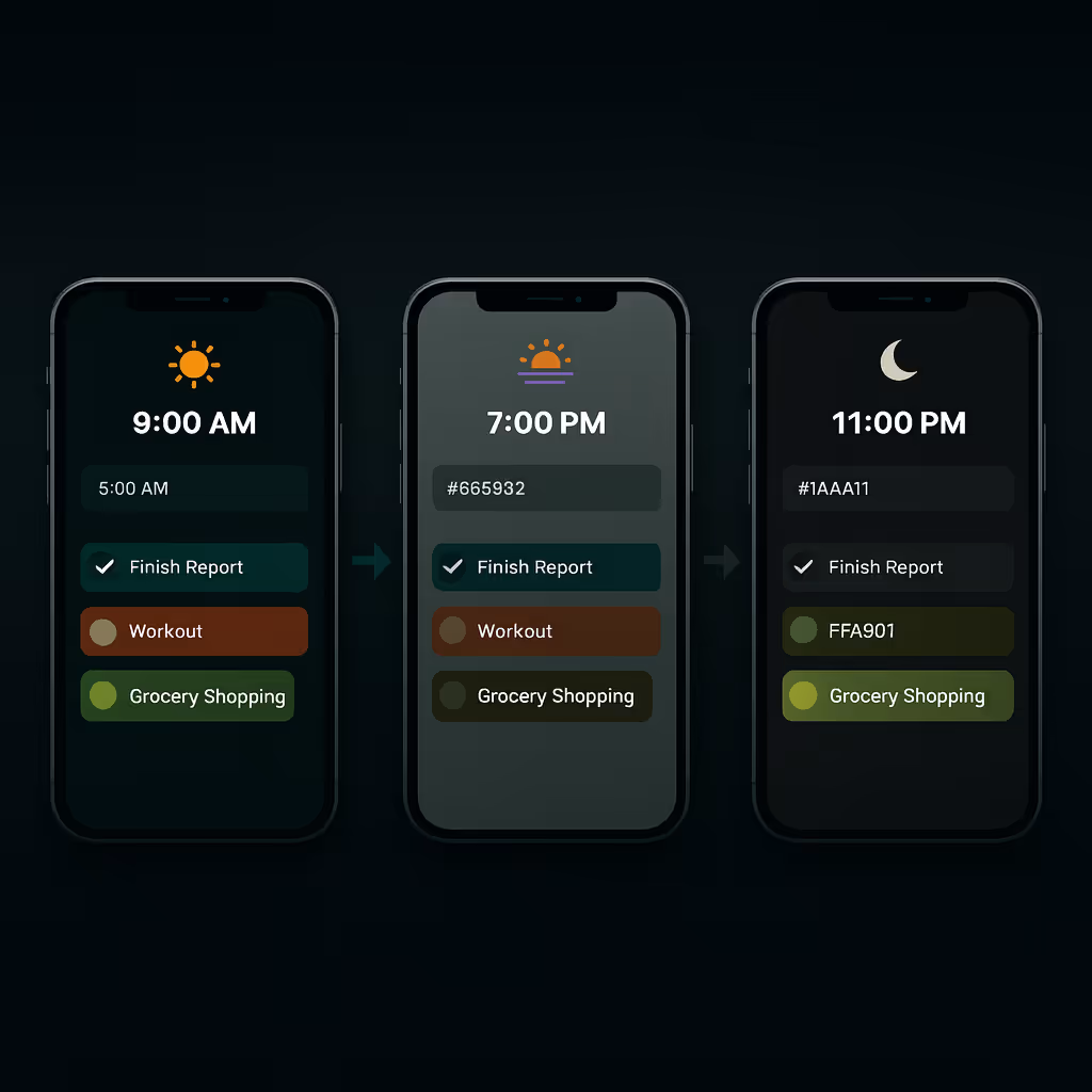
Alt text- Visual showing the same mobile app interface automatically transitioning from bright daytime mode to dark nighttime mode
For B2B SaaS companies, implement dark mode thoughtfully based on your specific user needs rather than following trends. If your buyers are technical users who expect dark interfaces, build it well. If they're not, focus development resources on other conversion improvements.
Conclusion
Dark mode isn't just about aesthetics - it's about user comfort, accessibility, and meeting modern expectations. For B2B SaaS and AI companies targeting technical audiences, dark mode has moved from optional to expected.
But implementation matters more than availability. Poorly executed dark mode reduces readability and frustrates users. This is where the full design process comes into play. A good UX designer doesn't add dark mode because competitors have it - they research user personas, understand browsing contexts, conduct usability testing, and iterate based on feedback.
The best digital product experiences come from understanding that user experience design extends beyond individual features. Dark mode needs to fit into your information architecture, complement your visual design system, and align with how users interact with your platform.
When you conduct user research and find technical buyers spend late evenings comparing platforms, dark mode becomes a user-centered solution. When usability testing shows developers prefer reading documentation in dark mode because it matches their code editor, you're making design decisions based on actual needs.
Don Norman's principles still apply: design for how people actually behave, not how you think they should behave. The graphic design elements need to work in both modes. The interaction designer needs to ensure clickable elements remain obvious. The overall user experience must feel cohesive whether someone chooses light or dark.


.avif)


.svg)
.svg)

