Use to summarize this article


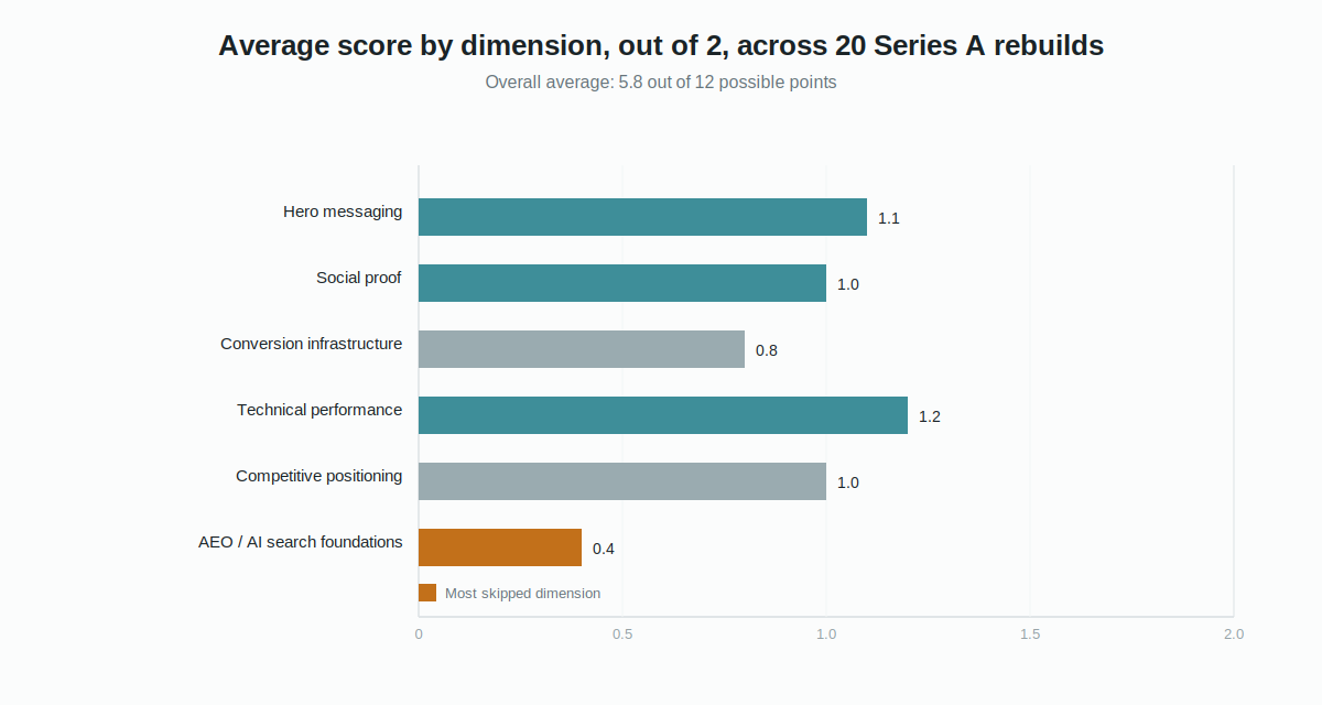
- Across 20 B2B SaaS companies that raised Series A, the average website update scored 5.8 out of 12 on the dimensions that drive commercial performance
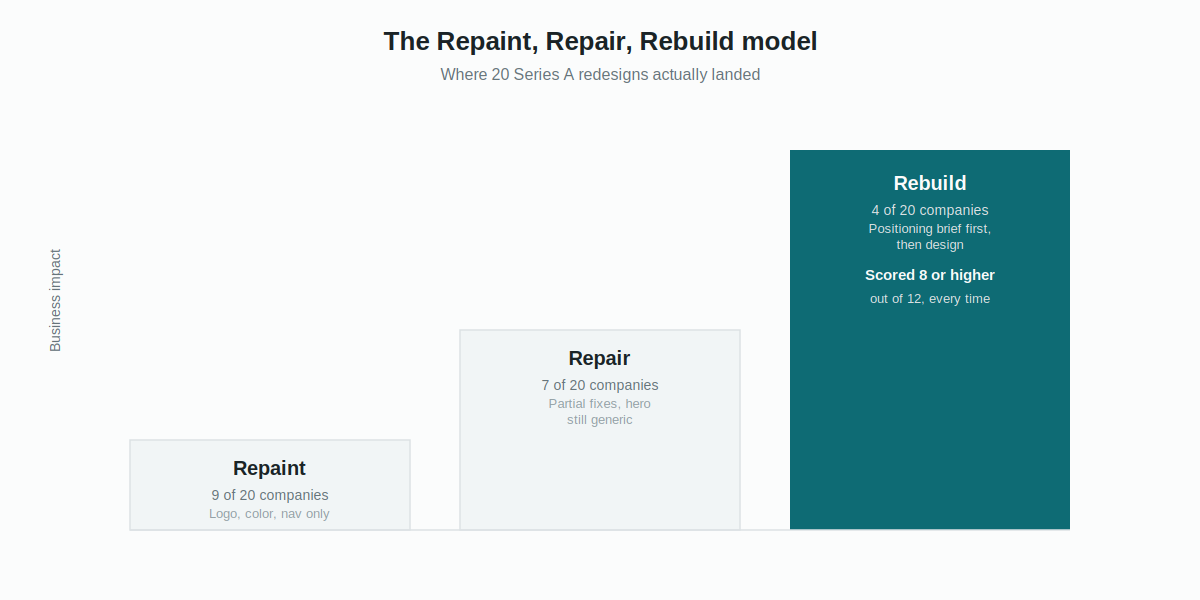
- Redesigns fall into three tiers: Repaint (visual only), Repair (partial fixes), and Rebuild (positioning-first). Only 4 of 20 reached Rebuild, and all 4 scored 8 or higher
- The three changes most tied to better conversion: a sharper ICP-specific hero, a transparent pricing page, and named, quantified case studies
- Zero of 20 companies had llms.txt live before announcing, and only four had FAQ schema, the most skipped high-upside investment in the set
- The four top scorers shared one trait the other 16 didn't: a written positioning brief before any design work began
About three weeks before a Series A announcement, you do the same thing every founder before you has done. You open Wayback Machine and pull up your old homepage.
It's never a comfortable look. The seed-stage site is rough in a way that reads as honest in hindsight. Small team, early product, a founder still figuring out what the thing even was. The new site, the one about to go live with the round, is supposed to be the grown-up version of that. Better design, sharper copy, proof that the company arrived.
Then you put the before and after side by side, and most of the time the only thing that actually changed is how it looks.
We pulled apart 20 B2B SaaS companies that raised Series A rounds between 2023 and 2025 to see what moved on their websites in the six months around the announcement, and which of those moves did anything for the business. The company names below are composites, not real businesses, but the patterns repeat with almost boring consistency. This is exactly the moment our website revamp work is built for.
The headline finding: most companies change the wrong things and leave the right things untouched.
Why does the average Series A redesign fix less than half of what actually matters?
We split the set into four categories, five companies each: Revenue and GTM, Customer Success and Retention, HR Tech and People Operations, and Developer Tools and Infrastructure. Every company raised between 8M and 45M.
For each one we scored six things, before and after the announcement. Hero messaging: did the headline move from broad and categorical to specific about who it's for and what problem it solves. Social proof: did proof grow up from a logo wall into named, quantified case studies. Conversion infrastructure: pricing page, demo flow, CTA placement. Technical performance: PageSpeed, Core Web Vitals, mobile. Competitive positioning: did the site build an actual wedge, or just list features. SEO and AEO foundations: title tags, schema, and whether the site was set up to show up in AI search at all.
Zero for no change, one for partial, two for meaningful. Twelve points possible.
That number is the whole story before the teardown even starts. Most rebuilds spend real money changing the site without changing the argument underneath it.
The Repaint, Repair, Rebuild model
After going through all 20 sites, a pattern kept showing up that had nothing to do with budget or category. Every company's redesign fell into one of three tiers, and the tier had almost nothing to do with how much money they spent.
Repaint is a visual refresh with no messaging work underneath. New logo, new color system, maybe a faster load time. The homepage says exactly what it said before, just in a nicer typeface.
Repair is a partial fix. Maybe a pricing page finally shows up, maybe a few case studies get added, but the hero headline stays generic and the positioning underneath never gets resolved.
Rebuild is the rare one. Hero messaging gets rewritten around a specific buyer and a specific consequence, proof gets rebuilt around named outcomes, pricing gets made transparent, and the technical and AEO foundations come along with it. Only four of the 20 companies landed here, and all four scored 8 or higher.
What a Repaint looks like:
The clearest Repaint we found was in the HR Tech and People Operations group, which scored 5.0 on average and was the weakest category for technical and AEO work. One company put its investor's name directly in the hero: "HR software that works, now backed by [Investor]." Enterprise HR buyers do not pick vendors based on who wrote the check. The investor name belongs in a press strip or the About page, not in the sentence meant to explain why the product exists. The core line, "HR software that works," which says nothing at all, went untouched through the entire redesign.
Another Repaint sat in Customer Success and Retention, the category with the widest spread in the whole set. This one scored a 3 out of 12, the lowest in the dataset. New logo, new typography, new color system, a slightly faster load. Hero untouched. Zero new case studies. No pricing page. A brand firm ran a full visual refresh and never touched a single messaging or conversion lever.

What a Repair looks like:
Repair is the most common outcome, and it's sneakier than a Repaint because it looks like real progress. Fourteen of the 20 companies had no pricing page before their round. Ten of those added one after announcing, which sounds like a win, until you notice that six of the ten used "contact us" on every single tier. That strips out most of the value a pricing page is supposed to deliver: letting a buyer qualify themselves before they ever talk to sales.
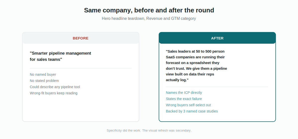
The Revenue and GTM category scored highest overall at 7.2, mostly because these teams tend to be marketing-led. But even the best performer in that group, which rewrote a flat "smarter pipeline management for sales teams" headline into something specific enough that the wrong buyer disqualifies themselves on sight, still shipped without any FAQ schema or AEO setup. The messaging work happened. The search infrastructure that would have let that work compound never did.
What a Rebuild looks like:
The Customer Success and Retention category, despite scoring worst overall in one case, also produced the single best teardown in the entire set: a 10 out of 12. The hero moved from a capability description to a consequence-first line naming the exact moment a CS leader dreads, the moment they find out a customer is churning because the customer told them, instead of seeing it coming. Four named case studies went up with real churn and NRR numbers attached. Transparent pricing appeared on the first two tiers. And this was the only company in all 20 that shipped llms.txt before its announcement, a detail that put it a full year ahead of the other 19 on AI search visibility.
The Developer Tools and Infrastructure category told a similar story from a different angle. These teams do the strongest technical work and the weakest messaging evolution, which tracks with who tends to found dev-tools companies. The standout in that group pulled off the hardest combination in the dataset: keeping technical credibility while adding real commercial stakes to the hero, then backing the claim immediately with named enterprise case studies and throughput numbers. It's the same move Linear made in its own homepage evolution, earning a bold claim by putting proof directly underneath it instead of leaving it to hang.
Zero of 20 had AI search infrastructure ready when the announcement traffic hit. That gap is growing every quarter, not shrinking.
The four patterns that showed up in every category
Design changes are close to universal. Messaging changes are not: Eighteen of 20 companies made some visual update. Eleven touched the hero at all, but only seven of those eleven were real shifts in specificity. The rest were lateral, different words sitting at the same level of vague. Design investment is nearly automatic at Series A. Messaging investment is the exception.
Case study depth beats logo volume, every time: Companies that added three or more named, quantified case studies outperformed the logo-adders on every signal we could see: time on site, demo requests, return visits. One GTM company bolted on 22 logos and zero case studies and posted the worst engagement in its category. Buyers want one customer's specific outcome, not 22 silhouettes standing in for proof.
CTA placement is broken almost everywhere: Fourteen of 20 had their main CTA only at the very bottom of the homepage. Seven had no CTA in the nav at all. Announcement traffic, journalists and investors mostly, scrolls fast and rarely reaches the footer. A CTA above the fold, again after social proof, and again at the bottom, plus one persistent in the header, is a low-effort fix with an outsized payoff.
The companies that scored highest all did the same thing first: The four companies that scored 8 or higher shared exactly one trait the other 16 didn't: a written positioning brief existed before any design work started. The low scorers almost all began with a Figma file or a design reference and worked backward to figure out what to say. That order gives you a beautiful site that doesn't know its own argument.
This matters more every quarter because of where buyers start looking. G2's March 2026 research on B2B software buyers found that a majority now start research with an AI chatbot more often than with Google, a share that has grown sharply since early 2025, and a large portion said AI guidance changed which vendor they ultimately picked. Forrester's 2026 buyer's journey survey found a similar pattern: generative AI and conversational search now outrank vendor websites and sales reps as the most meaningful research source for buyers.
So when your Series A announcement sends a buyer to ask an AI assistant what the best tool in your category is, a site with no AEO foundations sends that buyer to a generic answer, or straight to a competitor. Webflow's own AEO tooling, rolled out this September, makes tracking that exposure easier, but FAQ schema and llms.txt still have to be in place first for it to have anything to track. The fix takes a few hours. The return compounds for a year or more. It's the highest-ROI move most Series A companies skip, and it's a standard part of how we handle SEO and structured data on every rebuild.
How to run this teardown on your own site
You don't need an agency to do the first pass. You need an hour and some honesty.
Flowtrix has delivered 120+ revamps for B2B SaaS, AI, and cybersecurity teams, work that got us nominated for Webflow Partner of the Year 2025. Explore the work behind the messaging.




Common Mistakes to Avoid:
"The difference between a 9 out of 12 site and a 4 out of 12 site is almost never the design. It's whether someone answered the hardest question before anyone opened Figma."
That question is simple to state and hard to sit with: what is the most honest, most persuasive thing this company can say to the buyer it most needs to win. Answering it takes a founder maybe two weeks. Skipping it costs a year of traffic that lands on a site that doesn't know what it's arguing.
Do the things 15 of 20 skipped: quantified, named case studies, a pricing page with real tier logic on at least two tiers, FAQ schema, AEO foundations, a CTA at three scroll depths, and a hero that names the problem and the consequence instead of the product category. Skip the things 18 of 20 did that changed nothing: a visual refresh with no messaging work, logos with no stories behind them, nav expansion with no positioning clarity underneath it. And if you only do one thing well, make it the thing only four of 20 got right. Start with positioning, not design.











.svg)
.svg)