


Use AI to summarize this article


The wire clears. You tell the team. Your investor adds your logo to their portfolio page. And then they start doing something you rarely get to watch happen: they send people to your website.
Not just buyers. Co-investors running diligence on your next round. LPs trying to understand what the fund just backed. An enterprise procurement lead a partner name-dropped you to. A reporter the VC connected you with. A senior hire being talked into joining. Every one of those people lands on the same homepage, each carrying a different question. But the partner who sent them is carrying one expectation, and it never changes: that the site makes you look like a company worth their name being attached to.
Most portfolio sites do not clear that bar. The cost of missing it is quieter than a blown launch or a missed quarter, which is exactly why founders underrate it. Nobody emails you to say your site cost you a warm intro. They just stop sending people.
This is a breakdown of what investors actually look at when they pull up a portfolio company's website. Not the polite version. The version based on how the review actually happens, between meetings, on a phone, with a co-investor sitting right there.
The review happens far more often than you think
Founders picture the website review as a one-time thing at the close of a round. It is not. It is ongoing, and most of it happens in rooms you are not in.
Before a board meeting, partners often reopen the site to re-orient on your positioning and what changed since last quarter. If the homepage still says something you walked back six months ago, that gets noticed, and it gets noticed by the person you least want noticing.
When a fund announces a new investment to its LPs, the portfolio link goes out with it. In that moment your website is standing in for the fund's judgment. When your lead is syndicating the round or pulling in a strategic co-investor, the first move that co-investor makes is to open your site, and your lead is quietly vouching for whatever they find there.
Then there are the warm intros. A partner connects you to an enterprise buyer or a candidate, and that person looks you up before they reply to the email. The site is the handshake, and it happens before you have said a word. And when you raise again, your existing investors forward your site to new funds long before you ever get on a call. The site is out there prospecting for you while you are still building the deck.
The common thread across all of it: every one of these people was sent by someone with credibility on the line. The reputation tied to your website is not only yours.
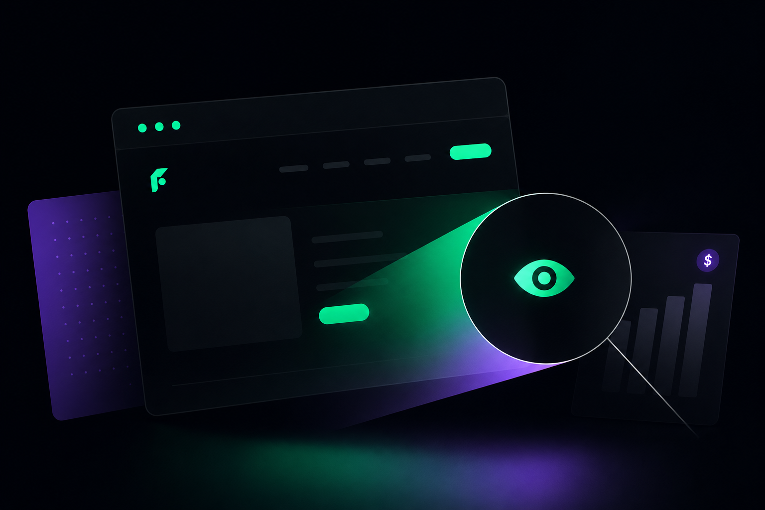
What investors actually check
VCs are not grading your site on whether it looks expensive. They are reading it for a small set of signals, and they move through it fast because they have done this hundreds of times.
1. The homepage, above the fold
This is the most important eight seconds of the whole review. The question is not "is this pretty." It is "can I tell what this company does, who it is for, and why it wins, before I scroll."
Positioning clarity is the first read. A headline like "the AI platform for modern teams" says nothing. "Pipeline forecasting for B2B SaaS sales teams running 50 to 500 reps" says everything. The second one tells the investor you know exactly who you are selling to. The first one tells them you are still figuring it out, and they are usually right.
The second read is focus. Are the logos, the language, and the visual tone pointed at one specific buyer, or does the page try to be for everyone? Vague positioning is almost never a copywriting problem. It is a symptom of an unresolved go-to-market question, and investors read it correctly nearly every time.
2. Navigation and information architecture
Investors know what they are looking for and they click straight to it. Pricing, almost always. Then Customers or Case Studies. Then About. Sometimes Blog or Resources.
A missing pricing page on a B2B SaaS site in 2026 reads as a company that is either unsure of its value or nervous about how its price compares. "Contact us for pricing" on every tier amplifies that, not hides it. A page with clear tier logic, even when the real number is custom, signals conviction. Buyers feel the same way, which is the actual point.
Customer evidence is the next stop, and logos alone do not count for much. "Trusted by 200+ companies" is noise. "How Acme cut churn 34% in 90 days" is signal. The About page matters more than founders expect at the early stage, because team depth and the founding story are part of what is being underwritten. Three sentences and a stock photo tells an investor the team has not bothered to present itself, and they extend that read to the product.
3. Social proof, and whether it is specific
Logo walls are table stakes and they get discounted hard unless the logos are genuinely heavy. What investors actually read are testimonials, case studies, and review-platform presence.
A named, titled, company-attributed quote carries roughly ten times the weight of "Marketing Manager, Fortune 500 Company." Anonymized praise reads as either fabricated or as a relationship too thin to put a name on. Quantified outcomes beat adjectives, and percentages travel better than absolutes because they compare cleanly across companies. Recency matters too. A wall of testimonials dated 2021, sitting on a site being read in 2026, raises an obvious question: when did the wins stop.
This is also where AI search has quietly rewritten the rules. According to G2's 2025 Buyer Behavior Report, GenAI chatbots are now the single biggest source influencing software shortlists at 17.1%, with review sites close behind at 15.1%, both of them ahead of vendor websites. Your reviews are not just social proof anymore. They are training data for the tools your buyers ask first.
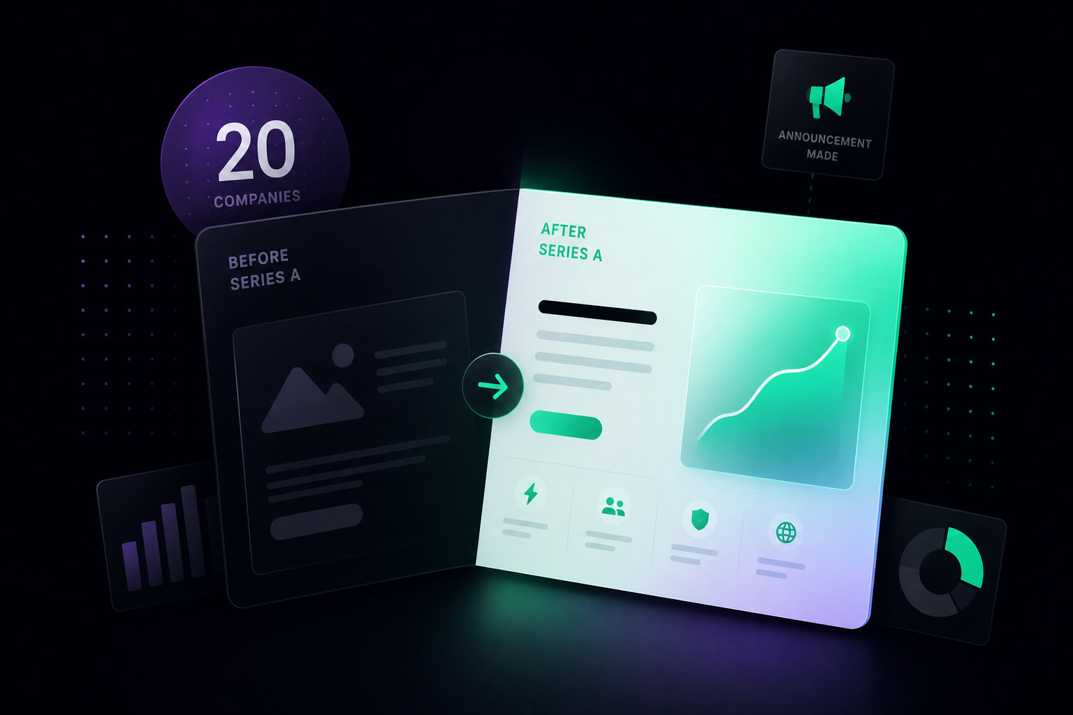
4. Traction and momentum
A partner who backed you at seed or Series A is watching for forward motion, and the site either communicates it or it does not. Customer counts and volume references establish scale even when the numbers are not the freshest. Publication dates on case studies tell a story all by themselves: if everything is dated to your first year, you either stopped winning notable logos or stopped writing them up, and neither reads well. A press bar with credible outlets says you have a comms function. A changelog or a "what's new" section says the product is alive and shipping. Flat is a signal, even when it is an accidental one.
5. Where you sit against competitors
VCs are category thinkers. They are holding your company up against everyone else chasing the same budget, so your site needs to draw the line for them instead of making them do the work. That means a clear point of difference stated plainly, not buried in a feature table. It means category language that places you correctly without overclaiming. And, often, it means comparison pages, because a company that refuses to go head to head on its own site usually does so because it knows it loses the comparison. Investors know that too. Confident differentiation is a signal about the product, not the marketing.
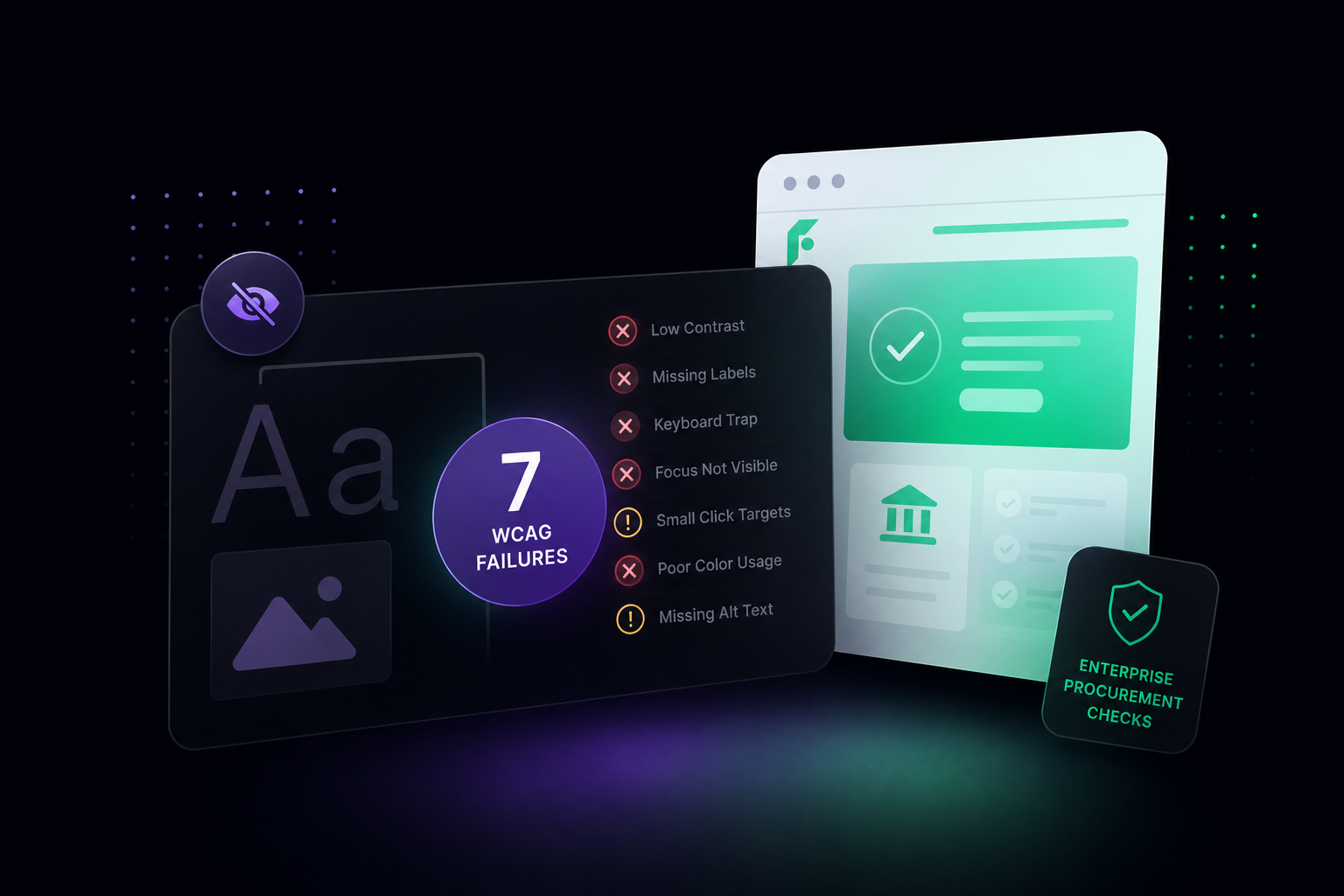
6. Technical performance
Anyone who has been around long enough knows a slow or broken marketing site is a decent proxy for engineering culture. They will not always say it out loud. They notice anyway.
Load speed is the obvious one, and the data is not subtle. Google's research found that as a page goes from one second to three seconds to load, the probability of a bounce climbs 32%.
For B2B specifically, a site that loads in one second tends to convert around three times better than one that takes five. Mobile is the other half of it, because enterprise buyers absolutely open your site on their phones, and a layout that breaks there raises questions about who is minding the details. Then the small stuff: a pricing page referencing a tier you sunset, a team page with three people who left, a 404 behind a nav link. Investors with technical backgrounds will run a PageSpeed Insights check before a diligence call, and a bad score on a simple marketing site is hard to explain away.
7. AI search visibility
This is the newest line on the checklist and the one most portfolio companies are quietly failing right now.
Buyers have moved their first research step into ChatGPT, Perplexity, and Google's AI mode. Gartner's 2025 survey of 645 B2B buyers found that 45% used generative AI during a recent purchase, mostly to gather information on vendors and products, and that buyers now consult an average of seven information sources before they decide. If your site is not structured so those tools can read and cite it, you are invisible to a fast-growing slice of your market, and a partner who understands this is now asking whether their portfolio shows up in AI answers for category keywords.
So they run the query themselves. Do you appear when they search your category in ChatGPT or Perplexity? Is the content structured for answer extraction, with clear headings, definition blocks, FAQ sections, and comparison tables a model can quote? Is there an llms.txt file telling AI crawlers how to read the site? Is the schema markup actually there, covering Organization, Product, FAQ, and Person? In 2026 those are baseline, not extras.
8. The overall execution signal
Past the specifics, investors are reading the site for one holistic thing: does this company sweat the details. Is the design intentional or stitched together. Is the copy sharp or written by committee.
A site that looks like nobody owns it, with three different type scales, four button styles, and stock photos that do not match the brand, tells an investor the team either does not care about customer-facing quality or cannot find the time to maintain it. Either way it is a flag. A site that is clearly owned, consistent, and recently updated says the opposite: this team holds its external presence to the same standard it holds the product. That is the read you want, because it is the read that travels.
The five failures that come up every time
What a VC-ready site actually looks like
Getting the site ready is not about spending more money to look more expensive. It is about saying the right things to the right people, loading fast, and showing up in search and in AI answers.
That means a hero pointed at one ICP, a pricing page with real tier logic, three named case studies with quantified outcomes dated inside the last 12 months, attributed testimonials, an About page with actual depth, 85+ on PageSpeed Insights across mobile and desktop, schema markup plus an llms.txt file, and a confirmed presence in AI answers for three to five category queries.
Most of this is achievable in a focused sprint, not a year-long redesign. The schema and llms.txt work in particular is fast on Webflow, which is part of why we build it into every B2B SaaS site we ship rather than treating it as an upsell.
The board meeting you actually want
There are two versions of this conversation, and the gap between them is not a redesign budget. It is a set of decisions about what the site is for, who it serves, and whether it performs.
One version: "I sent three enterprise contacts to your site last month and two of them booked demos." The other: "I tried to refer you to a fund I respect, sent them to your site first, and I think we need to talk about it." Same partner, same goodwill, completely different outcome.
At Flowtrix, this is the work. We build websites for B2B SaaS companies at Series A and Series B that perform for the full audience an investor sends to them, not just the buyer arriving through paid or organic. As a Webflow Enterprise Partner, we handle the positioning, the case studies, the technical performance, and the AEO and GEO layer that decides whether you show up in AI answers at all.
If your investor has already mentioned the website, or you are about to close and want to get ahead of it, that is a conversation worth having before the money lands, not after.


.avif)


.svg)
.svg)

