



Use to summarize this article


- Design for three readers: A B2B pricing page must answer the user, the economic buyer and the procurement reviewer within about ten seconds, without a sales call.
- Fix packaging first: Define one clear value metric, two to four buyer-named plans and the point where self-serve ends before you open Figma.
- Show the number, or a range: A generic "Contact us" loses conversions, so publish prices or a typical range and explain what moves the cost.
- Explain the enterprise path: Spell out what is different at that tier, the process, the timeline and who the buyer will talk to.
- Test one change at a time: With thin traffic, test bigger changes, track leading indicators and review sales feedback weekly.
B2B SaaS pricing page design is the work of helping three different people (a user, an economic buyer and a procurement reviewer) understand what they will pay, why it is fair and what happens next.
Start with packaging, not layout: two to four clearly named plans, one visible value metric, a comparison table that explains differences rather than listing features, and a separate, honest path for enterprise buyers. Then test one change at a time.
Over these years we have realized pricing page design for B2B SaaS begins long before anyone opens Figma. In this blog, we’re going to tell you how, step-by-step.
What a B2B pricing page should do?
Consumer pricing pages mostly convince one person to click "Buy." B2B pricing pages are read by a committee, usually asynchronously. Here’s what these three types of users look at based on their roles:
- The champion/user or team lead: They want to know "Will this fit my team, and can I start without asking permission?"
- The economic buyer (a VP, Head of Department or Finance lead): They want to know "What will this cost at our scale, and is it defensible?"
- The procurement or security reviewer: They want to know "Are there surprises: contract length, usage overages, data terms, SSO surcharges?"
A high-converting pricing page lets each of these readers find their answer within about ten seconds, without talking to anyone. That single design goal explains most of the SaaS pricing page best practices we're going to discuss further.

The pricing page is usually the most visited page by returning visitors. People come back to it after a demo, before a renewal conversation and when forwarding a link to a colleague. Treat it as a document that helps your clients make decisions rather than a billboard.
B2B SaaS pricing page design: Step-by-step guide
Here’s how to design a B2B SaaS pricing page that converts:
Step 1: Fix packaging before your work on the layout
Packaging is the set of decisions about what is in each plan, what you charge for and what you call things. Design can only clarify packaging; it cannot rescue bad packaging.
Before redesigning, answer the following questions:
- What is the value metric? It’s the unit that scales with the value customers receive: seats, projects, contacts, API calls, workflows run. Good metrics are easy to understand, predictable and grow as the customer succeeds. If your plans scale on something customers can't forecast, they may hesitate before purchasing.
- What genuinely separates a Team buyer from a Business buyer? Differences should reflect a real change in who is buying and what they need (collaboration, permissions, reporting, security), not an arbitrary feature-gating practice.
- Which features are "basics" that should never be gated? Charging a small team for wanting something basic generates resentment, and in B2B, resentment is shared in Slack channels.
- Where does self-serve end? Decide the thresholds in advance (seats, volume, compliance needs) at which you want a human conversation. Your page should make that threshold feel natural, not like a wall.
If your sales team has to consistently explain price plans on calls, you have a packaging problem. Make sure to fix it before design work begins.

Step 2: Build the page architecture
When working on the page architecture for a B2B SaaS pricing page, here’s a reliable top-to-bottom sequence you should follow:
- Headline and one-line framing: State the outcome and the pricing logic: "Pricing that scales with your team," or better, something specific such as "Priced per active workflow, not per seat."
- Plan cards (the core): Two to four plans, one visually emphasized
- Billing and audience controls: Annual/monthly toggle, and optionally a team-size selector
- Trust strip: Customer logos, a short quote, relevant badges (SOC 2, GDPR)
- Comparison table: Collapsed by default, expandable.
- Enterprise section: A real explanation of what is different and what the process looks like
- Objection-handling FAQ: Billing, security, contract, switching
- Closing CTA: A final route for people who scrolled to the bottom still undecided
Make sure to get reviews and test the page architecture before proceeding further.
Step 3: Design the plan cards
This is one of the elements visitors would want to hop onto. Here are the most important aspects you need to work on:
- Number of plans: Three plus an enterprise path is the most common structure because it gives buyers a natural middle option. It isn't a rule. Products with a very clear usage-based model sometimes do better with a single calculator.
- Naming: Name plans for the buyer, not for your org chart. "Team," "Business" and "Enterprise" tell the reader which one they are. "Silver," "Gold" and "Platinum" tell them nothing.
- The "for" line: Every card needs one sentence on who it fits ("For teams of 5 to 50 running shared workflows"). This does more work than any feature list.
- Feature bullets: Show 5 to 7 features. Lead with outcomes and capability differences, and finish with "Everything in [previous plan], plus:" so readers see the step-up logic.
- Emphasis: Highlight the plan you most want mid-market buyers to choose, but make sure it's genuinely the best fit for that buyer. A "Most popular" badge that isn't true impacts trust once someone checks the reviews.
- Price formatting: Display the unit alongside the number ("49 USD per user per month, billed annually"). Ambiguity here is the single most common cause of objections.
- Primary CTA messaging: Match the commitment level to the plan. "Start free trial" for low-friction tiers, "Talk to sales" for high-touch ones. Avoid giving every card the same generic "Get started" button.

Owlery’s freight platform spans seven distinct solutions. We built its Webflow site to bring clarity to that range and speak directly to the teams running modern supply chains. The site went live with 10+ pages in 6 weeks.
Step 4: Decide whether to show prices
This is one of the most debated questions when designing a B2B SaaS pricing page. Here’s what you should do:
Show prices when:
You have a self-serve motion, deal sizes are modest, buyers can predict their own usage and competitors already publish prices. Transparency filters out poorly fitting leads and shortens sales cycles because the first call starts from an agreed context.
Hide prices (or show "starting at") when:
Pricing genuinely depends on usage, integrations or contract structure in ways that can't be summarized, or when quoting publicly would materially anchor negotiations in a market of very large deals.
A generic “Contact Us” button results in lost conversions and worse: it creates a pipeline that attracts people who just want a number and then ghost, while serious buyers with a budget quietly move on to a vendor who answered the question.
You can show a price floor or typical range for an enterprise ("Most teams at this tier invest between X and Y per year") and explain what moves the number. It gives the economic buyer something to defend internally and keeps sales conversations honest.
Step 5: Create an effective comparison table
Most comparison tables are feature dumps with 60 checkmarks. Buyers don't read them, they scan for the one feature they care about.
Here’s a better practice:
- Group by buyer concern (Collaboration, Security and Admin, Integrations, Support) rather than by your product's internal modules
- Replace ticks with specifics where it matters: "Up to 10 automations" is more useful than a tick
- Collapse by default and keep column headers sticky as the reader scrolls
- Add a one-line explanation for non-obvious rows. A tooltip on "SSO" or "Audit logs" educates the champion, who then has to justify the upgrade to someone else.
- Highlight the 3 to 5 rows that actually trigger upgrades, because those are your real packaging boundaries
Step 6: Explain the value metric clearly and out loud
If you price per seat, per usage unit or per outcome, explain it right next to the price with an example. A short line such as "A 'run' is one completed workflow execution. A typical 20-person team uses about 3,000 a month" removes a surprising amount of friction.
If usage can grow beyond a plan, state what happens: soft limits, overage rates or automatic tier moves. Fear of an unpredictable bill is a common reason finance leaders stall a purchase.
Step 7: Design the path to Enterprise tier
A card that says only "Custom pricing" with a "Contact sales" button wastes your highest-value traffic. Here’s what you should tell the buyers instead:
- What is different at this tier (SSO/SAML, advanced permissions, SLAs, dedicated support, security review, custom contracts)?
- What the process looks like ("Intro call, scoping, security review, proposal, typically two to four weeks")?
- What they should bring (team size, key use cases, compliance requirements)?
- Who will they talk to?
This reduces back-and-forth and signals maturity. Large clients often judge your readiness to serve them by how clearly you explain the process.

Step 8: Add proof and risk reversal in the right place
Place proof close to where the decision is made, not just in a footer logo wall.
- A short quote near the recommended plan, ideally from a customer at that plan's scale
- A security and compliance line near the CTA for the plans that need it
- Risk reducers appropriate to B2B: free trial without a card, monthly option, clear cancellation terms, onboarding support, money-back or pilot terms
Avoid claims you can't substantiate on the page. "Trusted by thousands" without context reads as unnecessary filler.

B2B SaaS pricing page design best practices to ensure conversions
Here are some of the most important best practices to make sure your B2B SaaS pricing page design converts:
Design for the forwardable moment
In B2B, your pricing page is frequently pasted into a message to someone else. So ask: if a VP opens this page cold, without ever having seen your product, can they understand it?
Your pricing page should have: a clear heading structure, plan anchors that deep-link (/pricing#business), a plain-language summary of each plan and a "Share this plan" or "Download pricing summary" option for larger deals.
Amazon Signage’s Signage Stick serves schools, hospitals, restaurants, retailers and corporations across six industries. We built the site so that anyone landing on it can understand what the product does, who it’s for and how to get started in under a minute.
Read the full Amazon Signage case study →
Add a procurement block
Add a compact section answering what procurement will otherwise email you about: payment terms, invoicing, currencies, tax handling, contract length, data residency, security documentation and vendor onboarding. This block costs little to write and removes entire rounds of questions.
Track pricing page analytics beyond conversion rate
Track: clicks on each plan CTA, scroll depth to the comparison table, toggle usage (annual vs monthly), expansion of the comparison table, FAQ opens by question and where visitors go next (docs, security, case studies). The FAQ opens alone often reveal which objection to move above the fold.
Make sure your pricing page is AI-search-ready
Buyers increasingly ask AI tools "how much does [tool] cost?" and "what's the best option for a 20-person team?" If your pricing lives only inside images, scripts or a calculator, those systems can't cite it accurately.
Make sure plan names, prices, units, limits and key differences exist as crawlable text, add a plain-language summary, keep a dated "last updated" note and use structured data where appropriate. Don't let an outdated third-party listicle define your pricing.
Create a good post-click experience
The pricing page doesn't end at the button. Check what happens after a click: does the signup form echo the chosen plan? Does the sales form ask for more than it needs? A mismatch here quietly destroys conversion that you'd otherwise attribute to the page itself.
Mobile & accessibility
More B2B pricing traffic arrives on mobile than most teams expect, often via a forwarded link. Stack the cards vertically, put the recommended plan first or visually distinct, make the comparison table horizontally scrollable with a pinned first column, and keep tap targets generous.
Ensure color contrast, keyboard navigation and readable table semantics, which also helps crawlers parse your content.
B2B SaaS pricing page design examples and what to learn from them?
We found some of the best B2B SaaS pricing page design examples (including our clients) so you can take some inspiration before designing yours.
PuppyDog
Credits translated into output
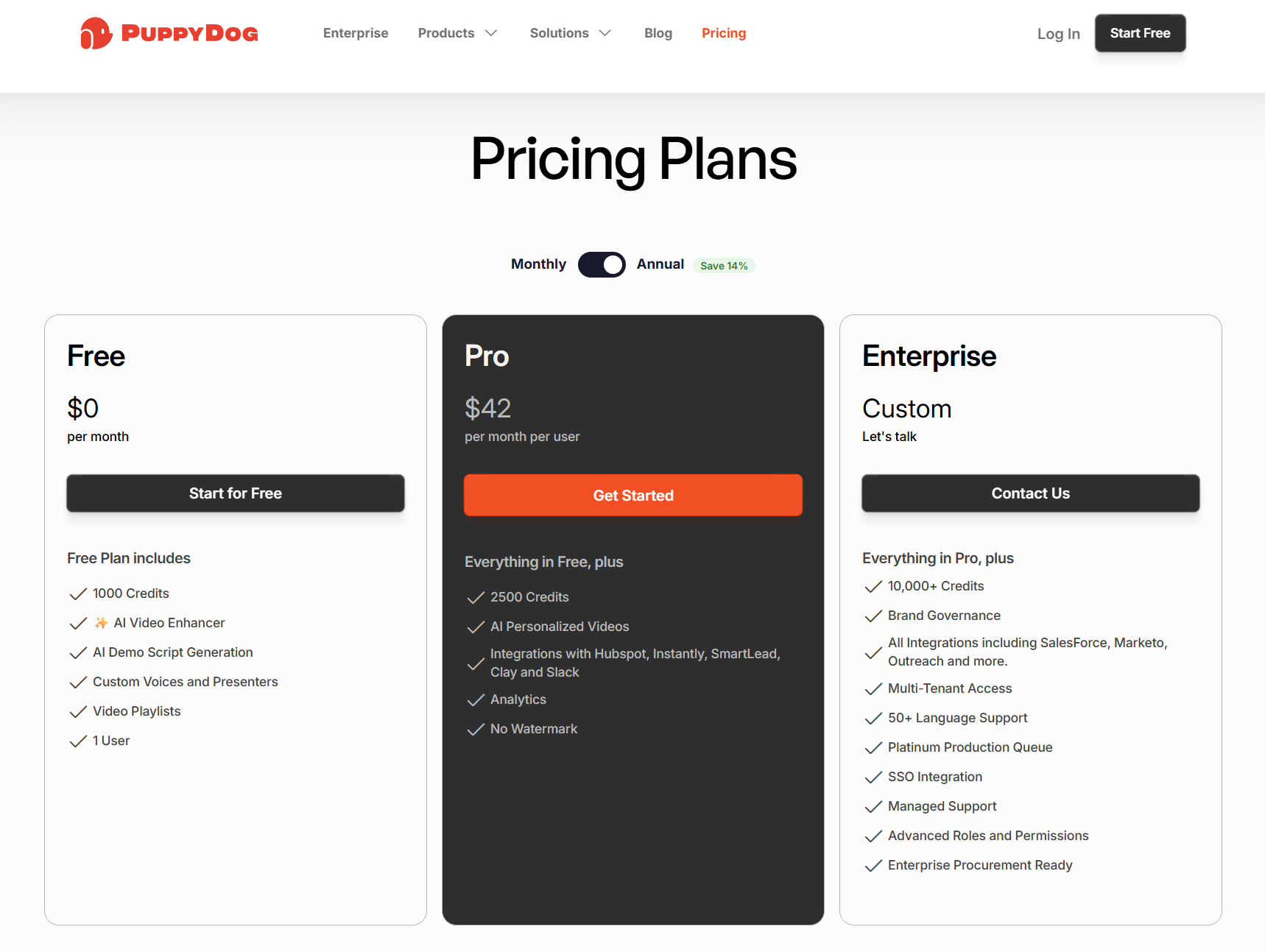
A Free, Pro and Enterprise ladder where the FAQ says a typical two-minute video uses about 500 credits and that annual credits roll over. Read the full PuppyDog case study →
Note: If you price on credits, say what they buy and what happens to unused ones.
Contentbird
Tiers named by company stage
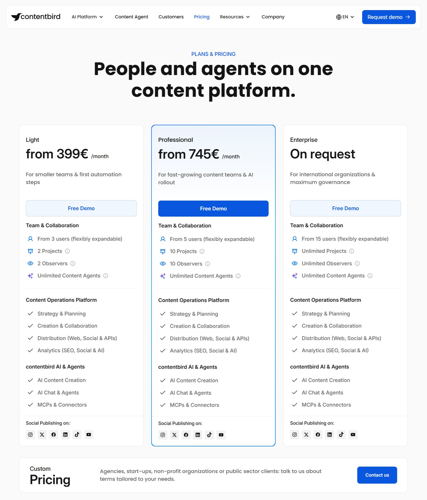
Light, Professional and Enterprise each state who they’re for, with user minimums, project limits and overage rates shown as numbers.
Note: When pricing has several moving parts, show every limit and overage rate.
Owlery
Custom pricing that explains what moves the price

It publishes no numbers, but says the platform is priced on functionality and scale and its AI agent on load volume, and the FAQ answers seat, timeline and security questions.
Note: If you can’t print a price, name what drives it.
ChatLabs
Pay for what you create, not for seats
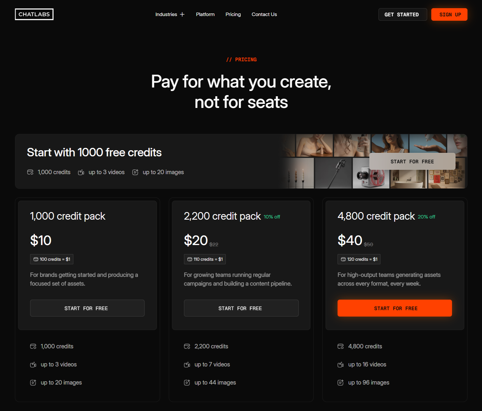
Three credit packs, each translated into videos and images, with the discount for larger packs visible. Read the full ChatLabs case study →
Note: If your pricing model is a differentiator, make it the headline.
Plausible
Search according to budget
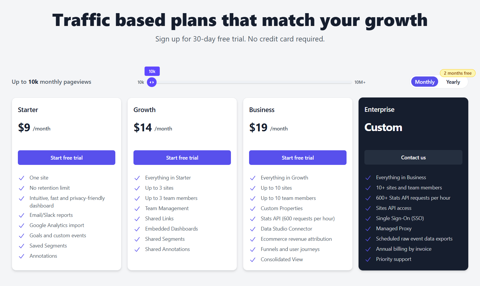
Pricing is set by monthly pageviews on a slider, and the same features apply at every level.
Note: When one metric drives cost, a slider lets buyers find their own number in seconds, and one feature set removes tier-comparison work.
Postmark
Volume slider set-up for budget range
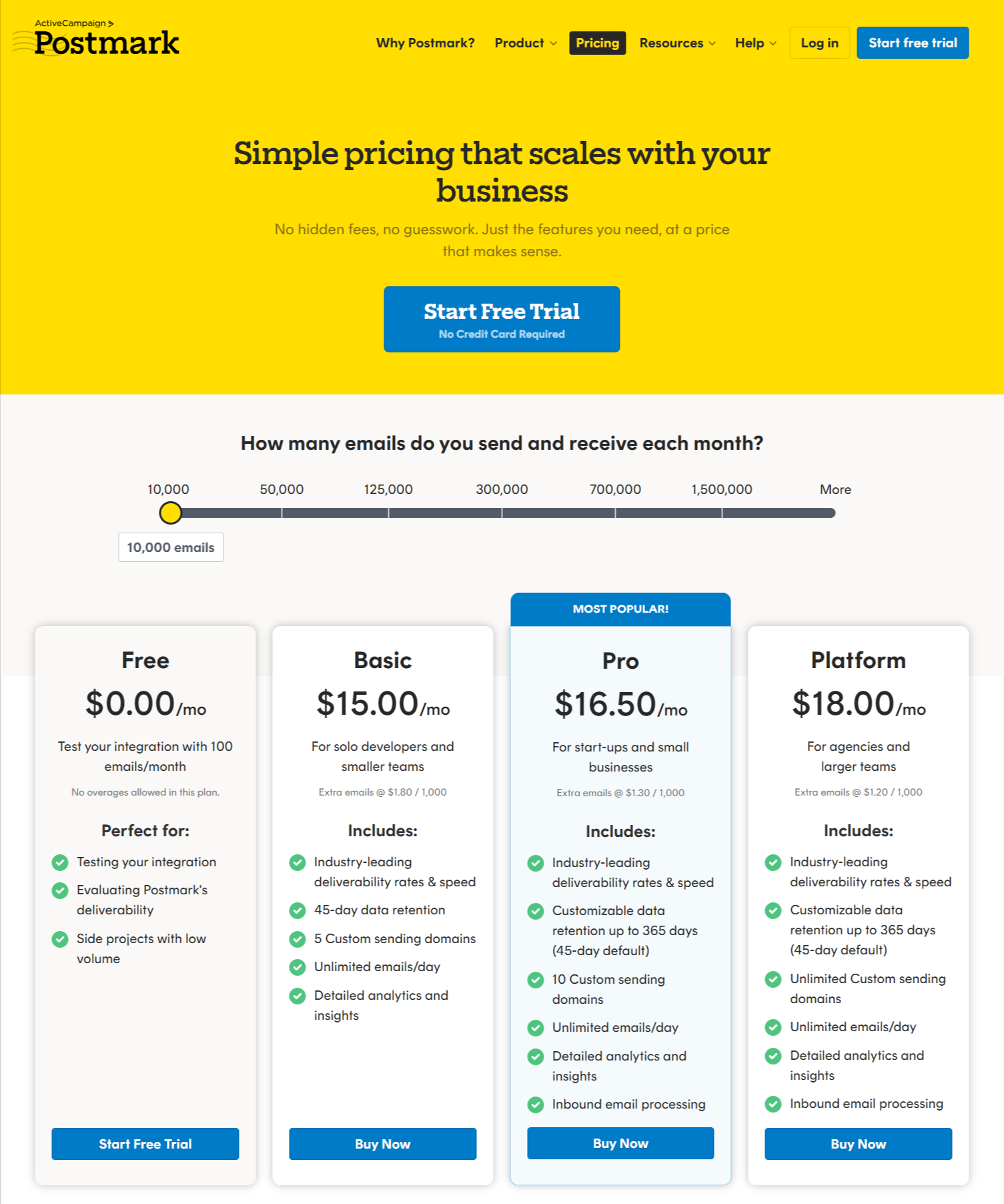
Plans are framed around email volume, with per-unit rates visible as the volume changes.
Note: For usage products, show the unit price next to the total so finance can sanity-check the bill.
Basecamp
Flat pricing
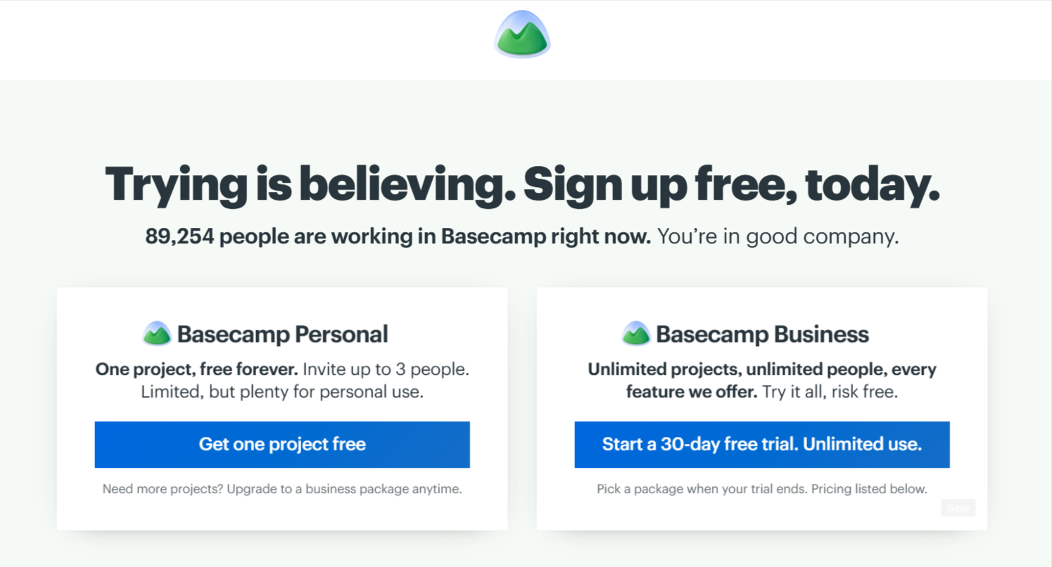
A single price that doesn't scale with headcount, positioned directly against per-seat tools.
Note: If your pricing model is a differentiator, make it the headline of the page and say what it replaces.
Close
Sales team ladder
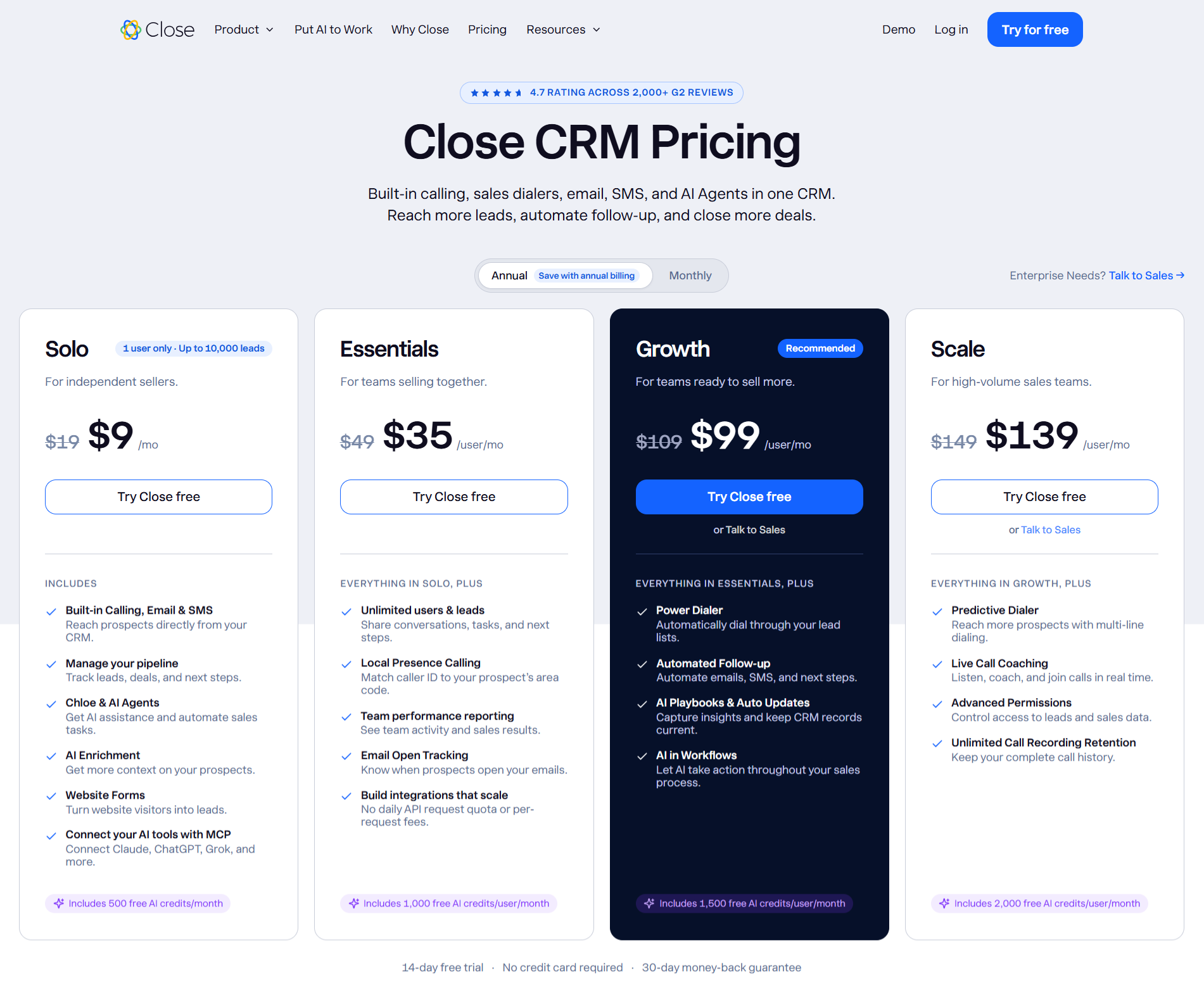
Plans step up by how a sales organization matures (more automation, reporting and controls), priced per user.
Note: Name the step-up by the buyer's next problem, not by a feature count.
Tailscale
Free-to-team path
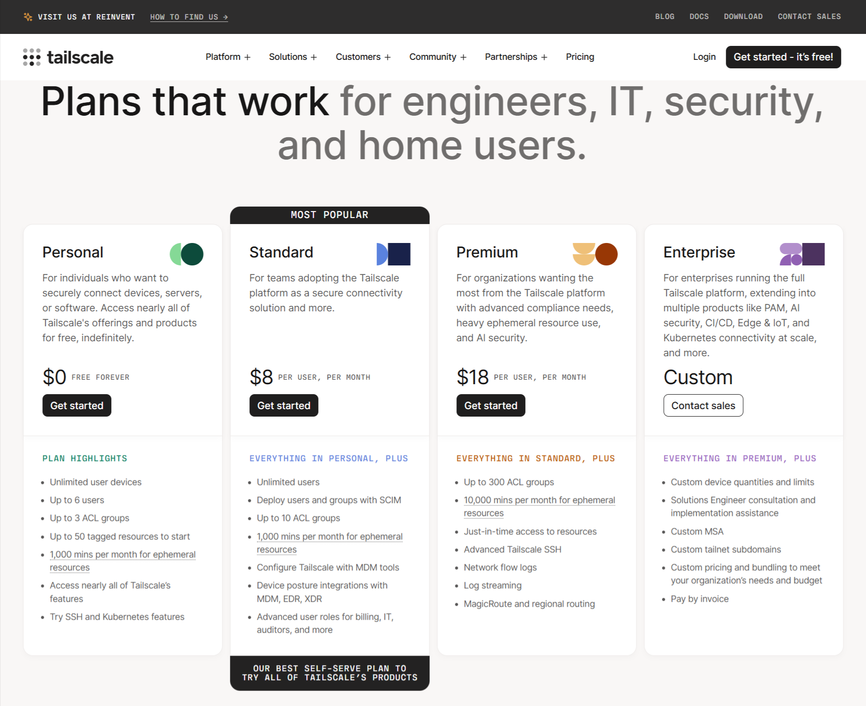
A free personal tier, a per-user team tier and a separate enterprise route.
Note: Free tier for individuals can seed a champion inside a company, as long as the team and enterprise steps are clearly distinct.
Cal.com
Individual-to-organization ladder
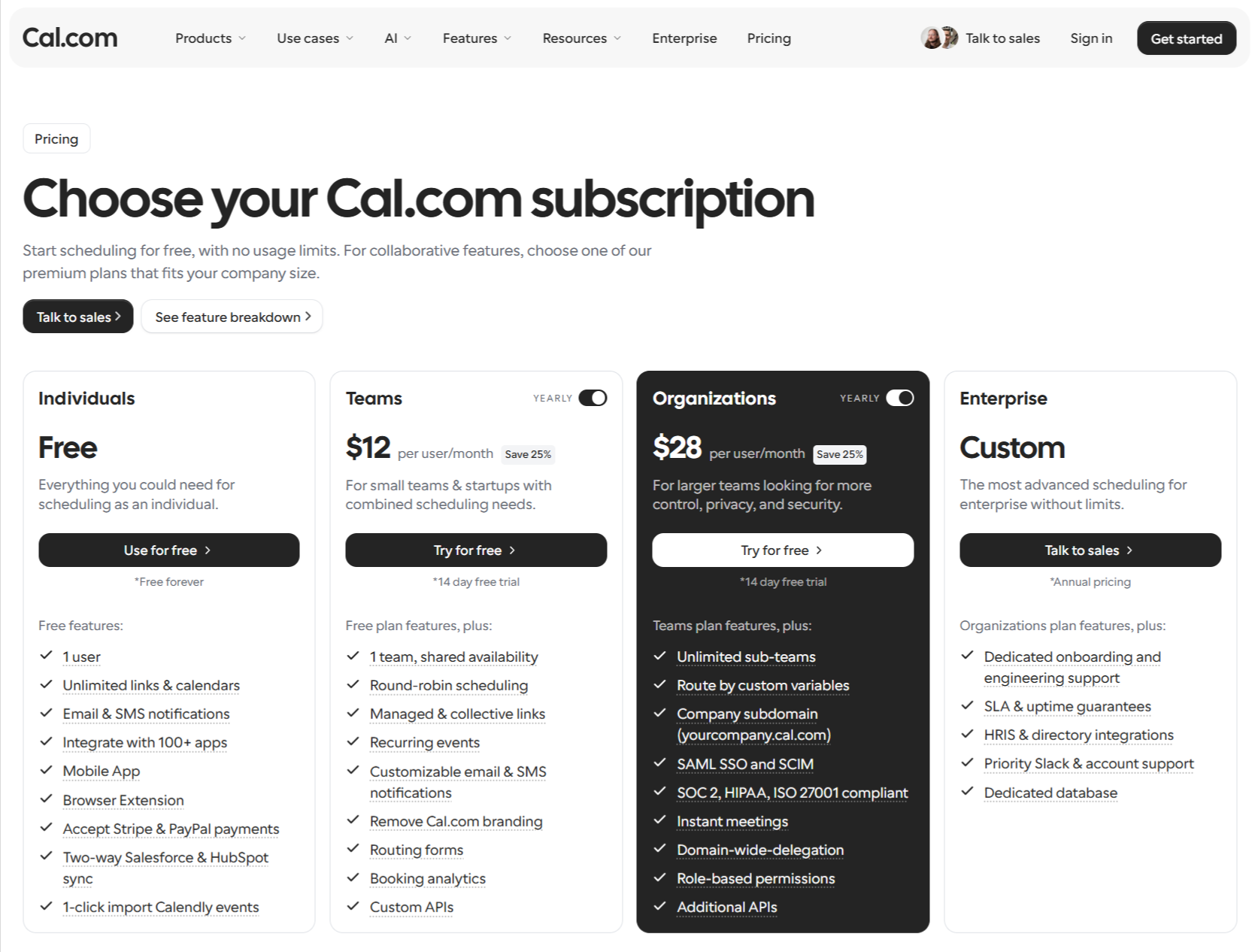
Free for individuals, per-user for teams, then organization and enterprise tiers for larger rollouts.
Note: Group tiers by who is buying (person, team, company) so each reader finds their level instantly.
Supabase
Spend control
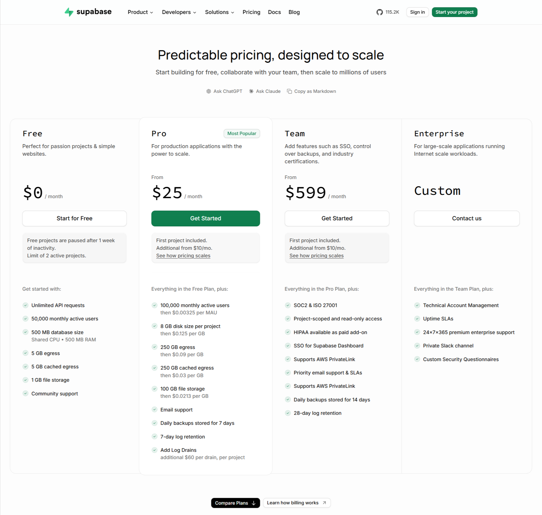
Usage-based plans paired with a clear explanation of how overages are handled and capped.
Note: Tell buyers what happens when they exceed limits, because fear of a surprise bill is a major reason finance teams hesitate.
How to test a B2B SaaS pricing page when traffic is thin?
Classic A/B testing advice assumes thousands of conversions a month. Many B2B SaaS pages don't have that. Here’s a realistic approach to testing your pricing page:
- Test bigger changes, less often. A button color rarely moves a metric you can detect. Plan structure, price display and enterprise messaging can.
- Use leading indicators such as plan-CTA click-through and demo-request quality, not only closed revenue.
- Combine quantitative and qualitative aspects. Session recordings, 5-second tests and 5 to 8 buyer interviews often tell you more than a statistically underpowered test.
- Change one thing at a time and record the date, hypothesis and result in a shared log.
- Review sales feedback weekly for the first month after launch. Confusion shows up on calls before it shows up in dashboards.
Be careful about pricing tests that show different prices to different visitors. They can create trust and legal problems if buyers compare notes. Test presentation, packaging and messaging instead.
Design for better conversions with Flowtrix
Every prospect who matters will read your pricing page when you are not in the room. If the page can’t answer all the visitors, the conversation moves to a competitor’s page, quietly, and you never learn why.
The good news is that the fix rarely requires a full redesign. Decide what you charge for, name plans for the buyer, show the number or at least a range, explain the enterprise path honestly and make the page easy to forward. Then change one thing at a time and listen to what sales hears on calls.
If you do that, your B2B SaaS pricing page design stops being a cost-of-doing-business page and starts working as your most patient salesperson.