



Use to summarize this article


- Design, don't invert: Dark mode needs its own color tokens, contrast checks and imagery, not a simple flip of your light theme.
- Know where it fits: It suits product UI, developer, security and AI tool sites, while long-form docs and finance, HR or operations audiences are better served by a light default with a toggle.
- Follow the core rules: Use dark gray (#121212) instead of pure black, meet WCAG contrast ratios, and check focus states, status colors, logos and charts.
- Build it on tokens: In Webflow, use CSS variables, prefers-color-scheme, a head script to prevent flash, and a toggle that saves the visitor's choice.
- Measure, don't assume: Track theme as an analytics dimension and A/B test the default theme to see the real impact.
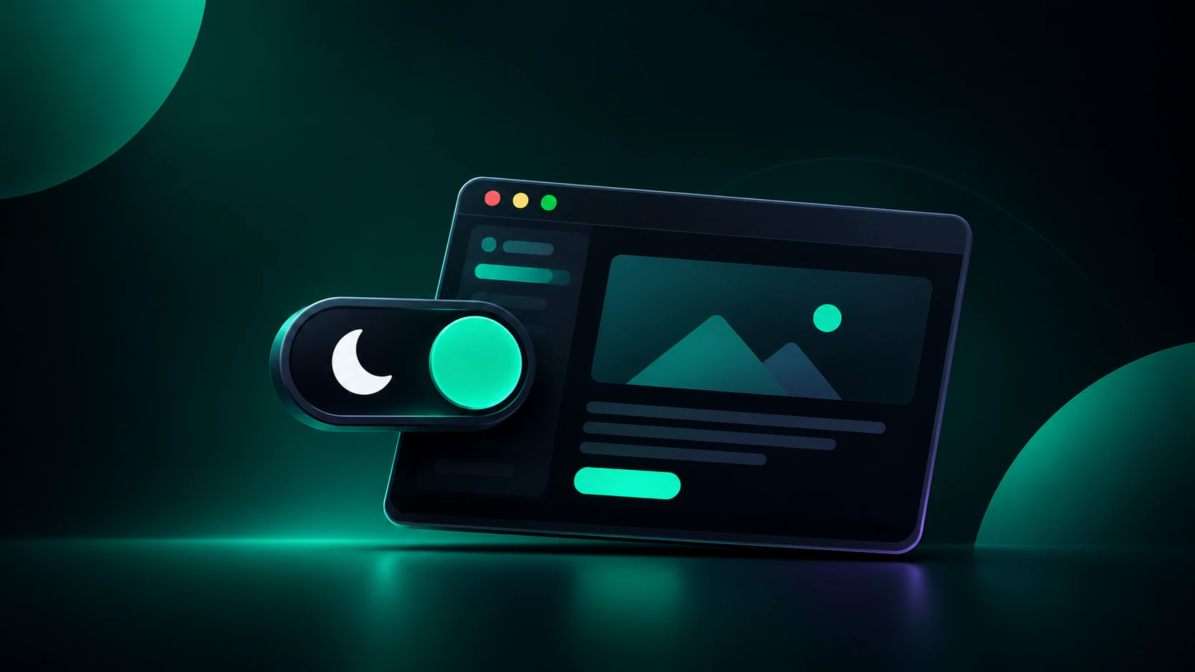
Dark mode UX design creates a dark-background version of a website or product, with its own color tokens, contrast checks and imagery, that users can choose or that follows their device setting.
For B2B SaaS websites it affects readability, accessibility and brand perception, which is why it needs deliberate design rather than a color inversion. It can be easy to demo and hard to get right.
In this blog we discuss why dark mode matters for B2B buyers, where it helps and where it should be avoided, the design rules that keep it readable and accessible, and how to build it in Webflow with working code.
Why dark mode UX design matters for B2B SaaS websites?
B2B buyers are specific about their priorities. They compare pricing tiers, read integration docs, check security pages and come back over several sessions, often after hours. For B2B SaaS website design, that makes visual comfort an important design requirement.
Technical buyers also spend their days in dark code editors, terminals and dashboards. A marketing site that matches the product's own interface feels continuous with the tools they already trust.
Benefits of dark mode UX design for B2B SaaS websites
Here’s how dark mode UX design benefits B2B SaaS websites:
Comfort in low light
Dark mode reduces the contrast between a bright screen and a dim room, which many people find more comfortable in the evening. Moreover, light mode generally performs better for people with normal vision in typical conditions. Treat comfort as a preference to respect, not a guarantee.
Accessibility for light-sensitive users
People with light sensitivity often find bright white interfaces painful, and dark mode can be the difference between using your site comfortably and leaving it. This is one of the most important accessibility arguments for offering a choice.
Battery savings on OLED screens
OLED and AMOLED pixels draw almost no power when they display black, so dark interfaces can extend battery life on phones with those panels. On LCD screens the savings are negligible because the backlight stays on.
Stronger visual hierarchy
On a dark surface, bright elements such as CTAs, key numbers and product UI draw attention naturally, so a well-built dark layout can guide the eye through complex product information with less visual noise.
Brand and category fit
Many technical buyers associate dark interfaces with developer tooling and infrastructure products, so dark mode can signal that you build for them. This matters most for AI and developer-tool companies and tends to matter less for buyers in finance, HR or operations. Brand perception also shifts as companies scale, so revisit the choice as your audience changes.
Dark mode UX design vs. light mode: What’s better?
It’s difficult to declare one of them as the best option. Dark mode tends to suit dashboards, developer tools, video and low-light browsing, while light mode often suits long-form reading, documentation and forms.
The table below shows when dark mode UX design works better and when the light mode should be your preference.
Dark mode UX design best practices
Here are some best practices you should consider when implementing dark mode UX design:
Use dark gray, not pure black
Pure black (#000000) behind bright text creates harsh contrast and a smearing effect on some screens. Material Design recommends a dark gray around #121212 for the base surface. Build depth with lighter surface layers instead of shadows, which are hard to see on dark backgrounds.
For text, use soft off-white rather than pure white to reduce visual vibration.
The table below gives you a starting token set.
Meet contrast requirements, then go beyond them
Test every text and component color against the surface it actually sits on, not just the page background. WCAG asks for at least 4.5:1 for normal text, 3:1 for large text, and 3:1 for the boundaries of interactive components and focus indicators. Check the WebAIM Contrast Checker for each pair.
Beyond the ratios:
- Check focus states: Keyboard focus rings designed for light backgrounds often disappear on dark ones
- Re-test status colors: Error, success and warning colors change in perceived intensity on dark surfaces
- Respect user settings: Test in forced-colors and high-contrast modes, and consider
prefers-contrast - Offer a choice: Some people with astigmatism report that light text on a dark background appears to bloom or blur, which is one more reason not to force dark mode

Design a color scheme instead of inverting light mode colors
Saturated colors that work on white can look harsh on dark surfaces. Desaturate accent colors by roughly 10 to 20% and slightly raise their lightness for the dark theme. Keep most of the interface in neutral tones and reserve color for actions and status. Limit bright accents to two or three, since more creates visual noise.
Adjust typography
Light text on a dark background tends to look heavier than dark text on light. Avoid thin font weights at small sizes, give body text a little more line height, and test body copy at your real sizes in both themes rather than judging from design mockups.
Handle images, logos, and media
Images made for light backgrounds often lose impact on dark ones. Provide a light version of your logo, since a dark logo disappears on a dark gray surface. Prefer SVG graphics and icons so CSS variables can recolor them, and for photos or complex graphics consider dark-specific versions with adjusted contrast. In HTML, a <picture> element with a prefers-color-scheme: dark media source swaps images without extra scripting.
Make the toggle obvious and persistent
Place the toggle in the top navigation or footer and make its icon show the current state. Mark it with aria-pressed so screen readers announce it, and consider three options: System, Light and Dark.
Default to the system setting using prefers-color-scheme, but always allow a manual override, and remember the visitor's choice in localStorage so they never have to re-select.
Dark mode UX design considerations for various B2B SaaS pages
When implementing dark mode UX design, every page needs to be dealt with differently. Here’s what you need to consider for the most important pages:
Product screenshots
Screenshots are conversion-critical proof, and a light UI screenshot on a dark page can look like a glaring rectangle. Add a subtle border or place screenshots on a slightly lighter card to keep edges clean without creating separate versions.
Pricing and comparison tables
Use lighter dark grays for each pricing card rather than relying on borders, and make selected states, hover states and CTAs clearly distinct. Visitors comparing tiers should never wonder which plan they have selected.
Wayground’s AI-powered platform is built around teachers who read, plan and assess for long stretches. Our Webflow development made their resources and assessments easier to access, with a 2.5x increase in engagement. It’s a good example of an audience where readability comes first.
Read the full Wayground case study →
Documentation
Offer a toggle instead of forcing either mode. Code-heavy reference pages usually read well in dark, while long conceptual guides are often more comfortable in light. Choose the default from your audience's behavior and remember each visitor's last choice.
Forms
Forms are where dark mode most often breaks, usually through weak input borders, invisible focus rings and low-contrast placeholder or error text. Whether fields are light or dark matters less than contrast, visible focus and clear errors. We can't point to a proven completion-rate advantage for either approach, so A/B test it on your demo-request form.
Charts and data visualizations
Re-check chart palettes on dark surfaces, because gridlines, axis labels and series colors that read well on white can vanish or glare on dark backgrounds.

Validate before you build
Treat dark mode like any significant design decision and confirm it fits your audience before committing development time.
- Research your users: Check analytics for device and time-of-day patterns, and ask a short question in a survey or interview: do you use dark mode on other sites, and when do you research software?
- Inventory your components: List navigation, buttons, forms, cards, modals, tables and charts, and define how each behaves in both themes. A component library and design system prevents dark mode that works on the homepage but breaks on case studies and pricing.
- Test with real users and devices: Have people matching your buyer profiles complete key tasks in both modes: find pricing, compare features, fill a form, read a case study. Test on OLED and LCD screens, in bright and dim rooms.
How to implement dark mode UX design in Webflow?
To implement dark mode on a website, define colors as CSS variables for each theme, read the visitor's system preference with prefers-color-scheme, add a toggle that saves the choice in localStorage, and set the theme in an inline head script so the page doesn't flash the wrong theme on load. Then test every component in both themes.
When we build Webflow development projects for B2B SaaS clients, we define color as variables from the start. A dark theme then becomes a second set of values on the same components, and marketing teams can adjust colors without developer help.
Here’s what you need to do step-by step:
Step 1: Define tokens
Create variables for backgrounds (three or four shades), text, borders, accents and status colors. In Webflow, you can use variable modes or CSS custom properties keyed to a data-theme attribute. The code below uses the second approach, which works on any stack.
Step 2: Add the head script
In Project Settings, open Custom Code and paste this in the head, before other styles. It sets the theme before first paint:
<meta name="color-scheme" content="light dark">
<script>
  (function () {
    try {
      var saved = localStorage.getItem('theme'); // 'light' | 'dark' | null
      var prefersDark = window.matchMedia('(prefers-color-scheme: dark)').matches;
      document.documentElement.setAttribute('data-theme', saved || (prefersDark ? 'dark' : 'light'));
    } catch (e) {}
  })();
</script>
Step 3: Define the themes
:root {
  color-scheme: light dark;
  --bg: #ffffff;
  --surface: #f5f6f8;
  --text: #1a1a1a;
  --text-muted: #555b66;
  --accent: #2f6df6;
}
[data-theme="dark"] {
  --bg: #121212;
  --surface: #1e1e1e;
  --text: #e0e0e0;
  --text-muted: #a8a8a8;
  --accent: #8ab4ff;
}
body { background: var(--bg); color: var(--text); }
Step 4: Wire up the toggle
Give your toggle element the class theme-toggle and add this before the closing body tag:
document.querySelector('.theme-toggle').addEventListener('click', function () {
  var next = document.documentElement.getAttribute('data-theme') === 'dark' ? 'light' : 'dark';
  document.documentElement.setAttribute('data-theme', next);
  try { localStorage.setItem('theme', next); } catch (e) {}
  this.setAttribute('aria-pressed', String(next === 'dark'));
});
Step 5: Optimize and test
Swap images through the <picture> approach or CSS variables rather than loading duplicate asset sets, and use SVG for logos where possible. Then check every component, state and contrast pair in both themes on desktop, mobile and different screen types.
If you are planning a redesign, build dark mode into the design system from the start. Retrofitting it later is far harder, and a Webflow migration is the ideal moment to set the tokens up properly.
How to measure the impact of your dark mode UX design?
Segment engagement and conversion data by theme, but remember self-selection: people who pick dark mode differ from those who don't, so a higher conversion rate among dark-mode users doesn't prove dark mode caused it. For a casual read, A/B test the default theme.
- Capture theme as a dimension: Send the active theme to your analytics tool as a custom dimension or event property.
- Track the right outcomes: Compare demo requests, trial signups, time on pricing pages and bounce rate by variant.
- Analyze gaps: Add a short feedback link near the toggle and watch support tickets for mentions of readability or contrast.
- Run it as an experiment: Use a light-default control against a dark-default variant and run it long enough to reach a meaningful sample. A conversion rate optimization process helps keep the test clean.
Our work on TripleDart’s Webflow site recently earned two Foxglove Awards for B2B web design.
Where is dark mode UX design heading beyond 2026?
B2B web design trends continue to evolve. Here are a few developments are worth building around:
- Native theming in CSS:
color-schemeand thelight-dark()function reduce the duplicate code that dark mode used to need. Check browser support on MDN before relying on it. - Theme-aware media:
<picture>sources keyed toprefers-color-schemelet images follow the theme without scripts. - User-preference queries:
prefers-contrastand forced-colors modes let sites respect more of the visitor's accessibility settings. - Intermediate themes: Some products now offer a dimmer, lower-contrast option between light and dark, which suits users who find both extremes uncomfortable.
Design for the future with Flowtrix
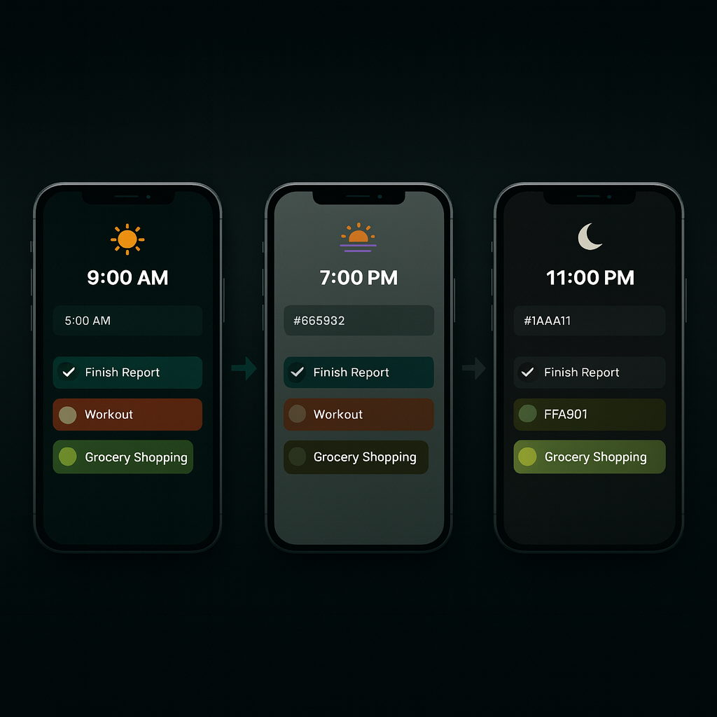
Dark mode is a strong fit for technical B2B audiences and a reasonable option for many others, but its value depends on execution and context. A dark theme with a real palette, proper contrast, tested components and a persistent toggle improves comfort and fits your audience. A rushed inversion hinders readability and trust.
Start by checking your own audience, design the dark palette deliberately, build it on a token system, and measure the result with an A/B test instead of assuming.
Not sure where to begin? Let us help you!