
.webp)


Use to summarize this article


- Clarity wins the first five seconds: Say what the product is, who it is for, and the outcome, before anyone scrolls.
- Use the Say, Show, Prove, Move framework: Explain the product, show it working, back up your claims, then make the next step obvious.
- Proof has to be specific: Named customers, real numbers, and security details beat "trusted by leading companies."
- One primary action: Match your CTA to your sales model and use the same label everywhere.
- Built for people, search, and AI: Clear category language, fast load times, mobile-first layouts, and consistent structured data help every visitor understand you.
Your buyer has already made up their mind about you before your sales team ever speaks to them.
They found you through a Google search, a LinkedIn post, or an AI answer. They opened your homepage in a tab next to three competitors. They gave each one a few seconds.
Then they closed two tabs.
Your homepage decides which tab stays open. At Flowtrix, we have revamped 120+ B2B SaaS, AI, and cybersecurity websites, and the homepage is almost always where the problem starts.
Short answer: A B2B SaaS homepage should explain what the product does, who it is for, what problem it solves, why buyers should trust it, and what to do next. The core sections are a clear value proposition, a real product visual, use cases, benefits, specific proof, answers to buying questions, and one primary CTA.
What Should a B2B SaaS Homepage Include?
A strong B2B SaaS homepage answers six questions, in roughly this order:
- What is the product?
- Who is it for?
- Why should the buyer care?
- How does it work?
- Why should the buyer trust it?
- What should they do next?
The sections you use to answer them will change with your product, audience, and sales model.
A product-led collaboration tool and an enterprise cybersecurity platform need very different homepages. The six questions stay the same.
Why Does the Homepage Matter More for B2B SaaS in 2026?
Because your buyer does most of the evaluation without you.
Gartner found that B2B buyers spend just 17% of their time meeting with suppliers, so if there are three potential suppliers, each gets only about 5% of a customer's time.
The rest happens on their own. They read your website, compare you with alternatives, and share links in Slack with the buying group.
Your homepage is the one sales conversation you never get to be in.
There is a second reader now too. AI search tools read your homepage to decide how to describe your company. If the page is vague, the AI answer about you will be vague.
The Say, Show, Prove, Move Framework
After 120+ website revamps, we kept seeing the same pattern. The homepages that converted were not the prettiest ones. They were the ones that did four jobs in the right order.
We call it Say, Show, Prove, Move.
- Say: Tell the visitor what the product is, who it is for, and what it helps them achieve.
- Show: Make the product tangible. Show it working and explain how it helps.
- Prove: Back up every claim with evidence and answer the questions that block a decision.
- Move: Give the visitor one obvious next step that fits where they are.
Each stage answers a different visitor question:
| Stage | Visitor question | Homepage sections that answer it |
|---|---|---|
| Say | What is this and is it for me? | Hero, audience, use cases |
| Show | How does it work and what will I get? | Product visuals, how it works, benefits |
| Prove | Can I believe this? | Logos, results, testimonials, security, integrations |
| Move | What happens next? | Primary CTA, pricing or buying info, final CTA |
Most weak homepages break this order. They Prove before they Say, with a logo wall before the visitor knows what the product does. Or they Move too early, asking for a demo before the product has been shown.
The rest of this guide walks through each stage.
Say: How Do You Write a Clear B2B SaaS Value Proposition?
Your hero section needs to answer three questions: What is this? Who is it for? What does it help them achieve?
If a visitor has to scroll to find out what you sell, the messaging needs work.
What the hero section needs:
- A specific headline that names the category or outcome
- One line of supporting copy that expands on the headline
- A primary CTA that matches your sales model
- A product visual that backs up the promise
- An optional secondary CTA for visitors who are not ready yet
Headline formulas that work:
Blank-page headlines tend to drift into vague brand language. These four formulas keep them grounded.
1. Category + audience:
"The [category] platform for [specific audience]"
Example: "The revenue intelligence platform for B2B sales teams"
2. Outcome without the pain:
"[Desired outcome] without [common pain point]"
Example: "Pass your SOC 2 audit without spreadsheet chaos"
3. Problem, then answer:
"[Pain point]? [Direct answer]"
Example: "Drowning in security logs? Route only the data that matters."
4. Action + object + benefit:
"[Verb] your [thing] so you can [result]"
Example: "Analyse every sales call so you can fix deals before they slip"
What to avoid:
Headlines like "The future of intelligent revenue" or "Built for what comes next" sound confident but say nothing. Your buyer cannot tell what you sell, and neither can Google or ChatGPT.
Jargon only you use internally fails too. Use the words your buyers type into search and say on sales calls.

Flowtrix example: Salesken's platform does a lot: live coaching, quality analysis, forecasting, and pipeline analytics. The challenge was simplifying that into messaging an enterprise buyer grasps quickly. After the Salesken revamp, the site saw a 45% increase in traffic, 37% increase in demo bookings, and 62% increase in quality leads.
Say: How Do You Make the Homepage Relevant to Different Buyers?
Most B2B SaaS products are bought by a group, not a person. The same platform might be evaluated by a sales leader, a RevOps manager, an IT lead, and someone in finance.
Your homepage cannot speak to all of them equally. If you try, the messaging turns generic and speaks to no one.
How to handle multiple personas:
- Pick a primary buyer and write the hero for them.
- Add a use-case section with a short path for each secondary role.
- Link each path to a dedicated solution page that goes deeper.
- Use role or industry labels your buyers recognise, like "For Sales Leaders" or "For Healthcare."
A simple use-case block looks like this:
For Sales Leaders: See pipeline risk before the forecast call.
For RevOps: Pull sales data into one reporting view.
For Sales Reps: Get coaching from every customer conversation.
Flowtrix examples: For Pepsales, the brief was layouts that make the product approachable for both sales leaders and reps. For Amazon Signage, the site presents one product clearly across six industries, with industry pages the team can manage on their own.
Should you personalise your B2B SaaS homepage?
Personalisation is worth considering once your core homepage is clear. Common approaches:
- Industry-specific hero copy or case studies for known target accounts
- Different messaging by traffic source, like a paid campaign or a partner referral
- Returning-visitor content that skips the basics and points to pricing or demos
Personalisation cannot fix unclear messaging. It only multiplies whatever is already there. Get the default homepage right first.
Show: How Do You Show a SaaS Product on the Homepage?
SaaS products are invisible until someone logs in. Your homepage has to make the product tangible.
Product visual formats and when to use each:
| Format | Best for | Watch out for |
|---|---|---|
| Static screenshots | Simple UIs and fast pages | Tiny, unreadable dashboards |
| UI animations | Showing a workflow step by step | Heavy files that slow the page |
| Product video | Complex products and customer stories | Autoplay with sound and long intros |
| Interactive demo | Buyers who want to try before a call | Tours with too many steps |
| Workflow diagrams | Infrastructure, data, and security products | Abstract shapes with no labels |
How to choose the right visual:
Ask one question: What would the customer actually see or do?
If the product analyses sales calls, show a call being analysed. If it routes security data, show the data flow. If it builds campaigns, show a campaign coming together.
A generic dashboard full of decorative charts looks polished but explains nothing.
Flowtrix examples: DataBahn offers an AI-powered data platform for security and telemetry data, and its complexity made the value hard to grasp quickly. We turned intricate data pipelines into clear graphics and diagrams. After the revamp, DataBahn saw a 5x boost in traffic, a 35% conversion rate, and a 40% increase in demo bookings.
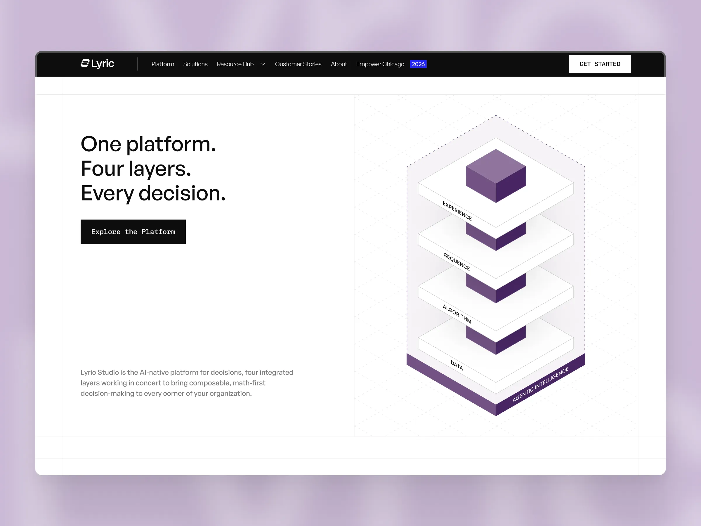
Lyric had a similar challenge. Its platform turns supply chain science into planning and modelling tools for brands like Coca-Cola Consolidated and BODYARMOR. The site had to translate that into a story anyone could follow, with rich animation and video that stayed fast. We launched it in 4 weeks.
Show: How Do You Turn Features Into Benefits?
Features describe what the software does. Benefits explain why the buyer should care.
Your homepage needs benefits first. Technical depth can live on product pages.
The Feature → Function → Benefit formula:
| Feature | Function | Customer benefit |
|---|---|---|
| Automated reporting | Combines data from multiple sources | Stop building reports by hand every Monday |
| Real-time monitoring | Flags changes as they happen | Catch problems before the next reporting cycle |
| Conversation intelligence | Analyses every sales call | Know which deals are at risk before the forecast |
| SSO and role-based access | Controls who sees what | Pass security review faster |
A simple problem, product, outcome block:
Problem: Sales teams spend hours reviewing calls to spot deal risks.
Product: The platform analyses every conversation and surfaces the signals.
Outcome: Reps spend less time reviewing and more time selling.
This structure works for almost any feature section on a SaaS homepage.

Prove: What Social Proof Should a B2B SaaS Homepage Have?
Every claim on your homepage raises one silent question: Can I believe this?
Proof answers it. The more specific the proof, the more it works.
Types of proof that work:
- Customer logos, ideally from your target industry
- Short testimonials with name, role, and company
- Measurable results from case studies
- Review ratings from G2 or Capterra
- Security certifications like SOC 2 or ISO 27001
- Customer counts or usage numbers
- Funding, awards, or analyst recognition
Specific proof vs vague proof:
Vague: "Trusted by leading companies."
Specific: "Used by 500+ revenue teams."
Stronger: "Helped customers cut reporting time by 40%."
Only publish numbers you can back up. Buyers check, and inflated claims kill trust faster than no claims.
Where to place proof:
- Right below the hero: a logo strip or one headline metric
- Next to big claims: a result that backs up the specific promise
- Near the CTA: a testimonial that removes last-minute doubt
- In its own section: case study cards with real outcomes
Here is what a strong testimonial looks like, from DataBahn's Head of Marketing, Vipul Nanda:
"It's been a pleasure to work with Himanshu and the entire Flowtrix Team. We have seen a significant uptick on inbound leads after the Website revamp."
It names a person, a role, and an outcome. That beats three anonymous five-star quotes.
Flowtrix example: Pepsales needed a site that simplified a feature-rich AI sales product and highlighted customer impact. After the revamp, Pepsales saw a 60% increase in lead generation, 7x rise in sales, and 40% increase in demo bookings.
Prove: What Buying Questions Should a SaaS Homepage Answer?
Your homepage does not need to answer everything. It does need to surface the questions that stop a deal.
The six questions that block B2B deals:
Does it integrate with our tools?
Show your key integrations as recognisable logos, grouped by category like CRM, data, or security.
Is it secure?
Surface SOC 2, ISO 27001, GDPR, SSO, and encryption. Link to a security or trust page.
How long does implementation take?
Give a realistic timeframe, or explain what affects it.
Who is it built for?
Name the roles, industries, or company sizes you serve best.
What does it cost?
Show pricing if you can. If pricing is custom, explain how it works instead of making visitors guess.
What happens after I book a demo?
Tell them. A short "Here's what happens next" line near the CTA reduces hesitation.
Flowtrix examples: For platforms like AuditCue (governance, risk, and compliance) and CogniSwitch (AI for regulated industries like healthcare and financial services), trust content is not optional. Their buyers work in compliance. After the AuditCue revamp, the site saw a 55% increase in demo bookings and 40% increase in quality leads.
.avif)
Move: What CTA Should a B2B SaaS Homepage Use?
A SaaS homepage should have one obvious primary action. The right one depends on your sales model.
| Sales model | Primary CTA | Secondary CTA | Best when |
|---|---|---|---|
| Product-led | Start free, Get started | See how it works | Users can get value without a sales call |
| Sales-led | Book a demo, Talk to sales | Explore the product | Deals need scoping, pricing, or security review |
| Hybrid | Start free | Book a demo | Small teams self-serve and enterprise buyers need sales |
How to build a clear CTA hierarchy:
- One primary button style used only for your main action
- A lighter secondary style for the backup option
- The same CTA label everywhere, from the navigation to the final section
- A short line near the CTA explaining what happens next
- Short forms, asking only for what sales actually needs
Flowtrix examples: For sales-led products, a clear demo path moves the numbers. APIwiz saw a 60% hike in demo bookings after its revamp. akirolabs saw a 2.5x increase in conversion rate and 40% reduction in bounce rate. For a more self-serve product, ChatLabs saw a 40% increase in user sign-ups.
If your site gets traffic but not enough qualified actions, conversion rate optimisation can show you where the path is breaking.
What Should Be Above the Fold on a SaaS Homepage?
Above the fold, a visitor should see what the product does, who it is for, the main outcome, a primary CTA, and a product visual.
The fold still matters. In Nielsen Norman Group's 2018 study, users spent about 57% of their page-viewing time above the fold, and 74% of viewing time was spent in the first two screenfuls.
What to put above the fold:
Above-the-Fold Checklist
- What the product does
- Who it is for
- The main outcome the buyer gets
- One clear primary CTA
- A product visual that backs up the promise
- An optional trust signal, like a logo strip or rating
You do not need to explain everything above the fold. The job is to make the value clear and give the visitor a reason to keep scrolling.
How Should Navigation Work on a B2B SaaS Homepage?
Navigation is part of the homepage experience. A confusing menu makes a clear page feel harder to use.
Navigation best practices:
- Keep the top level short, usually five to seven items.
- Use clear labels. "Platform" and "Solutions" can mean anything. "Product," "Use Cases," "Pricing," and "Customers" are clearer.
- Group pages by buyer goals, not by your internal team structure.
- Put one CTA button in the nav that matches your hero CTA.
- Make mega menus useful, with short descriptions under each link.
Do not ignore the footer:
The footer is where serious buyers go looking for things. Use it as a mini sitemap: product pages, solutions, resources, security, careers, and company info.
It also helps SEO by adding crawlable internal links across the site.
Flowtrix example: For TripleDart, an AI-native GTM partner for B2B SaaS, one clear result of the revamp was improved navigation across services and resources.
How Should a B2B SaaS Homepage Work on Mobile?
Mobile needs its own design, not a squeezed version of desktop.
B2B buyers often first see your site on their phone, from a LinkedIn post, an email, or a link a colleague shared. If that first view is broken, they may never come back on desktop.
Mobile homepage checklist:
Before You Ship: Mobile Check
- Single-column layout with clear section breaks
- Hero headline readable without zooming, with the CTA visible early
- Tap targets at least 44 by 44 pixels, with space between them
- Product visuals cropped for small screens, not full dashboards shrunk down
- Proof kept visible, not hidden behind tabs
- Accordions for long sections like FAQs and feature lists
- A sticky CTA if the page is long
- Testing on real phones, not just browser previews
How Fast Should a B2B SaaS Homepage Load?
Fast enough to pass Google's Core Web Vitals. That means:
- Largest Contentful Paint (LCP): 2.5 seconds or less
- Interaction to Next Paint (INP): 200 milliseconds or less
- Cumulative Layout Shift (CLS): 0.1 or less
SaaS homepages usually get slow for the same reasons: heavy hero videos, uncompressed images, too many third-party scripts, and animation libraries loading everything at once.
You can still have rich visuals. Compress media, lazy-load anything below the fold, and load animations only when they come into view.
This was a core requirement for Lyric. The site needed rich animations and video delivered without compromising speed.
Does Accessibility Matter on a SaaS Homepage?
Yes. Enterprise procurement teams increasingly check for it, and it improves the experience for every visitor.
Homepage accessibility basics:
- Enough colour contrast for text and buttons
- Descriptive alt text on product images
- Keyboard navigation that works through menus and CTAs
- Clear focus states on interactive elements
- No important information shown only in images or video
How Should a B2B SaaS Homepage Be Structured?
There is no universal template. This order works for most B2B SaaS products and follows the Say, Show, Prove, Move flow.
Say
1. Hero: value proposition, audience, CTA, product visual
2. Proof strip: customer logos or one strong metric
3. Problem and solution: what the buyer deals with and how you help
Show
4. Product overview: how the platform works
5. Benefits or use cases: what each buyer achieves
Prove
6. Customer results: case studies and measurable outcomes
7. Trust: integrations, security, compliance
Move
8. Buying information: pricing, implementation, next steps
9. FAQ: the questions that still block a decision
10. Final CTA: one clear next action
Not every company needs every section. Some products need more. Let the buying process decide, not a section count.
How Long Should a B2B SaaS Homepage Be?
As long as the buyer needs to decide on the next step, and no longer.
A simple product may need a short page. A complex enterprise platform may need room for use cases, integrations, security, implementation, and results.
The wrong question is: "How short can we make the homepage?"
The right question is: "What does this buyer need to know before taking the next step?"
Cut anything that does not help answer it.
How Do You Optimise a B2B SaaS Homepage for SEO?
Build SEO into the homepage from the start, not after design.
What your homepage must communicate clearly:
- Your company name and product category
- Who you serve and the problems you solve
- Your core use cases and industries
- Links to the pages that go deeper
Homepage SEO essentials:
- Title tag with your brand and category, like "Brand | Revenue Intelligence for B2B Sales Teams"
- One H1 that describes what you do in plain words
- H2s that match real topics, like use cases and integrations
- Descriptive alt text on product images
- Internal links to product, solution, industry, pricing, and customer pages
- Structured data, usually Organization, plus SoftwareApplication and FAQPage where relevant
- Crawlable text, not key messages locked inside images or video
Use natural language. "AI sales platform for revenue teams" gives search engines far more context than "The future of intelligent revenue."
How Do You Optimise a SaaS Homepage for AI Search?
Make it easy for AI tools to understand and describe your company correctly.
AI search tools like ChatGPT, Perplexity, and Google AI Overviews summarise what your site says. If the homepage is clear, the summary is accurate. If it is vague, the AI fills the gaps, sometimes wrongly.
How to make your homepage AI-readable:
- Define your category in one plain sentence near the top
- Use the same product and company names everywhere, on your site, LinkedIn, G2, and press
- Answer key questions directly in text, including in an FAQ section
- Use descriptive headings instead of clever ones
- Support claims with evidence, like named customers and real numbers
- Keep structured data consistent with what is visible on the page
You do not need to stuff "GEO" or "ChatGPT SEO" into the copy. Clear writing, strong technical SEO, and original proof are still the foundation.
What Are the Most Common B2B SaaS Homepage Mistakes?
- Vague headlines: "Built for what comes next" tells the buyer nothing about what you sell.
- Proving before saying: a logo wall before the visitor knows what the product is.
- Feature lists without benefits: buyers do not care what a feature is called. They care what it changes.
- Speaking to every persona equally: the messaging turns generic and connects with no one.
- Rotating hero carousels: most visitors only see the first slide, and the message keeps changing.
- Too many equal CTAs: three buttons with the same weight means no clear next step.
- Decorative product visuals: pretty dashboards that do not show what the product actually does.
- Hidden trust signals: security and compliance buried where enterprise buyers cannot find them.
- Desktop-only design: layouts that break or hide key content on phones.
- Heavy, slow pages: autoplay videos and huge animations that fail Core Web Vitals.
How Do You Know If Your SaaS Homepage Is Working?
Track what the homepage is supposed to do: move the right visitors to the next step.
Homepage metrics worth tracking:
- Hero CTA click-through rate: are people acting on your main message?
- Scroll depth: do visitors reach your proof and product sections?
- Demo or sign-up conversion rate, split by traffic source
- Engagement rate and time on page for key traffic sources
- Qualified pipeline from homepage visitors, not just form fills
Tools that help:
- Google Analytics 4 for traffic, events, and conversions
- Heatmaps and session recordings from tools like Microsoft Clarity or Hotjar
- A/B testing through Webflow Optimize or a similar tool
How to test without breaking things:
Change one thing at a time. Start with the hero headline, since it affects everything below it. Give each test enough traffic and time to be meaningful before calling a winner.
B2B SaaS Homepage Examples From Flowtrix
These are real Flowtrix projects. Each one faced a version of the same problem: a strong product that was hard to understand from the homepage.
Flowtrix has delivered 120+ revamps for B2B SaaS, AI and cybersecurity teams. Explore the work behind the messaging.

Complex AI sales features made clear. 60% increase in lead generation, 7x rise in sales, and 40% increase in demo bookings.

Data pipelines turned into clear visuals. 5x boost in traffic, 35% conversion rate, and 40% increase in demo bookings.

Enterprise-ready messaging for an AI sales platform. 45% more traffic, 37% more demo bookings, and 62% more quality leads.

An AI strategy co-pilot for enterprises. 2.5x increase in conversion rate and 40% reduction in bounce rate.
The common thread: none of these wins came from design alone. They came from clear messaging, real product visuals, specific proof, and a clean path to the next step.
Final Thoughts
A strong B2B SaaS homepage makes five things clear: what the product is, who it is for, why it matters, why buyers should trust it, and what to do next.
Say it clearly. Show it working. Prove it with evidence. Move the visitor forward.
The goal is not to fit every possible section onto one page. It is to give the right buyer enough to understand, evaluate, and act.
FAQ's
Quick answers to the questions teams ask most when planning what goes on a B2B SaaS homepage.









.svg)
.svg)