

Use to summarize this article


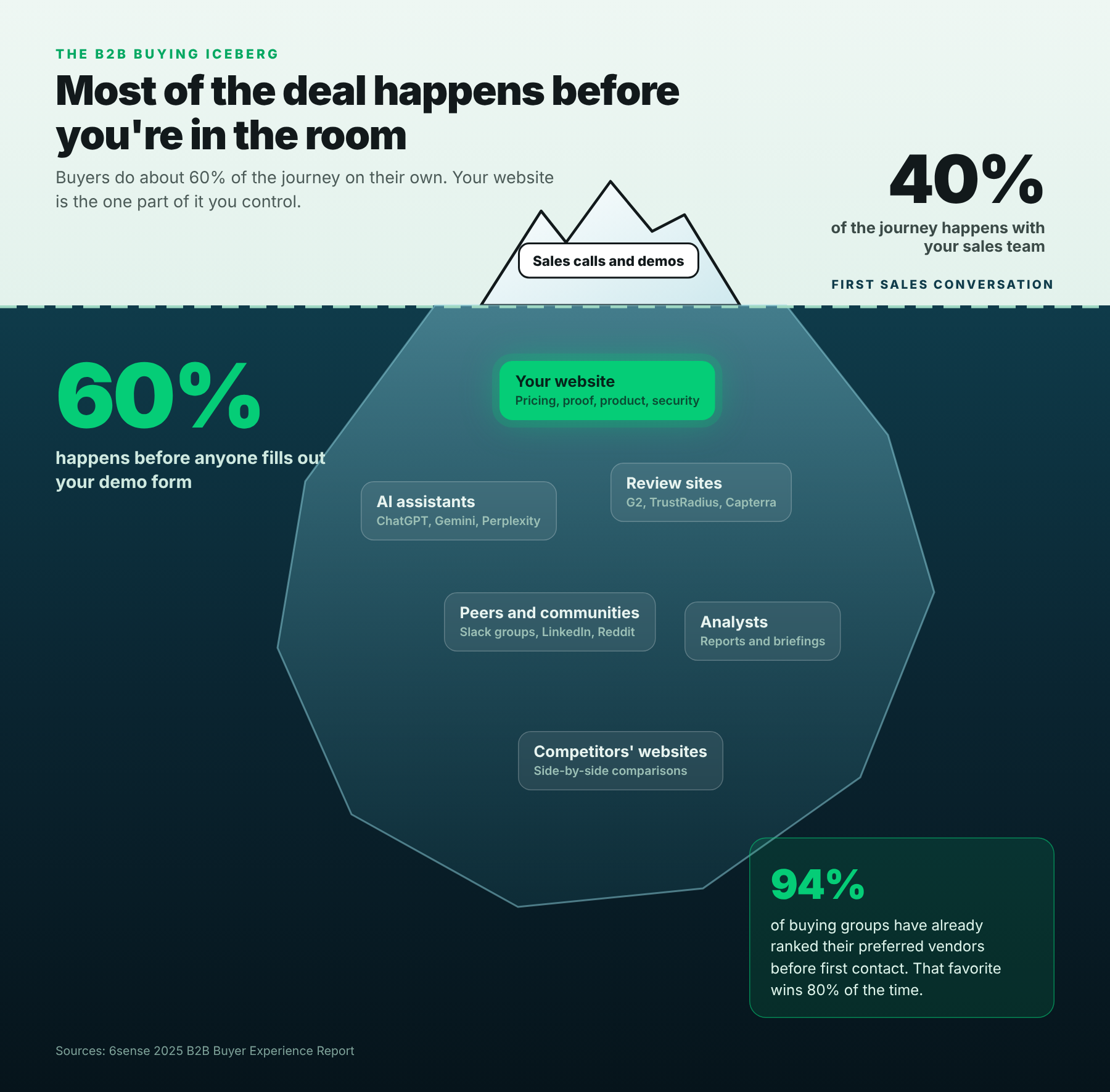
- What changed: Buyers do about 60% of the journey before talking to sales, and 94% have ranked their favorite vendors before first contact.
- Who reads your site: A buying group of 13 people inside the company and 9 outside it, plus the AI assistant summarizing you for all of them.
- The framework: Every page has to pass three readers. Skim (the 10-second visitor), Check (the buying group) and Cite (the AI assistant).
- Quick wins: A plain-English headline, real pricing, a security page, product screens and answers written so AI can quote them.
- Score yourself: Use the 10-point shortlist checklist near the end to find your biggest gaps.
B2B web design in 2026 means designing for three readers at once: the visitor who decides in 10 seconds whether to stay, the buying group that checks every claim before talking to sales, and the AI assistant that summarizes your site for all of them. Win all three, and you're on the shortlist before the first call.
Here's the uncomfortable part. Most buyers have picked a favorite vendor before they ever fill out your demo form. That favorite usually wins.
So your website isn't a brochure that supports sales. It's where the shortlist gets made.
This guide is shorter than most. It covers what changed, the three readers your pages need to win, and a checklist to score your own site. Every number in it was checked on 3 November 2026. If you want the visual side, our B2B web design trends for 2026 covers that.
Your website is where the shortlist gets made
Four studies from the last 18 months tell the same story. Buyers want to do the work on their own, and they make up their minds early.
| What the research found | Source |
|---|---|
| Buyers do about 60% of the journey before engaging a seller | 6sense, 2025 |
| 94% of buying groups rank their preferred vendors before first contact, and that favorite wins 80% of deals | 6sense, 2025 |
| 61% of B2B buyers prefer a buying experience with no sales rep at all | Gartner, 2025 |
| The average buying decision involves 13 people inside the company and 9 outside it | Forrester, 2026 |
| 94% of business buyers use AI during the buying process | Forrester, 2026 |
| 29% of software buyers now start research in tools like ChatGPT more often than Google | G2, 2025 |
Put those together and the job of a B2B website gets very clear. It has to win the shortlist on its own, with no salesperson in the room.
Skim, Check, Cite: the three readers every page has to win
Every important page on a B2B site gets read three different ways. We call it Skim, Check, Cite.
| Reader | Who it is | How long they give you | What they need |
|---|---|---|---|
| Skim | Anyone landing on the page for the first time | About 10 seconds | To know what you do, who it's for and what to do next |
| Check | The buying group: champion, finance, security, IT, users | Days or weeks, across many visits | Proof, pricing, security details and product screens they can share |
| Cite | ChatGPT, Gemini, Perplexity and Google's AI answers | A few seconds of crawling | Clear answers in plain text that are easy to quote correctly |
Most B2B sites are built for one of these. The Skim reader gets a slick hero. The Check reader gets a contact form. The Cite reader gets nothing at all. Here's how to serve all three.
Skim: earn the next 30 seconds
Nielsen Norman Group found that most page visits end within 10 to 20 seconds, and that the first 10 are the critical ones. Their advice is simple: communicate your value proposition within 10 seconds.
In those 10 seconds, a B2B buyer is quietly asking five questions:
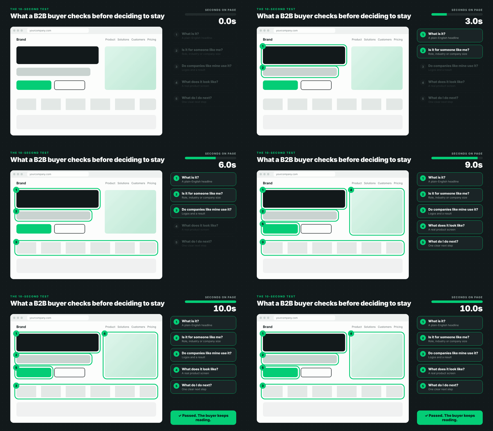
Most homepages fail at the first one. They lead with a slogan instead of saying what the product does.
| Fails the Skim test | Passes the Skim test |
|---|---|
| The future of work, reimagined | Payroll and HR software for companies with 50 to 500 people |
| Unlock the power of your data | Find and fix security alerts across your cloud in one place |
| Your partner in growth | Revenue forecasting for B2B sales teams, built on your CRM data |
Notice the pattern. The good versions name the product, the buyer and the result. Nothing clever, nothing to decode.


Check: give every seat at the table its own page
Once a buyer decides you're worth a look, they bring their colleagues. And each of them visits your site with a different question.
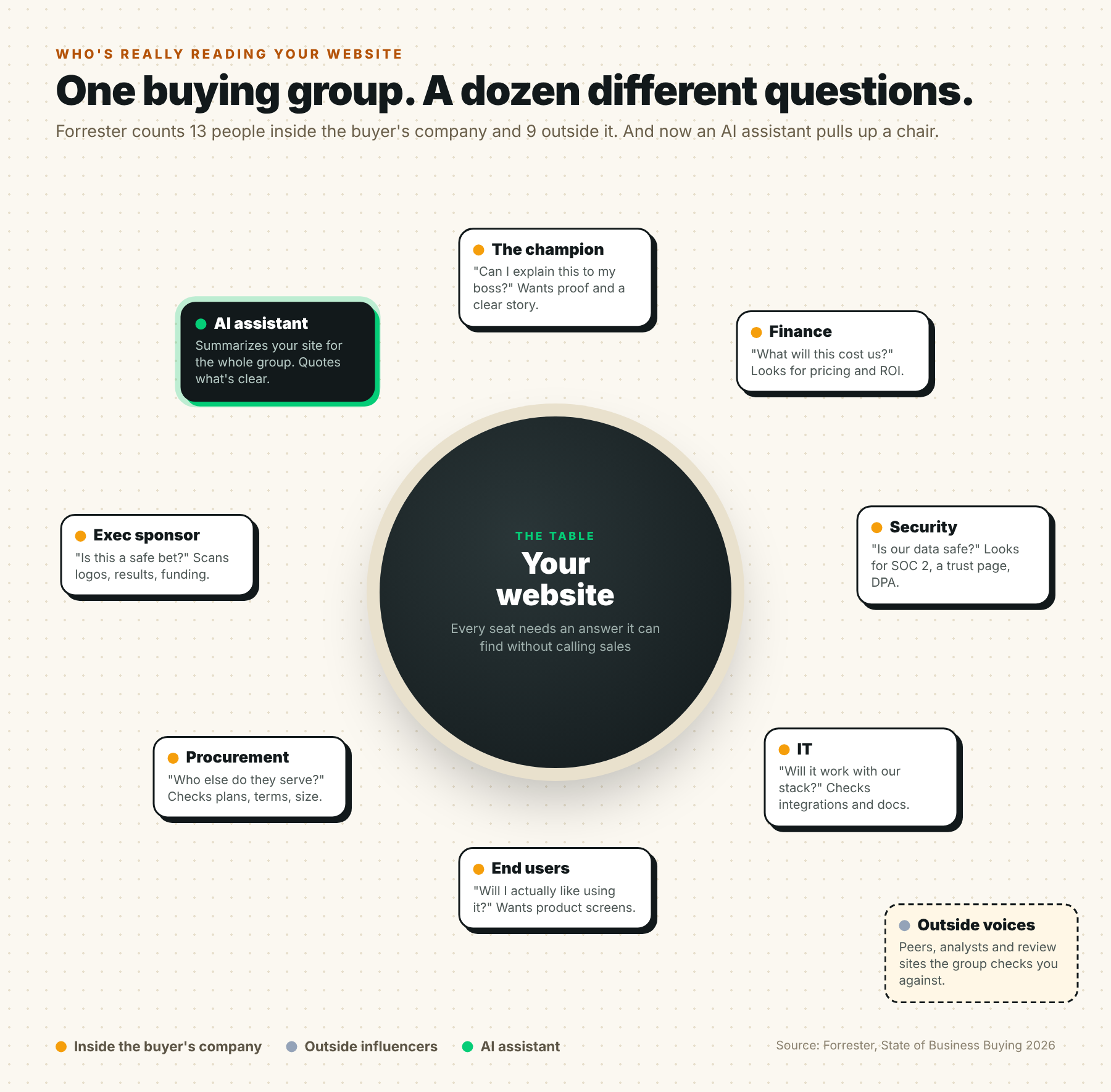
Here's where each person usually goes, and what they need to find there:
| Who | Their question | The page that answers it | What to put on it |
|---|---|---|---|
| The champion | Can I sell this internally? | Case studies | The problem, what changed and a real number, from a company like theirs |
| Finance | What will this cost? | Pricing | Real prices, or starting prices and what changes them |
| Security | Is our data safe? | Security or trust page | Certifications, data handling, subprocessors and a contact |
| IT | Will it fit our stack? | Integrations and docs | Every integration listed, with setup details |
| End users | Will I like using it? | Product pages | Real product screens and short videos, not just illustrations |
| Exec sponsor | Is this a safe bet? | Customers or about page | Logos, results, funding and who's behind the company |
Two of these pages get skipped more than any others.
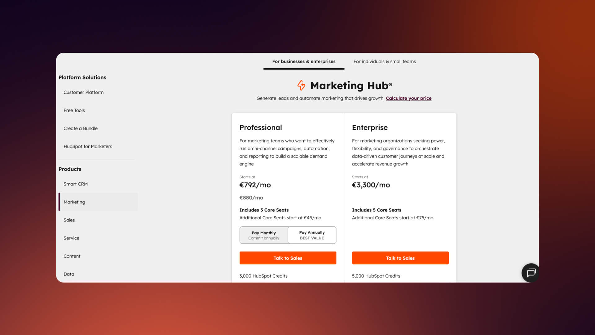
Pricing. TrustRadius found that transparent pricing is the number one thing buyers want vendors to improve, and it has held that spot every year since 2023. That's from its 2026 B2B Buying Disconnect report. If your price depends on usage or seats, show starting prices and explain what moves the number.
Security. For AI products especially, buyers want to know about data sources, security and performance. 6sense found that most vendor websites fail to explain these clearly, which pulls buyers into sales calls just to get basic answers.
It also helps to let people pick their own path. HubSpot's homepage does this well, by letting visitors choose by role or goal instead of reading one story meant for everyone.


Cite: write pages AI can quote correctly
The third reader is the newest. Forrester found that 94% of business buyers use AI somewhere in the buying process. G2 found that nearly 8 in 10 software buyers say AI search has changed how they research.
That means an AI assistant is often the first thing to read your site, and it summarizes you for the whole buying group. If your pages are vague, the summary is vague. If they're clear, the summary is accurate, and you're more likely to be named.
Buyers don't take AI answers on faith, either. TrustRadius found that 94% of buyers who use AI for research check the answers against other sources. So your website has to back up what the AI says about you.
What makes a page easy to cite:
- Answer first: Put the direct answer in the first sentence of a section, then explain.
- Use plain structure: Clear headings, short paragraphs, tables and lists are easier to quote than text inside images or sliders.
- Keep names consistent: Use the same product names, plan names and numbers on every page.
- Add schema: Organization, product and FAQ schema help machines understand what each page is about. The Flowtrix Schema App adds it without code.
- Keep content in the HTML: If important text only appears after a script runs, some AI crawlers won't see it.
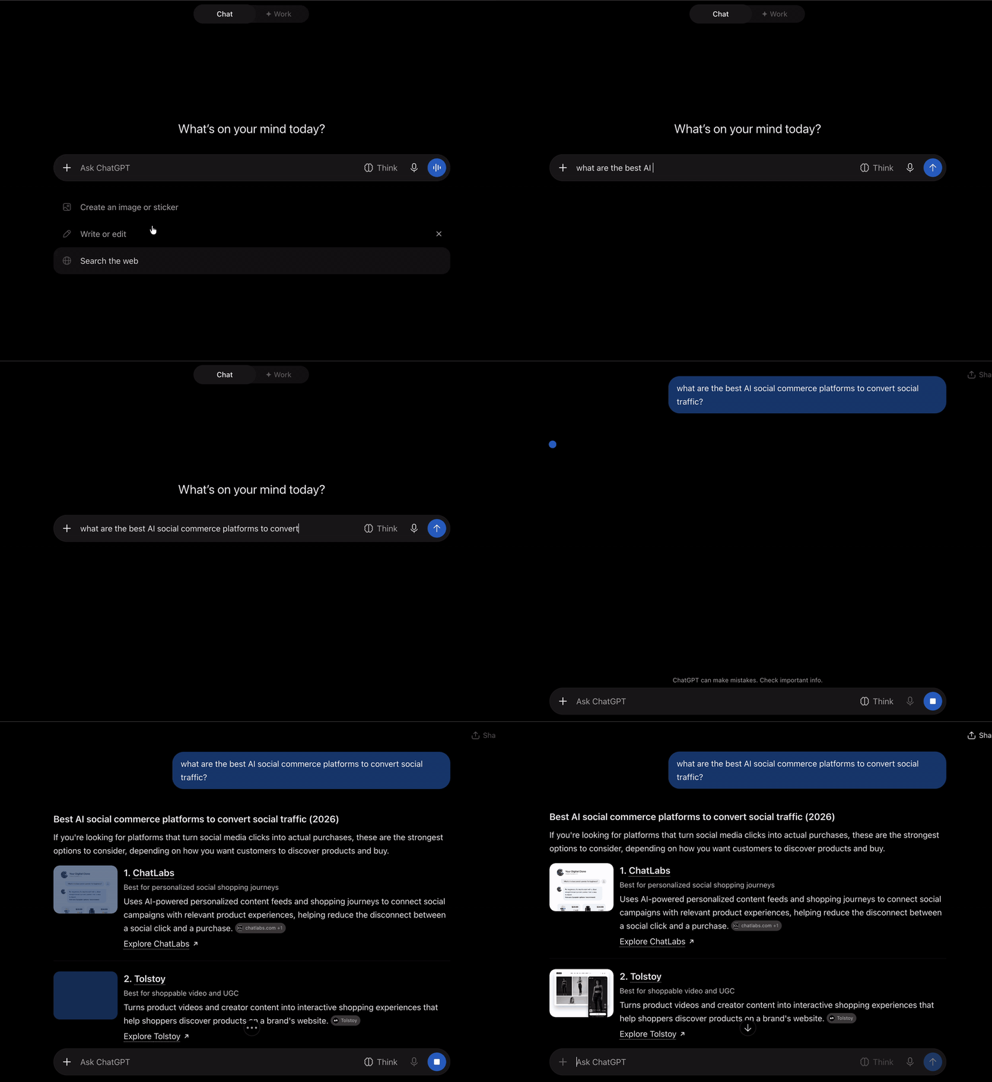
Here's what that looks like when it works. We rebuilt ChatLabs' website with this in mind. When we asked ChatGPT for the best AI social commerce platforms, ChatLabs was the first name it gave.
For more on this, see our guide to the best GEO agencies and how they approach AI search.
Free website audit
Would your site make the shortlist?
Get a scored breakdown of your positioning, proof, conversion paths and technical health, before you talk to an agency. Results in about a minute.
85/100
Overall score
What changed when our clients fixed this
These are results our clients reported after we rebuilt their websites around clearer messaging, stronger proof and pages for the whole buying group:
| Client | What we changed | What happened |
|---|---|---|
| Databahn | Turned a complex AI data platform into a clear story | 5x traffic, a 35% conversion rate and 40% more demo bookings |
| Salesken | Simplified the messaging around AI coaching and forecasting | 45% more traffic, 37% more demo bookings and 62% more quality leads |
| ChatLabs | Explained the product and the funnel behind it | 3.5x more pipeline and 40% more sign-ups |
| Owlery | Built persona-specific sections for each type of buyer | 42% more demo bookings and 2.5x engagement |
TripleDart is a good example of the Skim test in action. The company had repositioned as an AI-native GTM partner, and the old site didn't say so. We rebuilt it in 4 weeks around the new message.
Score your site in 5 minutes
Go through this list with your own site open. Give yourself one point for each yes.
The shortlist checklist
- Headline: A stranger can say what you sell after 10 seconds on the homepage.
- Audience: The homepage says who it's for, by role, industry or company size.
- Proof: Customer logos sit near a real, specific result.
- Product: Visitors can see actual product screens without booking a demo.
- Pricing: There's a pricing page with numbers, or at least starting prices.
- Security: There's a security or trust page with your certifications.
- Paths: Different roles can find their own page in one or two clicks.
- Case studies: Each one has a clear problem, change and number.
- AI-ready: Key pages answer a question in the first sentence and use FAQ schema.
- Next step: One clear call to action, repeated where decisions happen.
Scored 8 or more? You're in good shape. Focus on testing and keeping pages fresh.
Scored 5 to 7? Start with pricing and security. They're usually the fastest wins.
Scored under 5? The homepage message is probably the root problem. Fix that first, since every other page builds on it.
When to bring in help
You can fix a lot of this in-house. A sharper headline, a pricing page and a security page don't need an agency.
A partner makes sense when the problem is bigger than a few pages. When the positioning has changed, when the site has to win enterprise buyers, or when your team keeps patching an old site instead of fixing it.
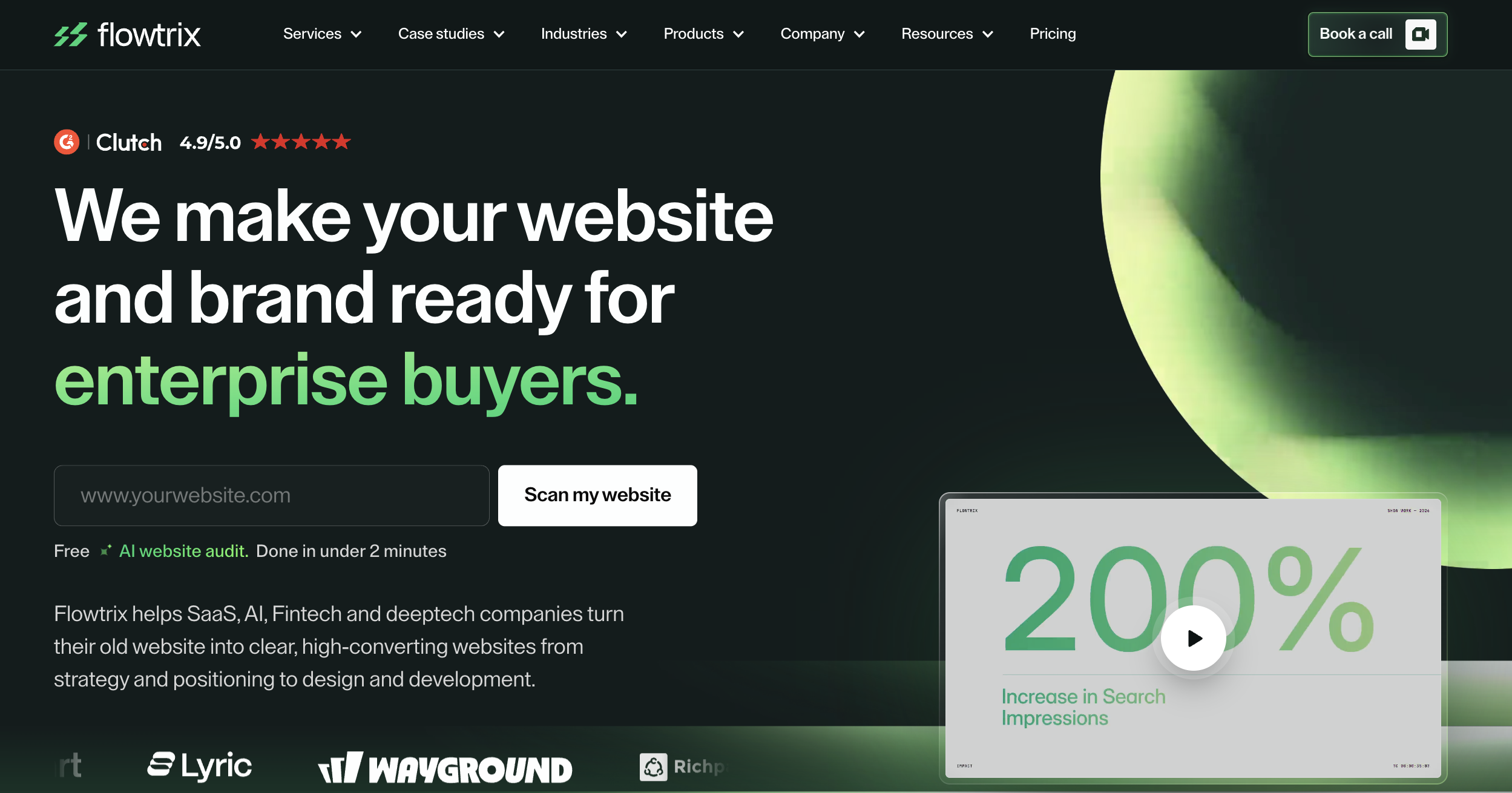
Flowtrix makes websites and brands ready for enterprise buyers. We've delivered 120+ projects for B2B SaaS, AI and cybersecurity companies, with strategy, design, development and SEO in one team.
The bottom line
B2B buyers make up their minds earlier than ever, in groups, and with AI reading alongside them.
So design for all three readers. Make the homepage clear in 10 seconds. Give every person in the buying group a page that answers their question. And write it all plainly enough that an AI assistant can quote you correctly.
Do that, and you're far more likely to be the favorite before the first call. Want a second opinion on your site? Talk to Flowtrix, or browse our case studies.
Flowtrix has delivered 120+ projects for B2B SaaS, AI and cybersecurity teams, with SEO and AEO built into every build.

An enterprise-grade site for a supply chain platform trusted by Coca-Cola Consolidated, live in 4 weeks.

A clear path for every buyer on a seven-solution freight platform, with 42% more demo bookings.

FAQ's
Quick answers to what B2B marketing teams ask before a website redesign.