




Use to summarize this article


Mobile website optimization in Webflow means making sure your site loads fast, responds to taps and reads well on a phone. That's where most visits happen, and it's the version Google uses to index you. The quickest way to find what's wrong is to run seven simple tests on your own phone.
Most teams review their website on a big monitor, in a meeting room, on office Wi-Fi. Their buyers see it on a phone, between meetings, on patchy mobile data. Those are two very different websites.
This guide skips the theory. It gives you seven tests you can run in about 15 minutes, what passing looks like for each, and the exact setting to change in Webflow when a test fails.

- Why it matters: Close to 6 in 10 web visits worldwide now happen on phones, and Google indexes your site using its smartphone crawler.
- The gap: Only 48% of mobile websites pass all three Core Web Vitals, compared with 56% on desktop.
- The method: Seven tests you can run on your own phone in about 15 minutes. Three check speed, four check how the site feels in your hand.
- What Webflow covers: Responsive image sizes and mobile breakpoints. What it doesn't: lazy-loaded hero images, background images and heavy scripts.
- Where to start: Use the flowchart to match a red Core Web Vital with its most likely fix.
Why your phone is the real test now
A few facts have changed since most B2B sites were last rebuilt:
| What's true now | What it means for your site | Source |
|---|---|---|
| Close to 6 in 10 web visits worldwide happen on phones | For most people, your mobile site is the first impression | StatCounter |
| Since July 5, 2024, Google crawls and indexes sites with its smartphone crawler | If something is missing on mobile, Google doesn't see it | Google, via PPC Land |
| 48% of mobile websites pass all three Core Web Vitals, compared with 56% on desktop | A site can look fine on your laptop and still fail on phones | HTTP Archive Web Almanac 2025 |
| 77% of mobile sites have good tap response (INP), compared with 97% on desktop | Phones struggle most when people tap, not when they scroll | HTTP Archive Web Almanac 2025 |
| A 0.1 second faster mobile site meant 21.6% more visitors reached the form page on lead generation sites | Speed shows up in your pipeline, not just your score | Deloitte and Google |
Google measures three things on mobile. You'll see all three in PageSpeed Insights:
| Metric | What it means in plain words | Good score |
|---|---|---|
| LCP (Largest Contentful Paint) | How long until the biggest thing on screen shows up, usually the hero image or headline | 2.5 seconds or less |
| INP (Interaction to Next Paint) | How fast the page reacts when someone taps. It replaced FID on March 12, 2024 | 200 ms or less |
| CLS (Cumulative Layout Shift) | How much the page jumps around while it loads | 0.1 or less |

Part 1: the speed tests
Grab your phone. Turn off Wi-Fi so you're on mobile data, and open your homepage and your most important landing page. These first three tests line up with the three Core Web Vitals.
Test 1: The 3-second test
Do this: Load the page and count. How long until the headline and hero image are fully there?
Pass if: Everything important is visible in under 2.5 seconds, and PageSpeed Insights shows a green LCP.
Fix it in Webflow:
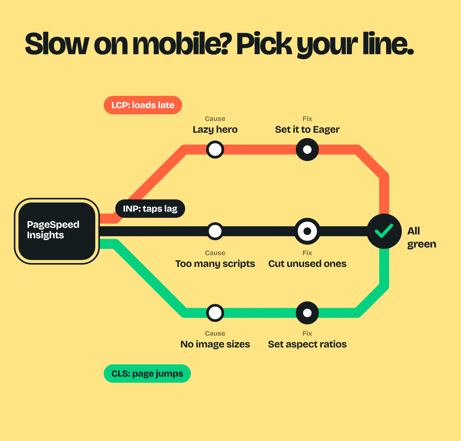
- Set the hero image to Eager. Webflow lazy loads new images by default, which is right for images lower down but wrong for the first thing people see. Select the image, open its settings and change Load to Eager. The Web Almanac found that about 16% to 17% of pages still lazy load their main image.
- Use an image element, not a background image. Webflow only creates responsive image sizes for image elements. Background images, images inside rich text and images added through the API or a CSV import don't get them.
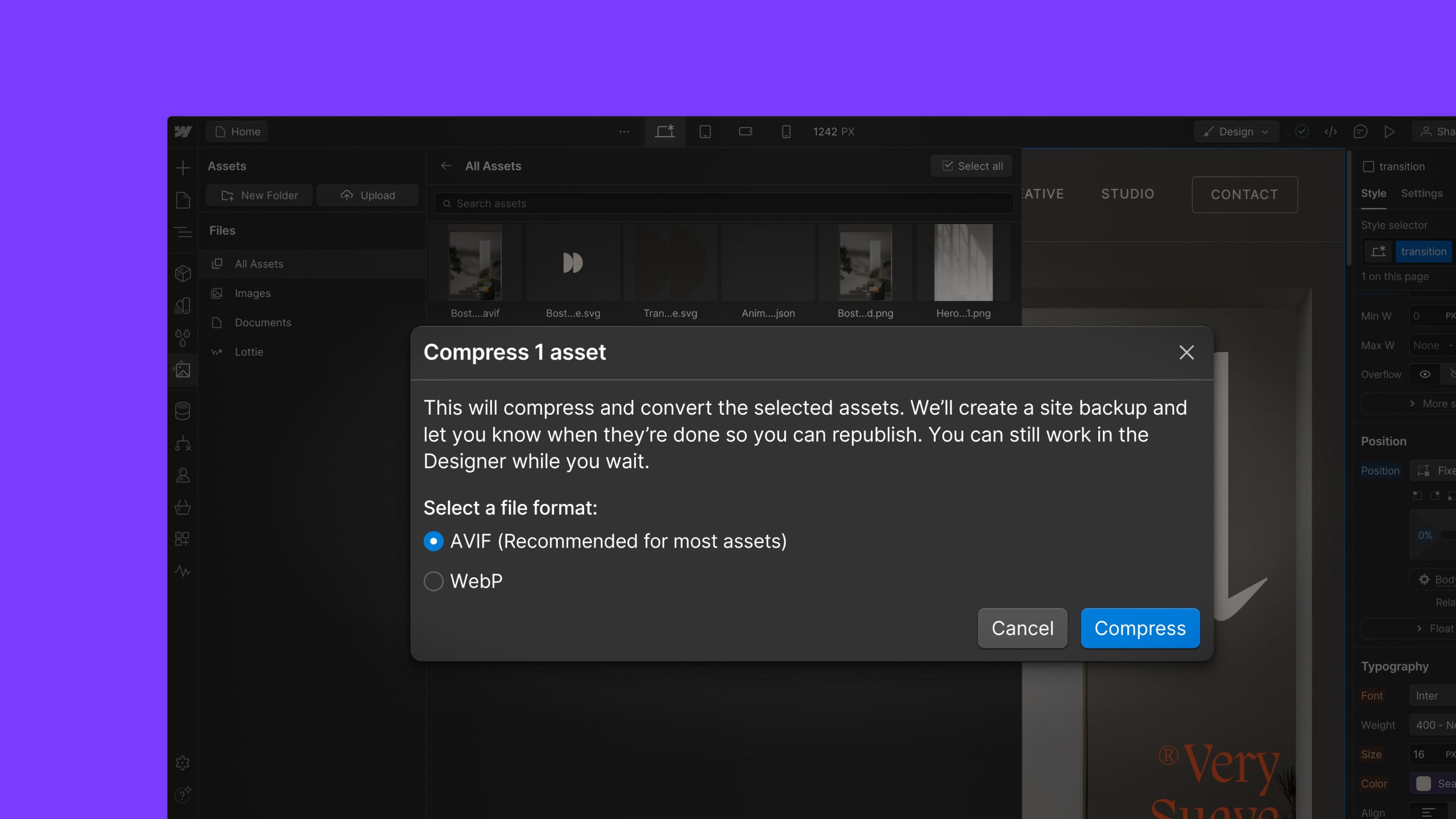
- Convert to AVIF or WebP. Open the Assets panel, select your images and use Webflow's built-in conversion tool.
- Drop the autoplay video above the fold on mobile. Show a poster image at the mobile breakpoints instead.
Test 2: The tap-lag test
Do this: Tap the menu, open an accordion, switch a tab. Does each one react straight away?
Pass if: Every tap gets a visible response almost instantly, and INP is under 200 ms.
Fix it in Webflow:
- List every script you load. Check the custom code in Site settings and in each page's settings. Chat widgets, heatmaps, A/B testing tools and tag managers all compete for the phone's attention at the same moment.
- Remove what nobody checks. If no one has opened that heatmap tool in three months, take it out.
- Load chat later. Start the chat widget after the visitor scrolls or after a few seconds, not on page load.
- Go easy on mobile animations. Webflow lets you choose which breakpoints an interaction runs on. Keep scroll effects for desktop if they make taps feel slow on phones.
Test 3: The jump test
Do this: Start reading the moment the page appears. Does the text you're reading move?
Pass if: Nothing shifts after it appears, and CLS is under 0.1.
Fix it in Webflow:
- Give images and embeds a fixed size or aspect ratio, so the browser saves space for them before they load.
- Make cookie and promo banners overlay the page with fixed positioning, instead of pushing content down.
- Reserve space for forms that load late, like embedded HubSpot or Marketo forms, by giving their wrapper a minimum height.
- Pick a fallback font close in size to your web font, so text doesn't jump when the real font loads.
If PageSpeed Insights shows a red metric and you're not sure which fix to try first, start here:

Part 2: the hand tests
A site can pass every speed test and still be annoying to use. These four tests check what a score can't: how the site feels in one hand.
Test 4: The thumb test
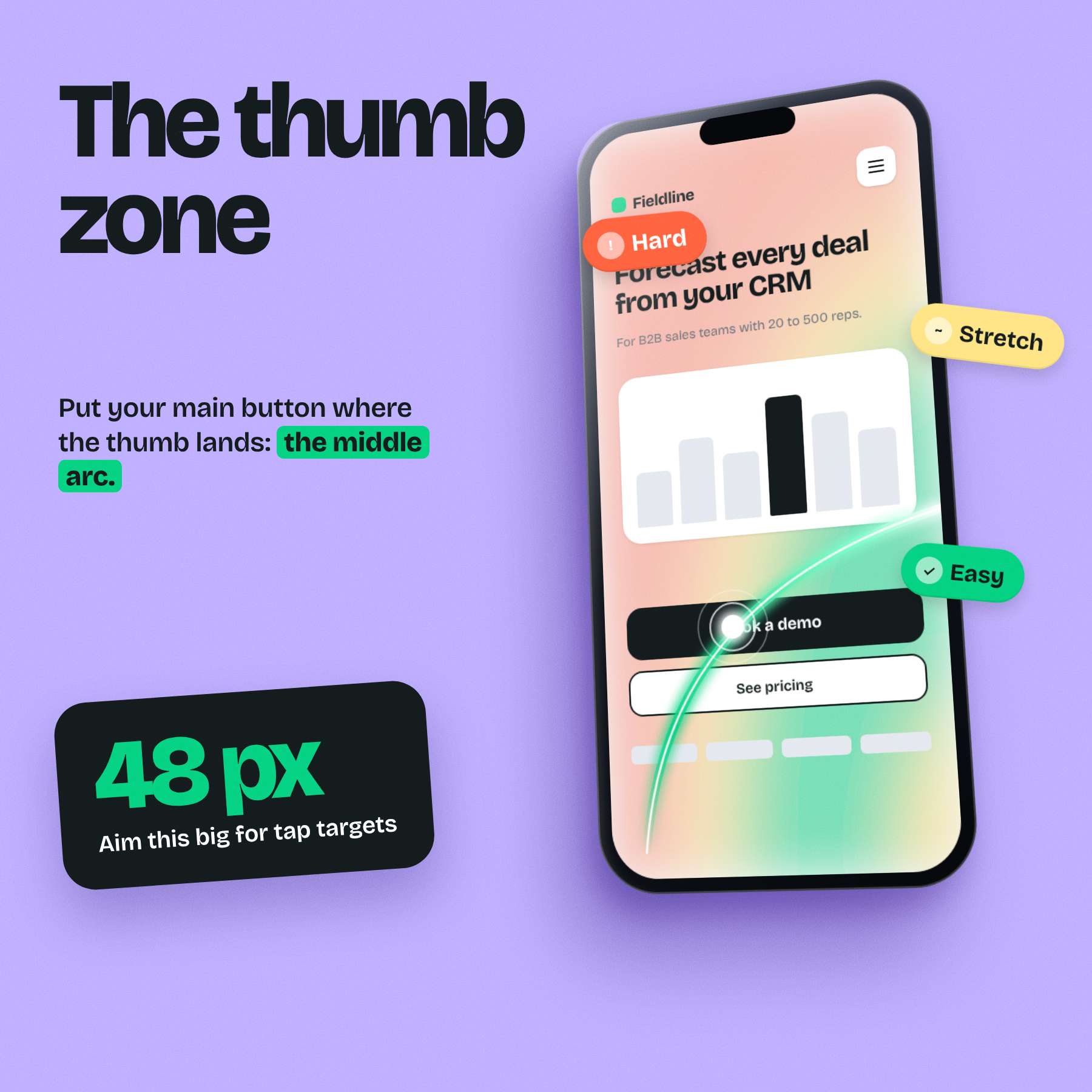
Do this: Hold your phone in one hand and scroll the page. Try to tap your main call to action with your thumb.
Pass if: You can reach and tap it without shifting your grip, and you never hit the wrong link by accident.
Fix it in Webflow:
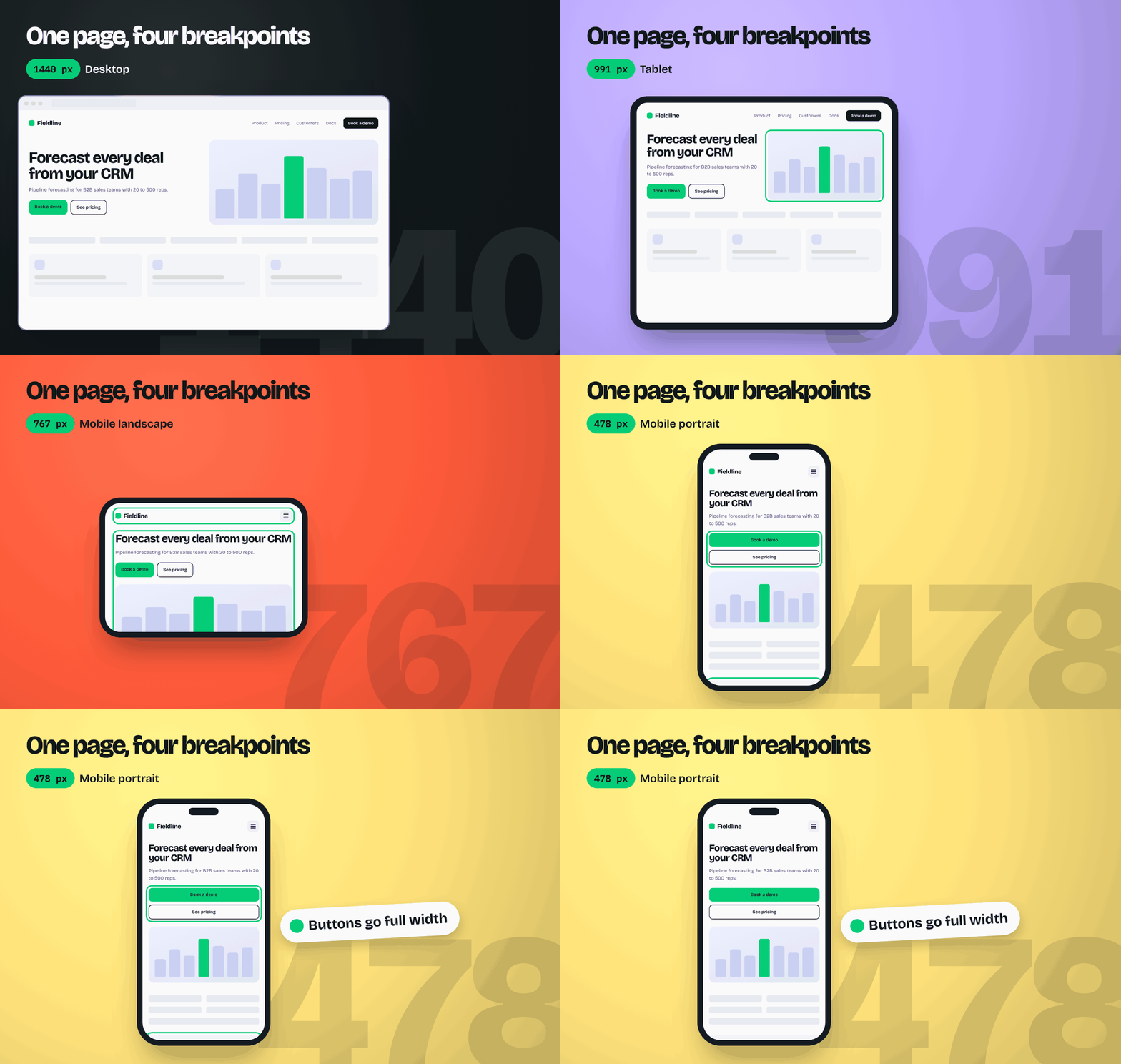
- Make primary buttons full width on the mobile portrait breakpoint, with a minimum height of 48 px.
- Leave space between tap targets. WCAG 2.2 sets 24 by 24 px as the minimum. Apple and Google recommend 44 to 48 px.
- Repeat the main call to action further down long pages, so it's never far from the thumb.
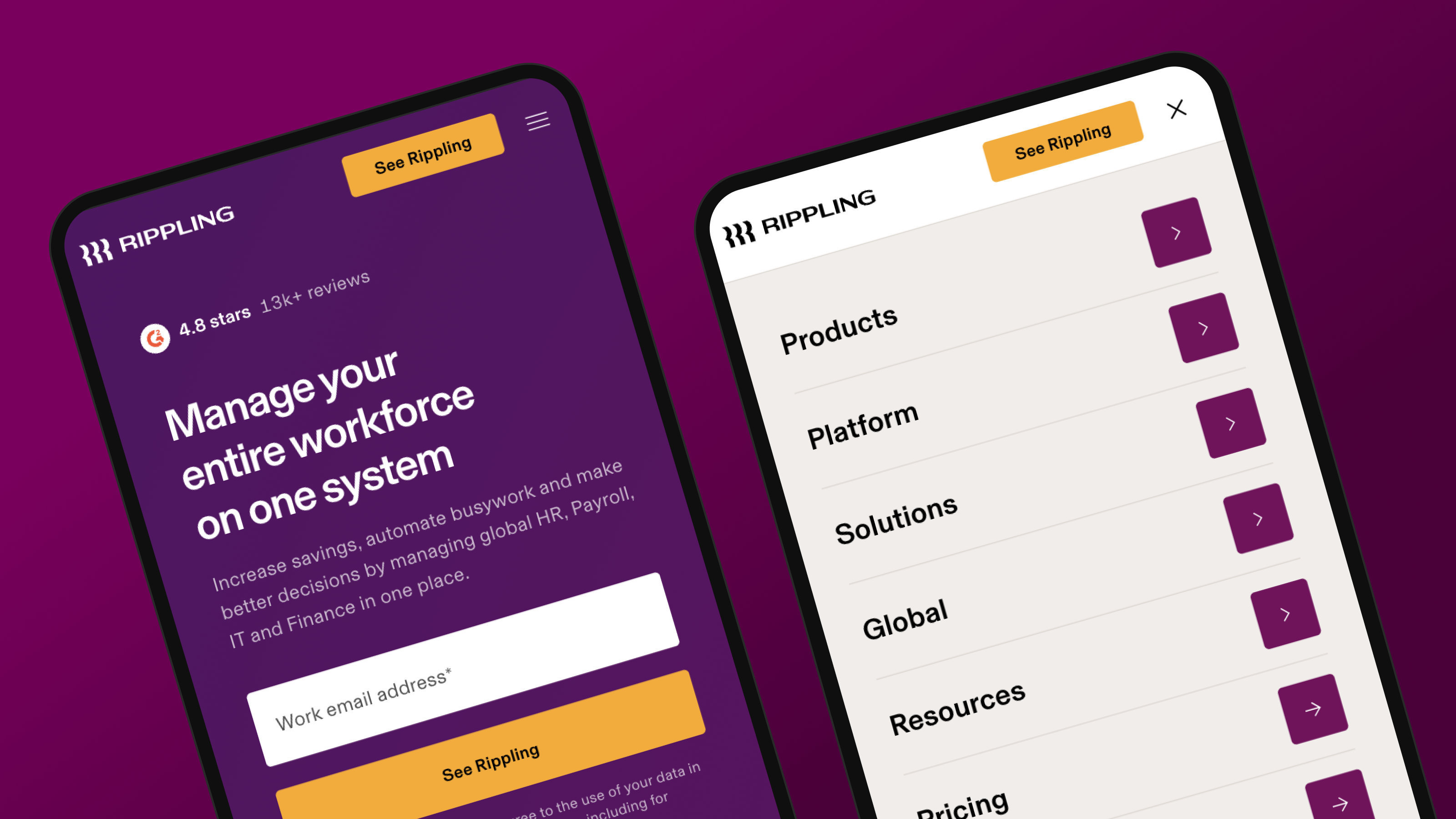
- Put a demo button inside the mobile menu, so the next step is always one tap away.
Test 5: The squint test
Do this: Hold your phone at a normal reading distance and read a full paragraph and a headline.
Pass if: Body text is at least 16 px, lines are comfortable to read, and no headline runs past four lines.
Fix it in Webflow:
- Use fluid type. Since June 2025, Webflow variables accept CSS functions like clamp(), calc(), min() and max(). Set your font sizes with clamp() so text scales smoothly between breakpoints.
- Check every heading at mobile portrait (478 px). A headline that looks great on desktop can turn into six lines on a phone.
- Shorten what you can. If a sentence needs to wrap five times on mobile, it's probably too long on desktop as well.
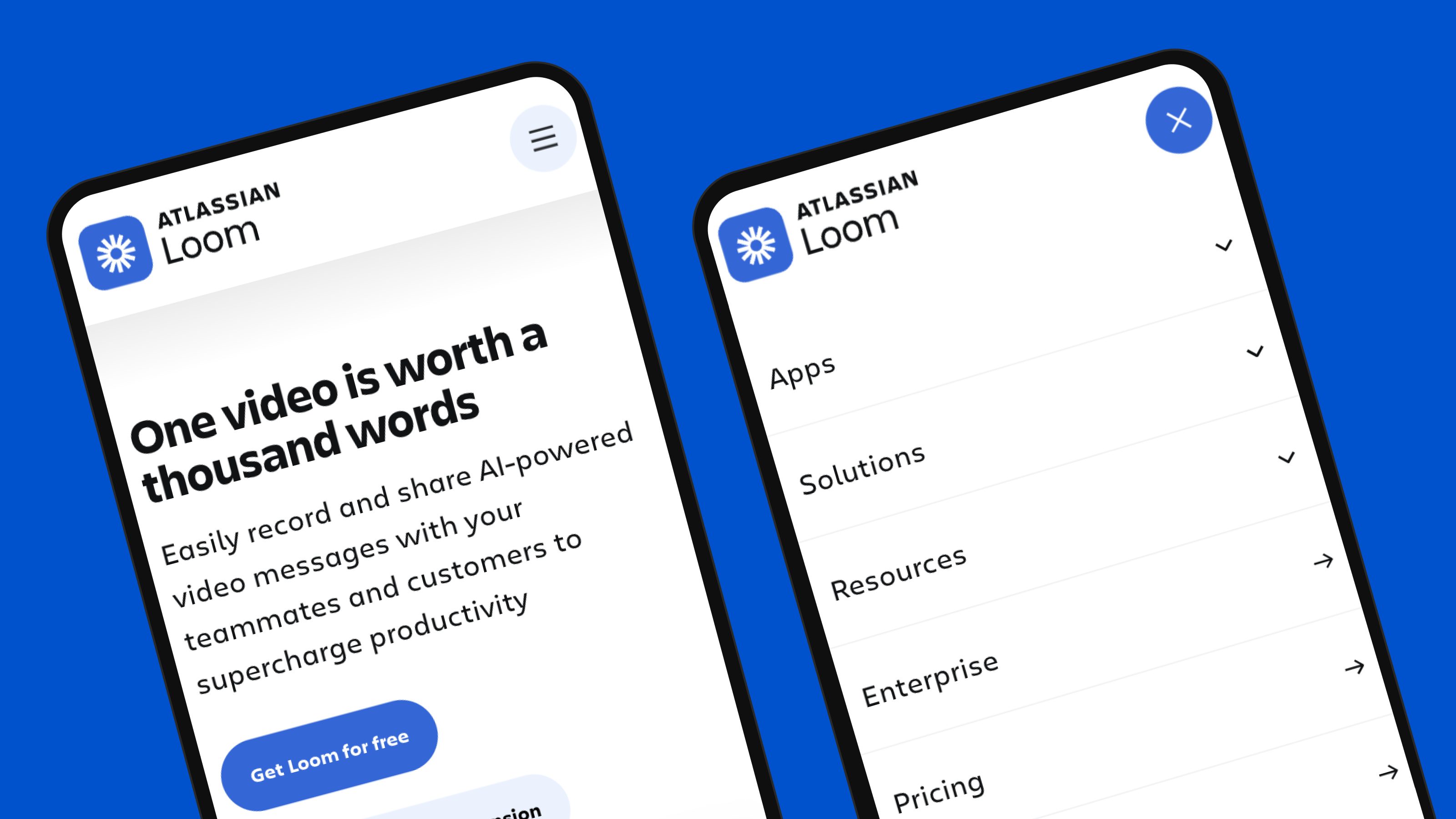
Test 6: The form test
Do this: Fill in your own demo form on your phone, start to finish.
Pass if: The right keyboard appears for each field, the page doesn't zoom in when you tap, and you finish in under a minute.
Fix it in Webflow:
- Set the right field type. Use Email and Phone types in Webflow's form field settings, so phones show the @ key or the number pad.
- Keep input text at 16 px or larger. On iPhones, Safari zooms in on any form field with smaller text, which breaks the layout.
- Add autocomplete. Use custom attributes like autocomplete="email" and autocomplete="organization" so phones can fill fields in one tap.
- Cut fields sales doesn't use. Every extra field is another chance to give up.
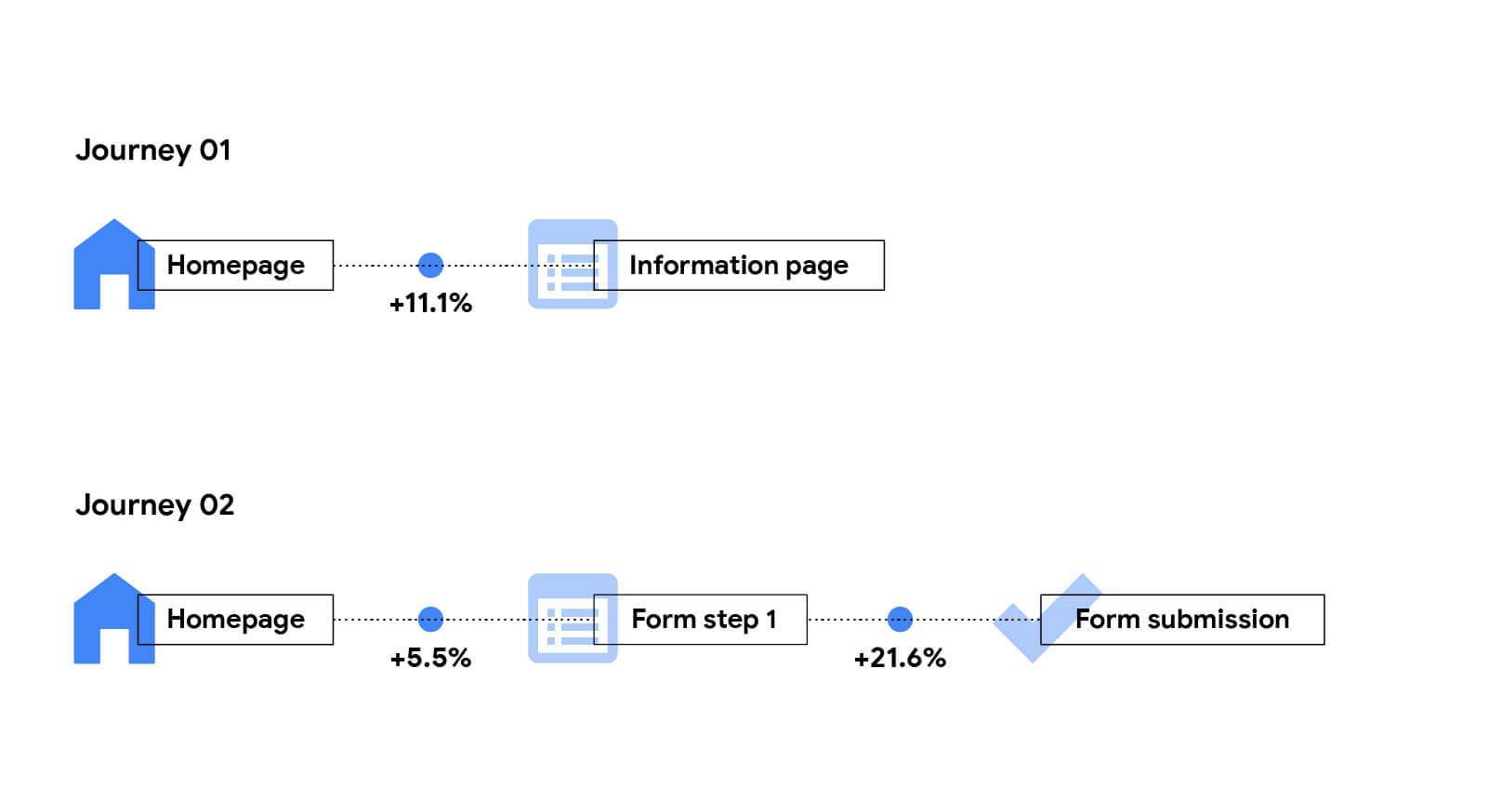
This is the test with the most direct link to revenue. In the Deloitte and Google study, a 0.1 second faster mobile site led to 21.6% more visitors reaching the form page on lead generation sites.
Test 7: The rotate test
Do this: Turn your phone sideways. Then open the same page on a tablet if you have one.
Pass if: Nothing spills off the side, there's no sideways scrolling, and the menu still works.
Fix it in Webflow:
- Check each breakpoint in the Designer. Webflow styles cascade down from desktop to tablet (991 px), mobile landscape (767 px) and mobile portrait (478 px). A fix at desktop can break something lower down.
- Hunt for fixed widths. An element set to 600 px wide will overflow a 478 px screen. Use percentages and max-width instead.
- Don't just hide overflow on the body. It hides the scrollbar, not the problem. Find the element that's too wide and fix it.
The 15-minute phone audit
- 3-second test: Headline and hero image are there in under 2.5 seconds.
- Tap-lag test: Menus, tabs and accordions react straight away.
- Jump test: Nothing moves after it appears.
- Thumb test: Main call to action is easy to reach with one thumb.
- Squint test: Body text is 16 px or more and headlines are four lines or fewer.
- Form test: Right keyboards, no zoom-in, done in under a minute.
- Rotate test: No sideways scrolling at any breakpoint.
What Webflow handles, and what it leaves to you
Webflow does a lot of mobile work automatically. It's worth knowing exactly where that stops.
| Area | Webflow does this for you | You still need to |
|---|---|---|
| Image sizes | Creates several sizes of each uploaded image and lets the phone pick the right one | Use image elements. Background images, rich text images and API or CSV imports don't get these sizes |
| Image format | Supports AVIF and WebP, with a built-in conversion tool | Run the conversion. Existing images aren't converted for you |
| Loading | Lazy loads images by default | Switch your hero image to Eager |
| Layout | Cascades styles from desktop down through tablet and two mobile breakpoints | Check every breakpoint and replace fixed widths |
| Text | Lets variables use clamp() for fluid type | Set up a type scale that works at 478 px |
| Scripts | Keeps its own code lean | Audit every third-party script you've added |
Free website audit
Does your site pass the phone test?
Get a scored breakdown of your site's speed, clarity and technical health, including how it holds up on mobile. Results in about a minute.
85/100
Overall score
What we've seen on client sites
Bounce rate is often where mobile problems show up first. People land, wait, and leave. These are results our clients reported after we rebuilt their websites:
Here's a closer look at one rebuild. ZingHR is a global HR platform, and we rebuilt its 22+ page site in 4 weeks.
When to bring in help
Most of the speed tests have fixes you can make yourself in an afternoon. Switching a hero image to Eager or removing an old script doesn't need an agency.
It's worth getting help when the problems are in the structure. When the layout breaks at several breakpoints, when every page was built with fixed widths, or when mobile was treated as an afterthought from the start.

Flowtrix makes websites and brands ready for enterprise buyers. We've delivered 120+ projects for B2B SaaS, AI and cybersecurity companies, and every page we build is tested on real phones at every Webflow breakpoint before launch.
The bottom line
Your buyers judge your site on a phone, and Google ranks the phone version. Run the seven tests, fix the red ones first, and test again in a month.
Start with the three speed tests, because they're the quickest wins. Then hand your phone to someone who has never seen your site, and watch where their thumb goes. Want a second pair of eyes? Talk to Flowtrix, or browse our case studies.
Flowtrix has delivered 120+ projects for B2B SaaS, AI and cybersecurity teams, and every build is checked page by page on real phones before launch.


FAQ's
Quick answers to what teams ask about making a Webflow site work on mobile.