



Use to summarize this article


- The cost: Knowledge workers lose about 25% of their time hunting for answers, and 47% struggle to find the information they need.
- The fix: Most of the wins come from clear labels, pages that are easy to find and fewer dead ends.
- Where Webflow fits: Your website, docs, help center, trust center and careers pages. Not your logged-in app.
- What changed in 2026: Webflow stopped offering User Accounts on January 29, 2026, and added custom roles and audit logs for Enterprise teams.
- Where to start: Fix search, accessibility and pages for each role before you think about a full redesign.
Enterprise UX is how easy it is for people to get work done with the tools and websites a large company runs. That includes employees, customers, partners and buyers. When it's good, people find what they need and move on. When it's bad, they ask someone, raise a ticket or give up.
A lot of enterprise UX advice is about dashboards and apps. But much of a company's digital workplace is plain web pages. The website. The help center. The docs. The trust center. The careers page.
That's where buyers and customers form their first opinion of you. It's also where a lot of time quietly gets lost.
In this guide, we'll look at how much that lost time adds up to, which parts of the workplace Webflow is good for, and six fixes you can start with.
The friction receipt
Nobody sends you a bill for a confusing website. You pay for it in small bits. A search that finds nothing. A document nobody can locate. A link that goes to the wrong page.
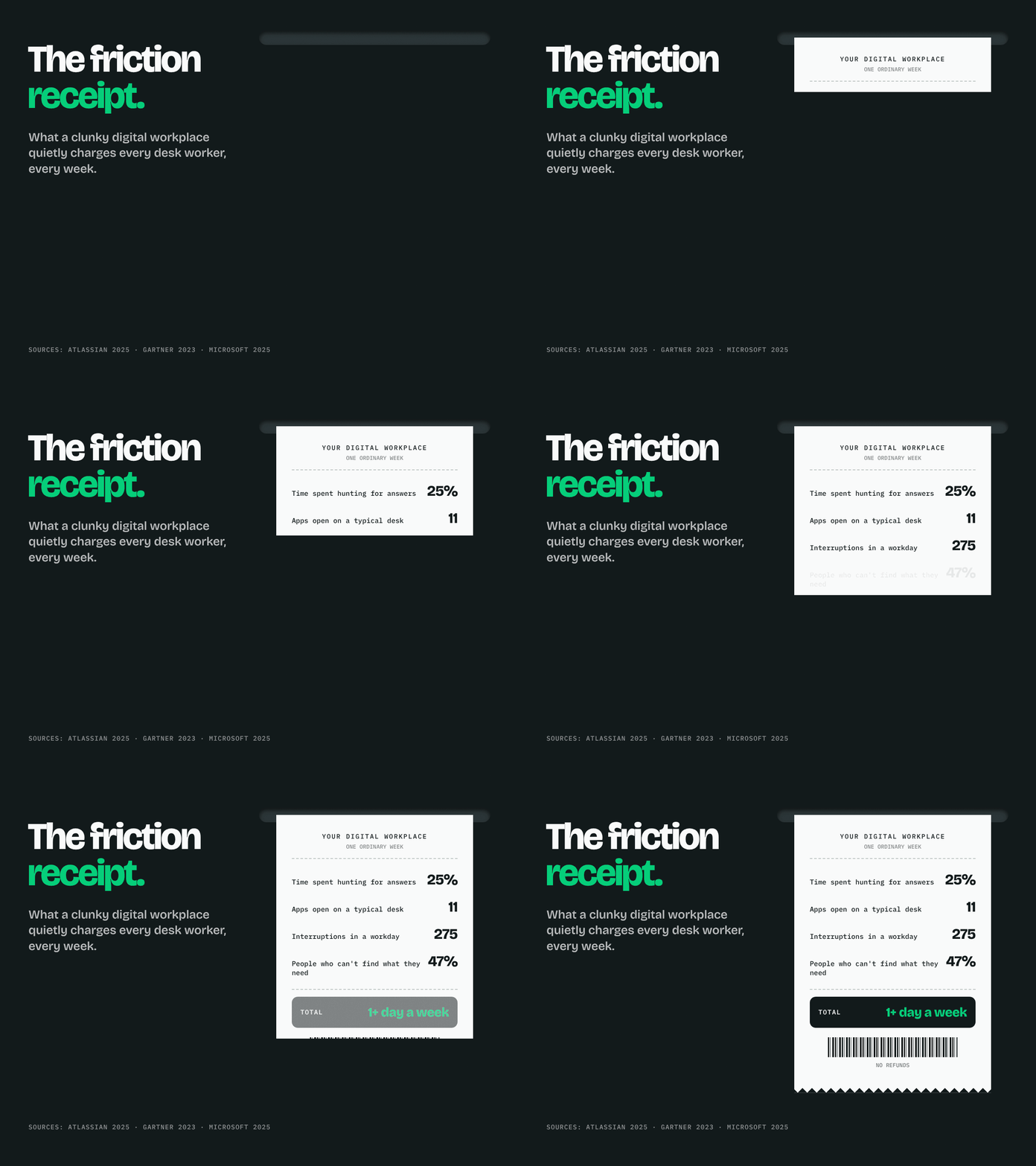
Put the research together, and the bill looks something like this.
| What the research found | Source |
|---|---|
| Teams lose about 25% of their time just searching for answers (12,000 knowledge workers surveyed) | Atlassian State of Teams 2025 |
| 47% of digital workers struggle to find the information they need to do their jobs | Gartner, via CFOtech |
| The average desk worker uses 11 applications, up from 6 in 2019 | Gartner, via CFOtech |
| Workers are interrupted up to 275 times a day, about once every two minutes | Microsoft Work Trend Index 2025, via Allwork |
| 80% of workers say they don't have the time or energy to do their job well | Microsoft Work Trend Index 2025, via Allwork |
People outside your company feel it too. Gartner found that 61% of B2B buyers would rather buy without talking to a sales rep (Gartner, 2025).
So if your site makes them hunt for pricing or security details, most won't pick up the phone. They'll just leave.

How enterprise UX is different
Designing for a whole company is different from designing an app for one person. A few things change.
| Consumer apps | Enterprise tools and sites | |
|---|---|---|
| Who uses it | One person, by choice | Many people in different roles |
| Who buys it | The same person | A group, and some of them may never use it |
| What a good visit looks like | They come back often | They get the job done and leave |
| What annoys people most | A slow or ugly screen | Confusing labels and missing pages |
| What matters most | Delight | Clear words and pages that are easy to find |
People don't open a help center to be impressed. They open it because they're stuck. Help them get unstuck fast, and that's good enterprise UX.
Your workplace has three floors
Think of your digital workplace as a building with three floors. Different people visit each one, and each one needs a different tool.
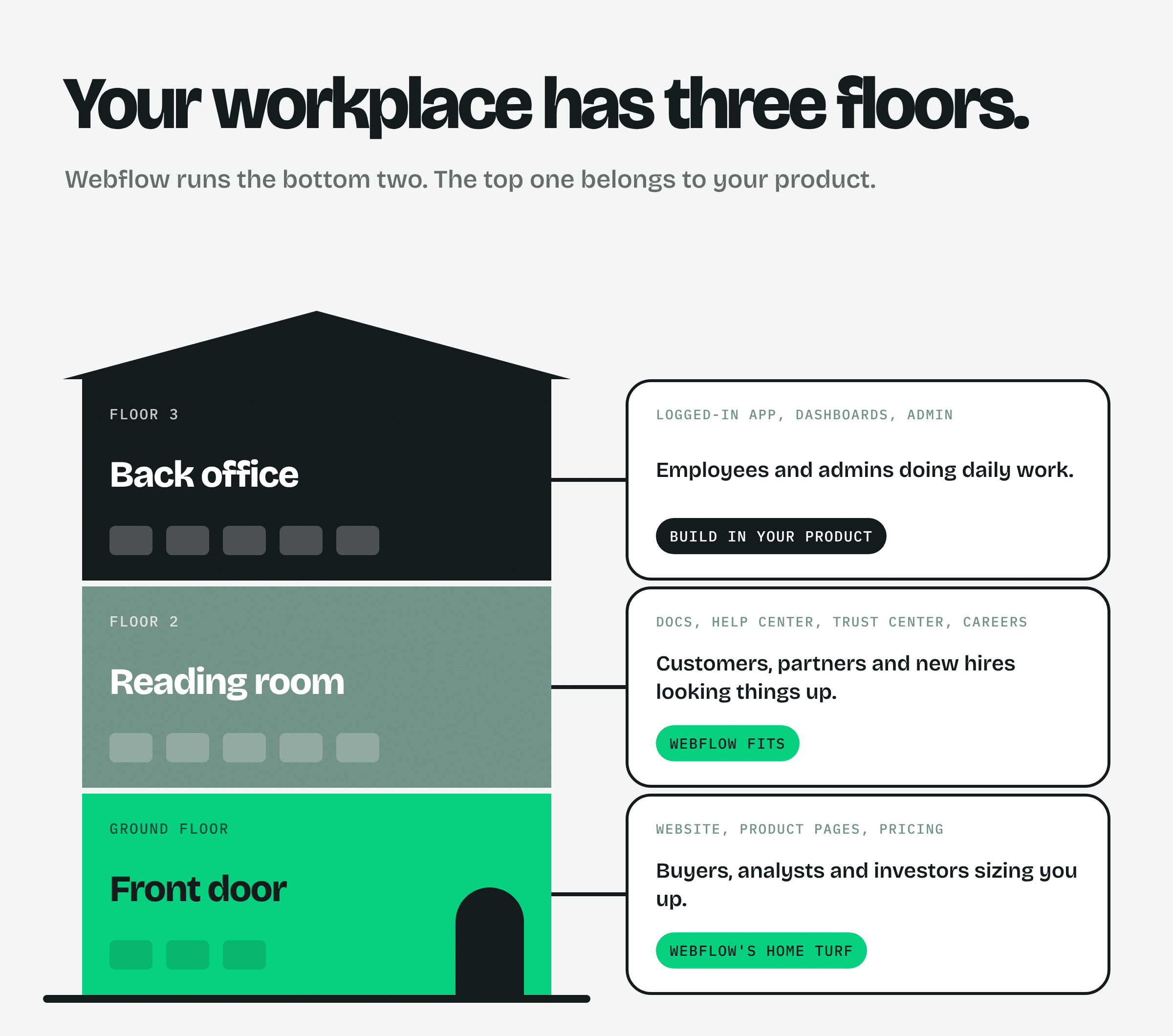
| Floor | What's on it | Who visits | Best tool |
|---|---|---|---|
| Front door | Website, product pages, pricing, case studies | Buyers, analysts, investors | Webflow |
| Reading room | Docs, help center, trust center, careers, partner pages | Customers, partners, candidates | Webflow, with password-protected pages where needed |
| Back office | Logged-in app, dashboards, admin tools | Employees and admins | Your own product or a dedicated tool |
Webflow stopped offering its User Accounts feature on January 29, 2026. It now points people to tools like Memberstack or Outseta for logins (Webflow Help Center).
So Webflow isn't the right home for internal dashboards anymore. For the bottom two floors, though, it works very well.
A Forrester study of Webflow customers found a 94% improvement in time to market and an 80% faster turnaround on changes (Forrester TEI, via Webflow).
Webflow paid for that study, so take the numbers as a best case. The main point still holds. When your marketing and support teams can update pages themselves, those pages stay current.
Six fixes, sorted by effort
Many teams start with a full redesign. It's the biggest and most expensive option, and it's rarely the first thing you need.
The grid below sorts six smaller fixes by how much work they take and how much they help. Start with the top left box.
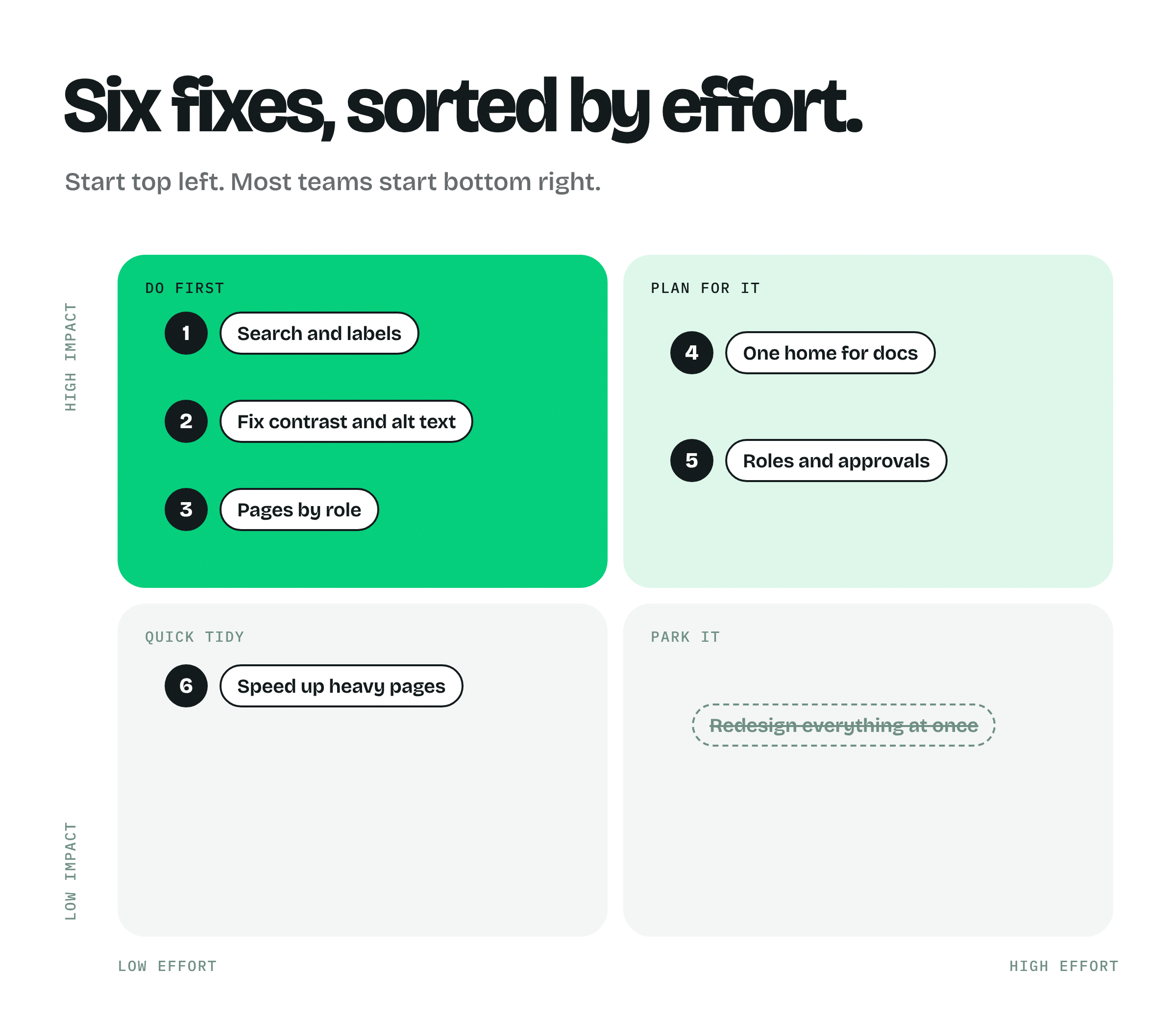
1. Search and labels
This one is usually the quickest win. Your users search for "SSO setup", but your page is called "Identity configuration". They never find it.
Use the words your users actually use. You'll find them in support tickets, sales call notes and your site search logs. Before you change the menu, ask five people to find a few pages and watch where they click.
In Webflow, add tags and categories to your CMS so people can filter docs and resources. Then keep one shared list of names so every team labels things the same way.
2. Fix contrast and alt text
Light grey text on white. Images with no description. Form fields with no label. These small things lock people out.
They're also very common. WebAIM checked the top one million home pages in 2025 and found accessibility errors on 94.8% of them, with 51 errors per page on average (WebAIM Million 2025).
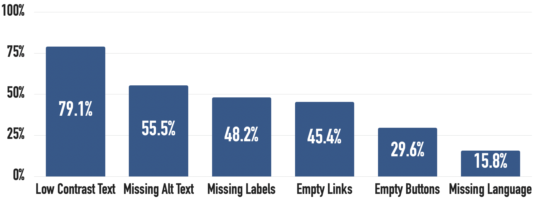
Webflow's Audit panel flags missing alt text and other issues while you build. Add alt text to an image once in the Assets panel, and it shows up everywhere you use that image.
There's a business reason too. The European Accessibility Act has applied since June 28, 2025, and large buyers now check accessibility before they sign a deal.
3. Pages by role
A security lead, a finance lead and an everyday user all want different things from your site. If they all land on the same general page, most of them leave without what they came for.
Give each one a clear path. A security page with your compliance details. An IT page with integrations and SSO. A page that shows finance what it costs and what it saves.
In Webflow, you can build one CMS template for each role or industry. After that, a new page takes minutes instead of a new design project.

4. One home for docs
Release notes live in one tool. Guides live in another. The security policy is a PDF in someone's shared drive. Sound familiar?
Bring your customer-facing docs, help articles and trust center into one place, with one search bar and one design. Fewer places to look means fewer "where is that?" messages.
Webflow's CMS handles this well. Use collections for articles and categories, shared components for things like steps and notes, and built-in localization if you publish in more than one language.
Our guide to enterprise Webflow CMS architecture shows how to set up collections so they stay tidy as they grow.
5. Roles and approvals
Some sites have no rules, so anyone can publish anything. Others have so many that nothing goes live without a developer. Both slow you down.
Agree on who can edit, who can publish and who can change the design system. Then let the tool enforce it, so nobody has to police it by hand.
Webflow Enterprise now has custom roles, page branching, publishing approvals and an audit log that can feed your security tools (Webflow).
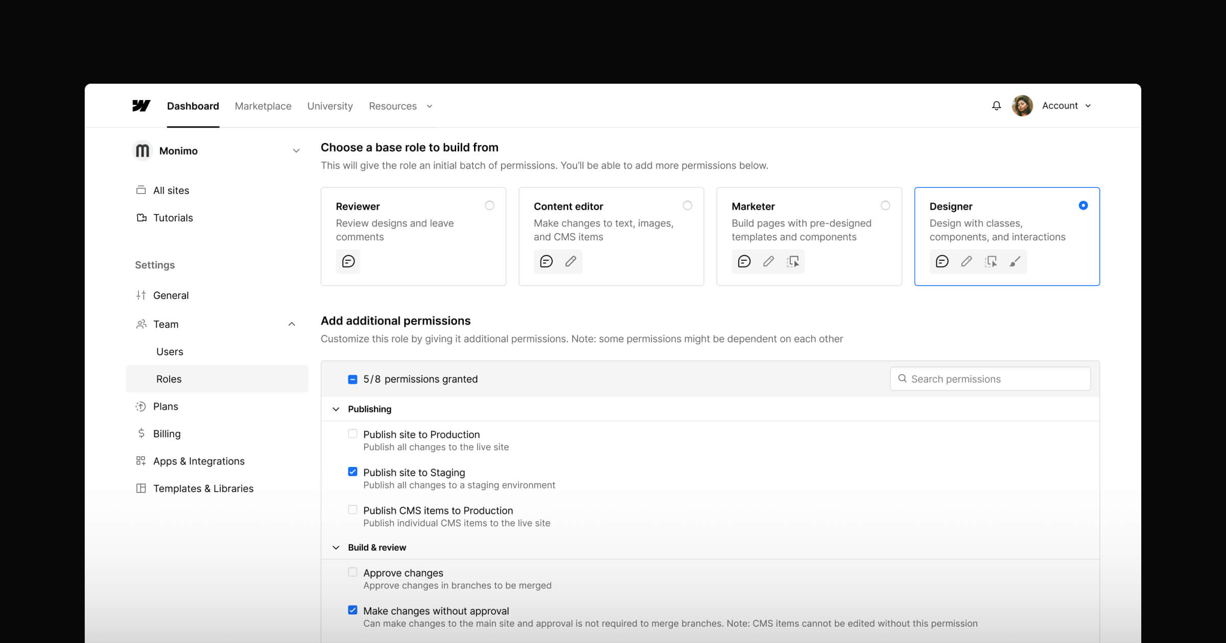
Here's a simple setup that works for most teams.
| Role | Can do | Can't do |
|---|---|---|
| Content editor | Write and update CMS items | Publish to the live site |
| Marketing lead | Review and publish pages | Change the design system |
| Designer | Edit components and styles | Change workspace permissions |
| Admin | Manage roles, SSO and audit logs | No limits |
6. Speed up heavy pages
If your pricing page takes four seconds to load on a phone, plenty of people won't wait.
Pick your three most visited pages and make them fast. Compress images, remove scripts nobody uses, and make sure the main image loads first.
Webflow already serves your site from a global network and can convert images to lighter formats like AVIF and WebP. Our Webflow mobile optimization guide covers the rest, step by step.

How to tell if it worked
Write down a few numbers before you make changes. Check them again after 30 days. It's the easiest way to show the work paid off.
Six numbers worth tracking
- Task success: Can five real people find your SSO docs, pricing and security policy without help?
- Time to find: How many seconds it takes them.
- Dead-end searches: Searches on your site that end with no click.
- Repeat tickets: Support questions your site should already answer.
- Accessibility errors: The count from a free WAVE or Lighthouse scan.
- Time to publish: Days from "we need this page" to "it's live".
Free website audit
Where does your site slow people down?
Get a scored breakdown of your site's clarity, structure and technical health, the things that decide whether people find what they came for. Results in about a minute.
85/100
Overall score
What this looks like in practice
Enterprise products usually have a lot to explain. These clients needed websites that made a complex product easy to follow.
| Client | The challenge | What happened |
|---|---|---|
| Lyric | A supply chain platform used by brands like Coca-Cola Consolidated | 10+ pages live in 4 weeks, with content updates 10x faster |
| Owlery | Seven freight products, each with its own buyer | 10+ pages in 6 weeks and 2.5x more engagement |
| CogniSwitch | AI for healthcare, defense and finance teams | Doubled growth in enterprise conversions |
ZingHR is an HR platform that many companies run their workplace on. Here's how we rebuilt its website.
How Flowtrix helps
Flowtrix makes websites and brands ready for enterprise buyers. We're a Webflow Enterprise Partner and have delivered 100+ projects for B2B SaaS, AI and cybersecurity companies.
We build the two floors Webflow is best at, the front door and the reading room. We also set up the roles, publishing steps and design systems that keep them in good shape after launch.
Start small, then measure
Good enterprise UX usually comes from a list of small fixes. Use words people recognize. Make pages easy to find. Make text easy to read. Let your team publish without waiting on a developer.
Start with search, accessibility and pages for each role. Measure before and after. Leave the big redesign until the small fixes stop helping.
Want a second opinion on where your site loses people? Talk to Flowtrix or browse our case studies.
Flowtrix has delivered 100+ projects for B2B SaaS, AI and cybersecurity teams, including enterprise platforms with many products, many buyers and a lot to explain.

10+ pages live in 4 weeks for a platform trusted by Coca-Cola Consolidated, with content updates 10x faster.

Seven freight solutions explained on one clear Webflow site, with 2.5x more engagement.

A site for AI in healthcare, defense and finance that doubled growth in enterprise conversions.
FAQ's
Quick answers to what teams ask when they start fixing enterprise UX.