

Glossary
What is Kerning (Typography)?
Kerning is a micro-level detail in Typography that addresses the awkward gaps that can occur between certain letter pairs (e.g., 'W' and 'A', or 'T' and 'o').
Why Kerning Matters in UI/UX?
While subtle, correct kerning is essential for achieving a professional, polished User Interface (UI) and ensuring readability.
- Aesthetics: Poor kerning makes a design look unprofessional or amateur, damaging the Brand Identity and trust.
- Readability: Especially in large, bold headlines (like the Hero Section), bad kerning can introduce visual noise, slowing down comprehension and reducing the intended impact of the Copywriting.
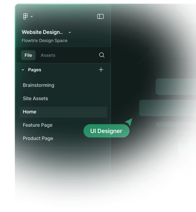
Example from Flowtrix Projects
Flowtrix's commitment to Pixel Perfect design extends to micro-details like Kerning. During the Figma design phase, we ensure all primary headlines and key text elements adhere to precise Typography standards. This attention to detail in the UI (User Interface) guarantees the final Webflow build perfectly reinforces the client’s premium Brand Identity.
Categories:
Design
Related Terms:
Master Webflow.
Get insights directly.
Never scheduled, never spammed. Be the first to know when we publish a piece or release something cool!


.avif)


.svg)
.svg)

