

Glossary
What is X-Height (Typography)?
X-Height is a micro-detail in Typography that strongly influences the legibility of body text. A typeface with a large x-height means the lowercase letters take up more vertical space, making the font look larger and often easier to read at small sizes.
Why X-Height Matters in UX and Accessibility?
The legibility of the main body text is critical for keeping users engaged and improving the User Experience (UX).
- Readability: A generous x-height makes it easier for the eye to distinguish between characters, especially for users with visual impairments, directly addressing Website Accessibility.
- Visual Hierarchy: Consistent text sizes and a legible x-height ensure the reader's focus is on the large, bold headlines (the Visual Hierarchy) rather than struggling with the body copy.
- Brand Identity: The x-height choice contributes to the overall aesthetic and professional look of the Brand Identity.
Example from Flowtrix Projects
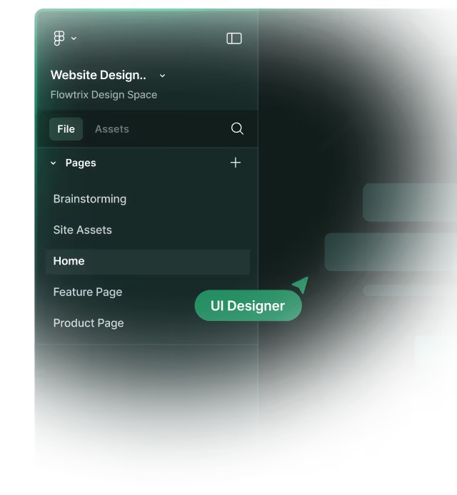
In the Figma design phase, Flowtrix carefully selects typefaces with an optimized X-Height as part of our Typography strategy. This ensures maximum legibility for all body copy, which is a key component of a superior User Experience (UX) and a requirement for meeting Website Accessibility standards for our enterprise clients.
Categories:
Design
Related Terms:
Master Webflow.
Get insights directly.
Never scheduled, never spammed. Be the first to know when we publish a piece or release something cool!


.avif)


.svg)
.svg)

