

What is Visual Hierarchy?
Visual Hierarchy uses design elements to signal to the user what they should look at first, second, and so on. It is a fundamental technique in UX Design and relies on size, scale, color, contrast, spacing and typography.
Why Visual Hierarchy Matters in Conversion?
A clear Visual Hierarchy is essential for a high-performing website because it minimizes friction and directs the user toward the primary business goal.
- Focus: Ensures the key value proposition and the CTA (Call to Action) are noticed immediately, reducing Bounce Rate.
- Comprehension: Improves the scannability of the page, allowing users to quickly process information and move efficiently through the User Flow.
- Goal Alignment: Directs the user's attention along the lines of the intended Customer Journey.
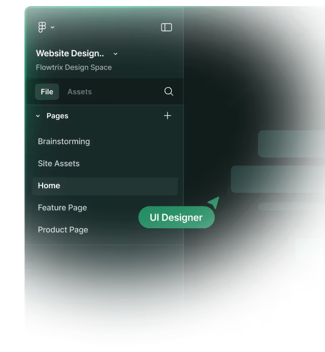
Example from Flowtrix Projects
Flowtrix designs every Section with a strict Visual Hierarchy to optimize for B2B buyer intent. We use contrasting colors (Color Theory) for the primary CTA, large, bold Typography for the Hero Section headline, and strategic White Space to emphasize key selling points. This ensures the design guides the user's eye effortlessly toward the conversion goal, maximizing Conversion Rate.
Master Webflow.
Get insights directly.


.avif)


.svg)
.svg)

